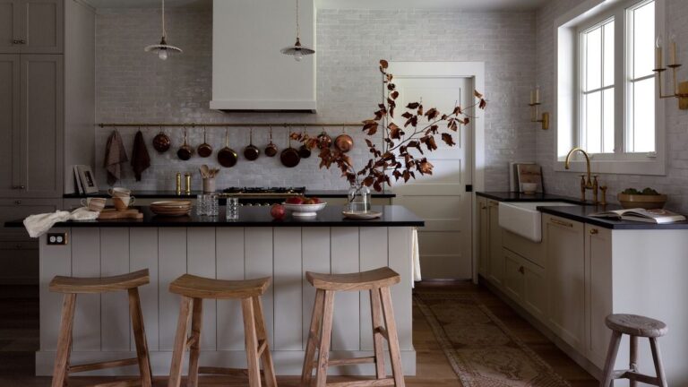
If you’re a fashion-forward decorator, you’ll have already got the memo that soft beiges and grounding earthy neutrals are leading pale color trends for kitchens this year. You may also have spotted that gray is nowhere on the list, and its popularity has been dwindling for some time now.
However, while the masculine and moody ‘Battleship Gray’ that was the nation’s favorite kitchen color just a decade ago may be dead and buried, with nobody weeping over its loss, there are strong indicators that we’ve not seen the last of gray kitchens. Only this time, pale and elegant is the sophisticated way to go gray.
‘Light gray is an especially popular kitchen color as it offers a neutral backdrop that complements a variety of design styles, from modern to traditional,’ agrees interior designer Rebecca Hughes. ‘It provides a classic and sophisticated foundation, while offering the flexibility to personalize the kitchen space according to individual tastes and styles.’
10 light gray kitchen ideas that are soft and subtle
Palest gray is an excellent choice for neutral kitchen ideas and can work well as a tonal accent color in white kitchens. Paired with bolder tones, light gray can also prove surprisingly dynamic and brave.
1. Pair a light gray kitchen with luxurious materials
(Image credit: Joana Aranha)
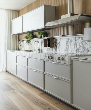
Introduce luxurious materials in coordinating tones to boost the wow factor of simple pale gray kitchen cabinets. With its undulating gray veining, natural marble is a clever choice, as Joana Aranha Studio shows in this stunning apartment.
‘To elevate any pale gray kitchen, we recommend integrating marble into the design. Here, we opted for Calacatta Oro marble for the kitchen countertop, extending it up the wall for a unique and refined touch,’ explains founder, Joana Aranha.‘The interplay between the pale gray tones of the kitchen and the intricate patterns of the Calacatta Oro marble contributes to an atmosphere of lightness and elegance.’
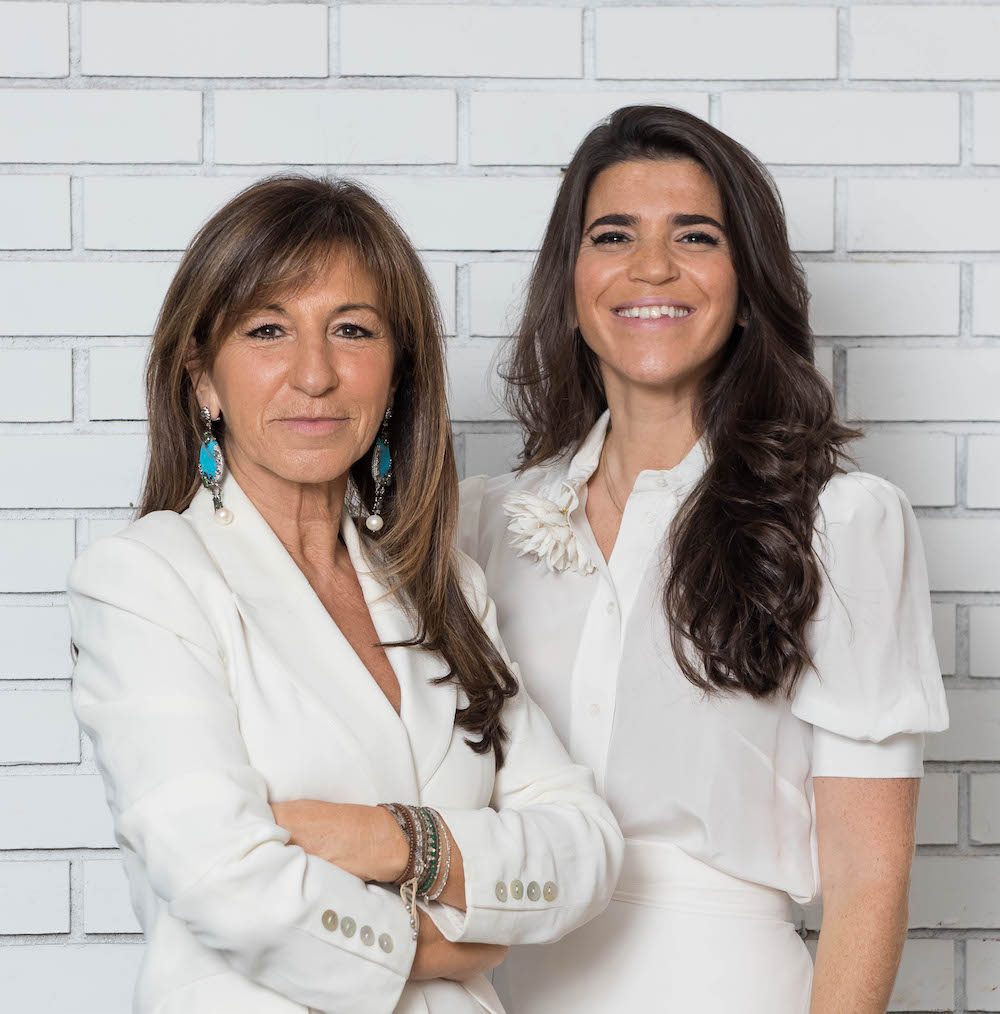
Joana Aranha established her eponymous studio four decades ago. Now in partnership with her architect daughter, Marta Aranha, the Portugal-based studio draws inspiration globally, creating extraordinary living spaces. Their work spans residential, commercial, restaurants, yachts and private jets.
2. Go for gray on the island
(Image credit: Benjamin Johnston)
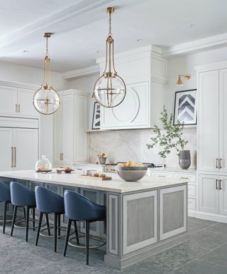
Focusing your gray attentions solely on a kitchen island can provide depth and interest, while steering the color palette away from full ‘battleship’ gray territory. In this predominantly white kitchen, interior designer Benjamin Johnston demonstrates the power and strength of a smaller dose of this versatile shade.
‘To help achieve an impactful look on this stylish island, we used a neutral gray wood stain that coordinates beautifully with the stone flooring,’ recalls Benjamin. ‘We then used two colors of paint to highlight the panel detail on the island and to lend an added dose of impact and personality. Suddenly, a classic, clean white kitchen packs a subtle yet welcome punch!’

Houston-based Benjamin Johnston has been creating eloquent interiors for nearly two decades. Benjamin’s architectural background shines through every extraordinary luxury residential project he and his talented team tackle, and he’s also an established product designer and has collaborated on the design of furniture, rugs and textiles for various high-end brands.
3. Warm up the gray with woods
(Image credit: Cohesively Curated Interiors/Carina Skrobecki)
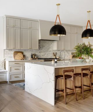
Without the benefit of lots of lovely natural daylight, gray can be a chilly choice that isn’t terribly welcoming. The secret is to seek out a soft, warm gray that’s closer to beige than black – then dial up the color temperature via plenty of natural timber accents.
For this family home in Seattle’s Lake Forest Park, interior designer Emily Ruff needed to work all her design magic to transform the fortunes of the original dark, small kitchen. ‘The goal was light and bright, but still warm,’ says Emily, who chose Benjamin Moore’s Revere Pewter, a light putty gray, on the cabinetry for its cozy undernotes. ‘We then brought in wood tones in the cabinetry, dining table, and stools to ensure the overall scheme felt warm and inviting,’ she explains.
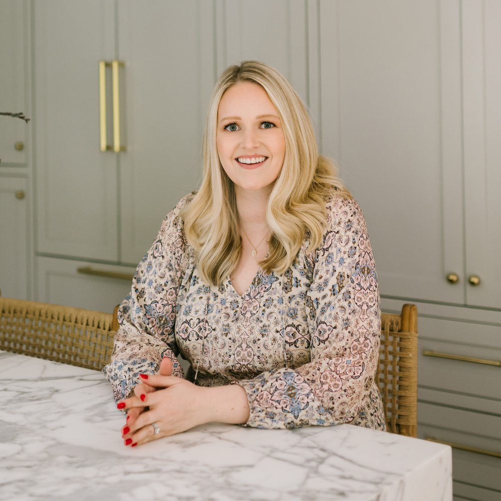
Cohesively Curated is a full-service design studio based in Seattle and founded by Emily Ruff. Emily’s designs marry interest and invitation—with modern livability and a textural, eclectic aesthetic. Emily is known for her discerning eye and ability to craft spaces that are equal parts comfort and conversation-starter.
4. Up the interest in a light gray kitchen
(Image credit: Annie Downing Interiors/Lindsay Brown)
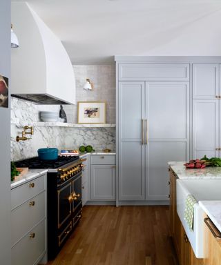
Gray doesn’t have to be dull, as this layered scheme by Annie Downing Interiors proves. With its shapely cooker hood, and impactful black range cooker, there’s plenty to admire and no chance of getting tired of this elegant gray kitchen.
‘I wanted to create a light, bright kitchen without relying on a white color palette,’ recalls Annie. ‘We chose Farrow and Ball’s Pavilion Gray, a lovely dove color that pairs well with warm tones. The mix of warm and cool tones, as well as the open shelving, marble kitchen backsplash, and Zellige tile, all have contemporary appeal. Soft but modern.’
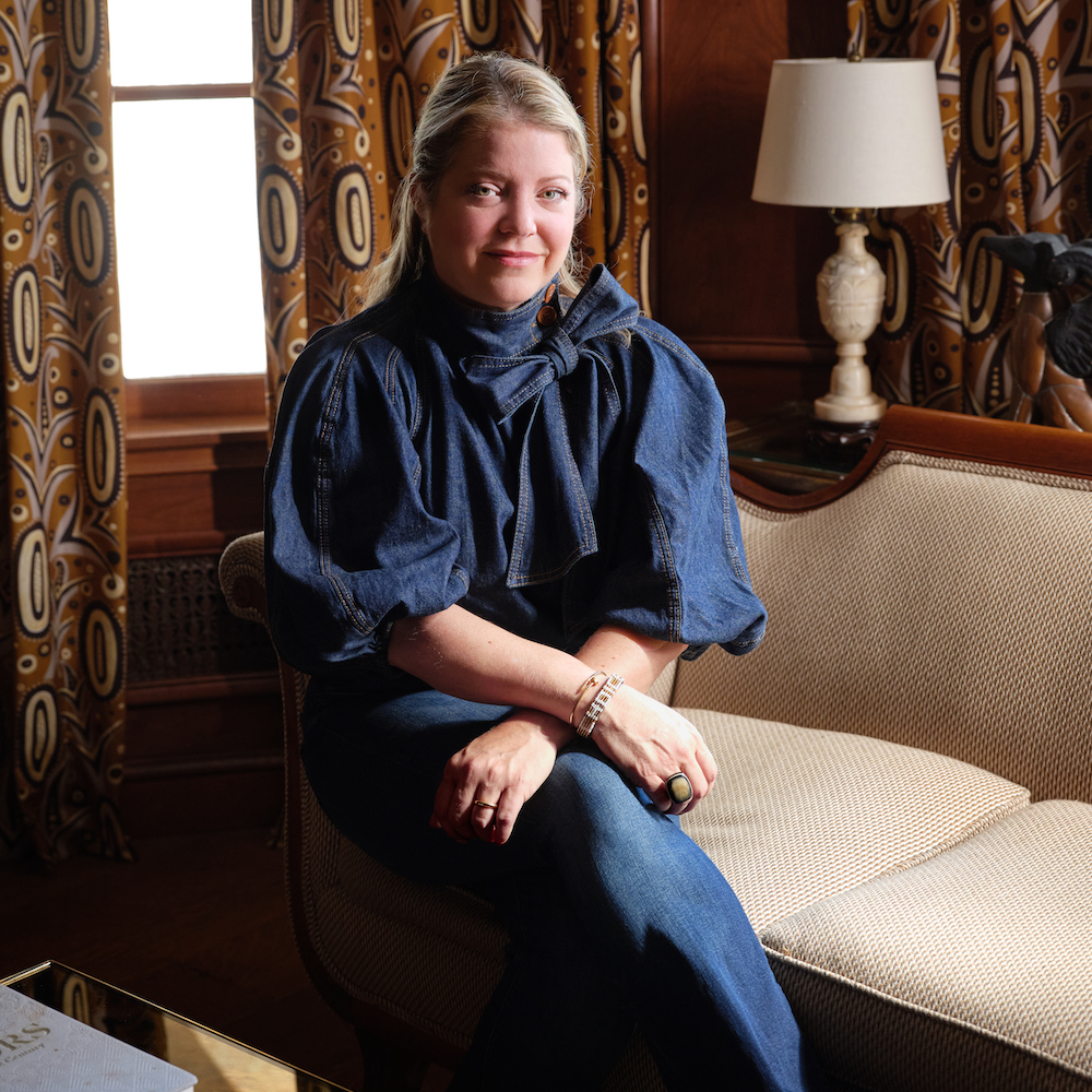
Annie Downing is known for her unique, eclectic use of color and whimsical details in a clever, yet approachable way. Downing and her team are dedicated to creating unique, one-of-a-kind interiors that mesh modern design with traditional elements.
5. Create an inviting tonal scheme
(Image credit: Kate Feather/Birgit Mons)
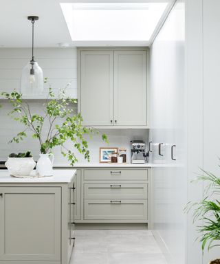
As a color, gray is one of the most versatile neutral tones to use within the kitchen due to the broad range of shades, so says kitchen designer Kasia Piorko, who curated this two-tone kitchen scheme. As with any tonal color switch, a gray-on-gray palette boasts subtle definition and depth.
‘For this kitchen, we used two gray tones from Little Greene,’ adds Kasia, who is the founder of bespoke kitchen-maker Kate Feather. ‘Putti on the Shaker units, chosen for its slight green hue. To create a classic yet modern feel, we paired it with Fescue on the tall units, which is a great neutral gray with a warm undertone.’
6. Textural treat
(Image credit: StruckSured Interiors/Emily Kennedy)
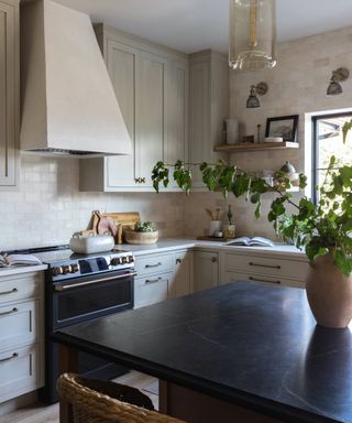
Texture can have a huge impact on interest levels, proving far more characterful than flat expanses of gray. In this kitchen designed by StruckSured Interiors, the pale gray cabinets are hand-painted in Wood-Mode Cabinets’ Vintage Putty, which has hints of cool green and a vintage distressed finish.
‘The distressed glaze on the paintwork really gives it an aged look and is great for handling life’s messes with a household of kids,’ explains Samantha Struck of StruckSured Interiors. ‘We like the warmth and welcoming feel that the brushstrokes and finish lend to the space.’

Samantha Stuck founded StruckSured Interiors of Hood River, Oregon, more than a decade ago and has clients nationwide. Her interiors are informed by a deep respect for nature and landscape coupled with an appreciation for clean, fine lines and a modern, fresh twist.
7. Try light gray on modern cabinetry
(Image credit: Louise Robinson Interiors)
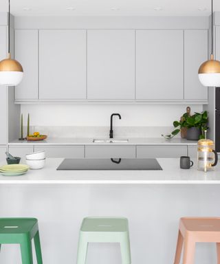
Palest gray isn’t just for more traditional kitchens, it can look equally timeless and serene on modern, handle-less doors. For this simple but sophisticated contemporary kitchen, interior designer Louise Robinson chose off-the-peg cabinets in a delicate matt gray. Benjamin Moore’s Metro Gray is similar.
‘I picked the color as it’s a soft, stony gray that feels warmer than some alternatives and it’s light enough to be used on cabinets that carry right up to the ceiling, without overpowering the space. A darker gray would have been too much for the scale of the space,’ explains Louise.
8. Pick light gray as the perfect timeless backdrop
(Image credit: Bethany Adams Interiors)
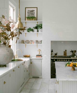
The sheer brilliance of pale gray lies in its versatility, which makes it a timeless choice that can flex and adapt as your family grows. The owners of this historic 1870’s Louisville home have a timeless sense of style and wanted a flexible color for their new kitchen that would complement the architectural heritage, and also appeal to more modern sensibilities. Bethany Sundman Adams, principal of Bethany Adams Interiors, delivered the goods with her usual flair.
‘We chose Ammonite by Farrow and Ball, which is the perfect balance of warm and cool tones. A very subtle gray, it’s not in danger of looking dated anytime soon and the clients can pair it with just about any accent color for an easy update through the years,’ she explains.
9. Encourage calm with a pale gray kitchen
(Image credit: Rebecca Hughes Interiors)
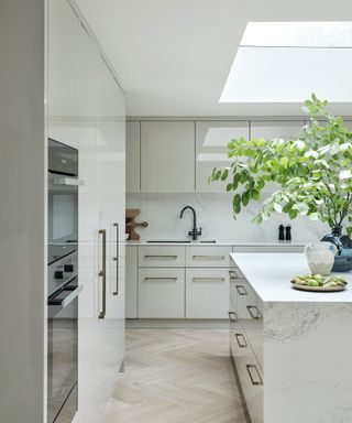
If there’s one reason pale gray will always have a place in our hearts, it must be its sheer peacefulness. Just looking at a photo of this quiet luxury kitchen by Rebecca Hughes Interiors is enough to still the soul.
‘Gray tones are known for their ability to create a clean and calming atmosphere, making them well-suited for the often bustling and multitasking environment of kitchens,’ says interior designer, Rebecca Hughes, who used Little Greene’s French Grey Pale in this tranquil kitchen.
‘Gray will also remain a popular choice because it pairs so seamlessly with a range of materials, including stainless steel appliances, marble countertops, and brass hardware, allowing for diverse design possibilities,’ Rebecca adds.
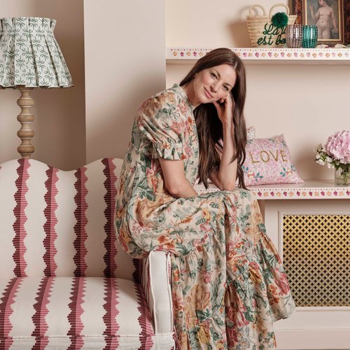
Rebecca Hughes is the founder of Rebecca Hughes Interiors, a high-end interior design studio providing turnkey design services that result in uniquely beautiful homes. Rebecca is passionate about mixing classical and modern furniture and celebrating architectural heritage. Her eye for craftsmanship and detail is evidenced in the luxurious, high-quality interiors she creates.
10. Choose pale gray for a light filled space
(Image credit: Benjamin Johnston/Julie Soefer)
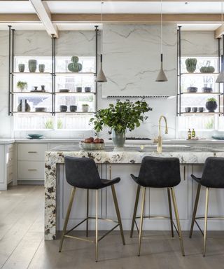
Choose the palest gray in a light-filled kitchen to enjoy a sophisticated neutral palette that’s kinder on the eyes than pure white. In this brightly lit kitchen, Benjamin Johnston Design has used Sherwin Williams’ Skyline Steel, a warm stone gray that reads as off-white. ‘Any storage solution that doesn’t obstruct the flow of natural light into the room is always a pro,’ says creative director, Benjamin Johnston.
The heavily figured Patagonia stone worktops on the island helps to elevate the pale gray cabinetry, with brass touches acting like jewels on this otherwise neutral palette. The whitened wood flooring below and timber beams above provide extra visual warmth and a connection with the trees outside.
FAQs
What colors go well with light gray kitchen?
Decorating with gray couldn’t be easier. As a neutral, so many colors go well with light gray kitchens, making it virtually impossible to go wrong. As a pale color, it will reflect the light, rather than absorb it, so if you’re seeking a bright, uplifting space, pair light gray with similarly reflective neutrals, such as off-white or greige.
Alternatively, you could use pale gray to balance a darker scheme. For example, by using dark green kitchen cabinets and light gray walls. ‘Depending on the light levels, I would generally recommend opting for darker shades on the base cabinets and lighter above, particularly if the ceilings are low,’ adds interior designer Irene Gunter, founder of Gunter & Co.
How do I add warmth to my gray kitchen?
Introducing pattern, texture and natural materials are all tried-and-tested techniques for adding warmth to a gray kitchen. Or any color kitchen for that matter! Seeking out cozy kitchen rug ideas is a great place to start, especially if you have hard flooring as they’ll provide physical warmth underfoot.
Bringing vintage pieces into a kitchen is another go-to trick that designers use to add character and that inviting lived-in atmosphere. Think antique lighting, an old dresser, accessories and upholstery. A squashy old armchair in the corner, or a display of earthenware – whatever you choose, if it’s a little battered and timeworn, it’s sure to bring warmth and charm to a gray kitchen.
When it comes to choosing the best pale gray kitchen ideas, there really are no obstacles to success. Light gray is a flexible shade that won’t date easily, nor lose appeal. How will you embrace the new pale gray trend in your next kitchen remodel?


