These era-specific designs have timeless appeal without feeling too theme-y.


Inspiration for your dream kitchen can be found anywhere, from a favorite restaurant to a dinner plate with the perfect color palette. If you happen to love all things retro and swoon at the thought of clean lines and streamlined cabinetry, taking inspiration from mid-century modern kitchen design could be the right course of action for your next renovation or cook space makeover.
At its core, mid-century modern design is all about form and functionality—with a little flare thrown in, too. Spanning much of the ‘50s, ‘60s, and ‘70s, the design era fell into favor thanks to its eye-catching architectural appeal, as well as its focus on flow, entertaining, and a more modern way of living. In the kitchen, mid-century decor often manifested in a functional layout, with plenty of wood details and a nature-inspired palette of mustard, green, rust, blue, and more.
Fast-forward to 2024 and mid-century modern design is just as beloved as it was in its heyday, allowing homeowners to pay homage to the past while living in a space that still works hard for a modern household. Looking to add a retro vibe to your space? Below, we’re rounding up 14 mid-century modern kitchen design ideas you can steal right now to help you toast to the past—and dream of a stylish future.
Related: Want a Timeless Kitchen? The Pros Say Avoid These 5 Design Mistakes
Choose Era-Specific Accessories
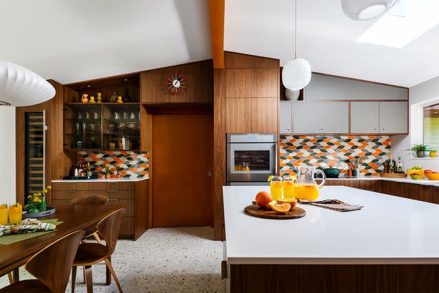

Oftentimes, designing a well-rounded space comes down to reinforcing your chosen vibe in moments big and small. Take this kitchen by Chesmore Buck Architecture as an example. While much of the architecture already leans mid-century modern, tinier details—like the retro vases, era-specific light fixtures, and classic ball clock—reinforce the vibe and tie a bow on the whole design.
Play With Your Palette
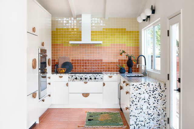

One of the best ways to nod to a certain design era is by using specific palettes or color combinations often seen throughout the decades. For mid-century modern design, that means punchy hues of rust, mustard, pink, green, and blue. In this charming kitchen by Aker Interiors, a trio of warm shades plays together on the tile backsplash, tying into the colorful flecks in the terrazzo countertops.
Add Some Height
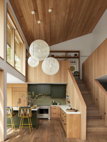

Mid-century modern architecture is characterized by clean, open interiors, graphic angles, and plenty of natural light—all of which this kitchen embraces wholeheartedly. Designed by Raili Clasen and seen in her new book, Surf Style at Home, out this April, this mid-century modern-tinged space embraces soaring ceilings, relying on a backdrop of natural wood to channel a serene yet inviting atmosphere.
Mix Up Your Hardware
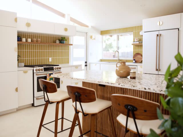

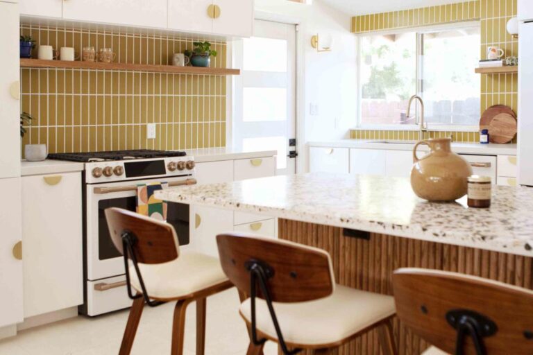
Hardware can be a purely utilitarian addition to your kitchen cabinets—or it can make a statement. When designing a mid-century modern kitchen, something as simple as the right knobs can help reinforce your vibe. In this kitchen from Christa Borden of High & Tight Design, half-moon brass pulls add a mod nod throughout the retro space.
Choose No-Frills Cabinetry
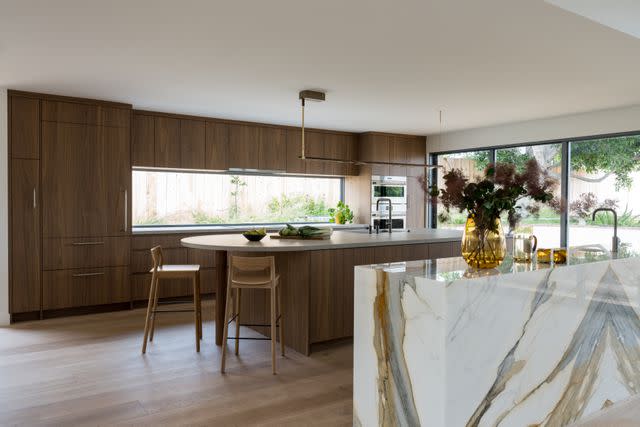

Clean lines and simplistic silhouettes are a hallmark of mid-century modern design, and in kitchens, that often means cabinetry profiles that embrace a back-to-basics ethos. In this sleek space, designer Abbie Naber paired slab-front wood cabinetry with a streamlined layout and standout stone for a kitchen that stands the test of time.
Embrace Quirky Angles
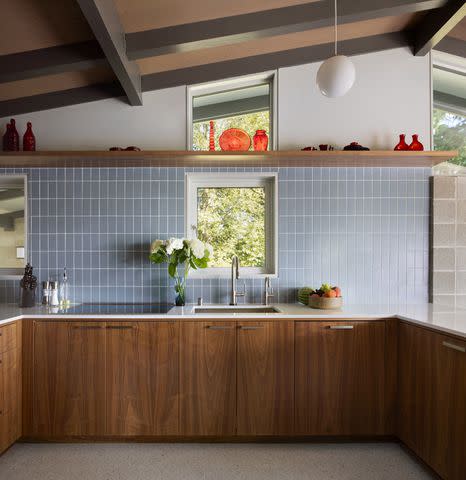

If you’re lucky enough to score a home with true mid-century modern architecture in its DNA, chances are you’re living amongst a lot of quirky angles and graphic lines. Our advice? Lean into the impactful nature of these elements to help give your kitchen design credibility. In this mid-century kitchen, the team at Chesmore Buck Architecture embraced angular windows and a sloped ceiling, pairing them with the clean lines of slab-front base cabinetry and a floating shelf.
Mix In Other Vibes
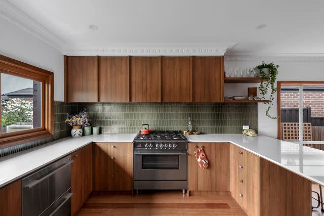

Garnering inspiration from a prominent design era is always a great way to kick off a renovation, but the last thing you want is for your kitchen to feel too theme-y. To avoid a design that feels one-note, incorporate elements from other eras or styles for a mix-and-match vibe that’s all your own. In this versatile kitchen from M.J. Harris Group, slab-front cabinetry and a linear green backsplash marry with a more traditional crown molding for a design that won’t be pigeonholed.
Add Tons of Texture
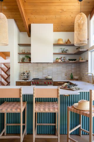

When it comes to encouraging your eye to dance around a space, the more texture you can incorporate into your design, the better. For a distinctly mid-century modern feel, look to this kitchen by Abbie Naber as an example, which relies on elements like a richly stained wood plank ceiling and a fluted island (in a retro teal hue) to nail the era.
Try a Stone Alternative
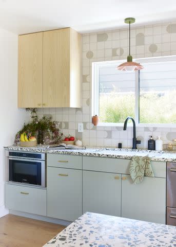

Natural stone is a worthy choice for a kitchen inspired by any era, but a mid-century modern outlook grants you a few other eye-catching options as well. One of our favorites? Terrazzo, an engineered material made from colorful chips of marble, granite, quartz, or glass, all bound in a base material of cement or epoxy resin. In this kitchen by Natalie Myers of Veneer Designs, a white countertop flecked with shades of black and green adds a funky touch to the space.
Install Retro Appliances
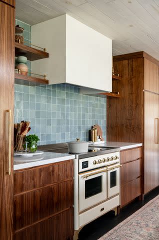

Your appliances take up a lot of real estate in your kitchen, so it’s always a good opportunity for personalization if you can work them into your overall design scheme. For a mid-century modern spin, look for gadgets that boast era-specific designs, like a retro color or bold knobs. Here, designer Nikole Starr relied on a white and gold ILVE oven to anchor the room and nod to a bygone decade.
Incorporate Playful Touches
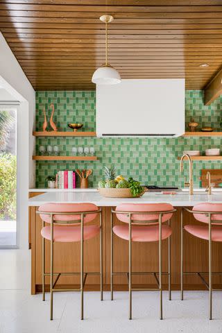

It’s easy to get lost in the beautiful clean lines and functionality of mid-century modern design, but it’s important to remember that it was a really fun era for decor, too! Embrace the playful energy that typified those decades in design by incorporating joyful color pairings or fun accessories into your kitchen. This project by designer Jen Samson includes both, relying on a cheeky pink and green color scheme and quirky details—like a pair of ceramic birds perched on the open shelves—to lend personality.
Consider Alternative Storage
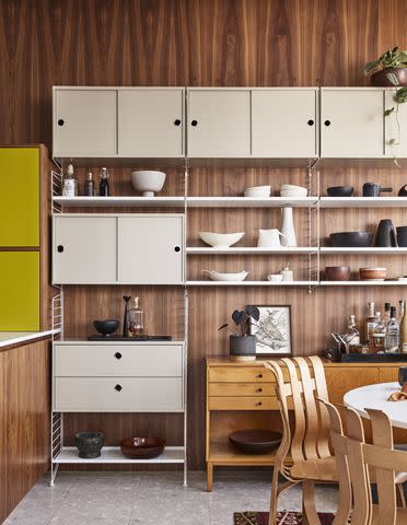

Form and function exist side-by-side in a mid-century modern kitchen, allowing the space to look as good as it lives. To make the most of your square footage, consider incorporating an era-specific storage solution into your kitchen. In this home originally designed in the 1960s by famed builder Joseph Eichler, designer Christine Lin conceived a retro storage wall that combines mid-century lines with plenty of room for displaying dishware.
Bring the Drama
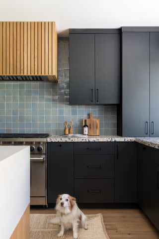

While mid-century modern design is known for earthier hues, that doesn’t mean you can’t stray from tradition when devising your iteration of the era. In this moody space by Katie Betyar of Solstice Interiors, inky black cabinets add weight to lighter MCM elements, such as a reeded wood oven hood and terrazzo countertops.
Embrace an Open Layout
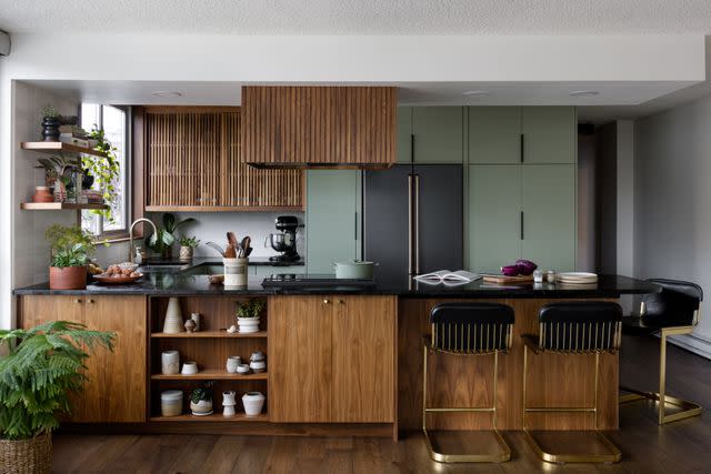

Open floorplans gained traction during the ‘50s, ‘60s, and early ‘70s when homeowners were focused on entertaining and maximizing light and flow throughout their homes. If you’re undertaking a down-to-the-studs renovation and want to lean into a mid-century modern ethos for your kitchen, consider how it flows into the rest of the space and open up the room wherever possible. In this project, The Residency Bureau team created an intimate feel with a peninsula island while maintaining a clean sightline into the kitchen by skipping upper cabinetry on most walls.
For more Real Simple news, make sure to sign up for our newsletter!
Read the original article on Real Simple.


