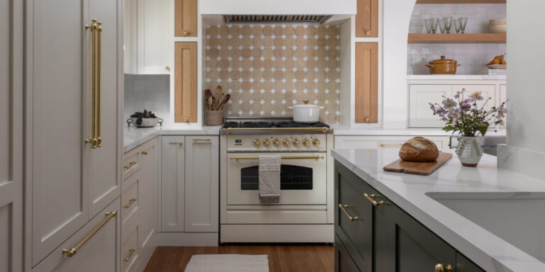
When it came to the kitchen in their three-bedroom, two-bathroom home built in San Francisco in the 1930s, they wanted to keep the current size and layout but adapt the space to fit the needs of their family (they have two daughters), so they brought in Allie Allen and Sasha White of Shiny Shed Collective to oversee the renovation of the 144-square-foot, L-shaped room.
Lauren Anderson/SEN Creative
Their clients, Allie and Sasha, were looking for a way to maximize storage and update outdated aspects of their kitchen, including linoleum floors and counters, and dated appliances. The kitchen is small, and they love to cook, so functionality was important to them.
“Our clients didn't want to take away their favorite atrium in this renovation,” says Allie. “It's common in kitchen renovations to utilize every inch of space possible and add elements like a large standing island, but our clients wanted to maximize the available space without taking away the home's attractive central patio.”
Lauren Anderson/SEN Creative
The design duo decided to extend the kitchen into the breakfast nook to create a more open feel. “This accomplishes two things: first, it makes the kitchen feel larger and less cramped,” Sasha explains. “Second, it allows us to incorporate useful and creative design elements. Plus, we wanted the space to feel cozy and luxurious, but still at home. In the kitchen, we added a built-in banquette to mimic the existing arches in other parts of the house and to highlight some of the original architecture, like the bay window.”
Lauren Anderson/SEN Creative
To increase functionality, they got creative and installed an appliance garage that fits the client's everyday appliances, a hidden spice rack, and a step stool that's tucked into a thin cabinet to the right of the sink. The stove is both a statement piece and a hardworking appliance. “We chose a stove that was really eye-catching because we knew the stove wall would be a big design element,” Allie says. “The Italian ILVE stove has gas burners, which was important to the client, but the oven is electric. It's really a statement piece in the room's design.”
Lauren Anderson/SEN Creative
In terms of the design and color palette, the clients initially wanted a primarily white kitchen, but as the work progressed, they came to favor the addition of wood tones, terracotta, and some color. The addition of warm tones and colors helped pay homage to the Spanish style, another goal of the home.
“We wanted to use a lot of natural materials in this space,” Sasha explains, “We worked with Amber Flooring to bring in new wood flooring in the kitchen that matches the wood flooring in the rest of the house. For the backsplash, we used a combination of Zellige and terra cotta tiles from Tile Fever, as well as a beautiful ceramic pendant that has a great texture.”
Lauren Anderson/SEN Creative
Allie and Sasha say the best update to their kitchen is what they call their “eat-in kitchen.” After opening up the kitchen to the original breakfast room, they were able to create a built-in breakfast nook with comfortable bench seating.
Lauren Anderson/SEN Creative
“Clients regularly message me to tell me how delighted they are with their kitchens, that they've all but abandoned the dining room and now eat on the kitchen banquette as a family,” says Ally. “It makes them so happy to imagine Mom and Dad cooking dinner while their daughter does her homework at the custom table we designed. One of our goals as a design studio is to bring joy into our clients' everyday lives, and it's rewarding to know that we've achieved that.”


