We may earn revenue from products available on this page and/or participate in affiliate programs.
International Klein Blue, a favorite ultramarine hue of midcentury artist Yves Klein, is a notoriously mercurial pigment to work with—specifically, it needs a binder to become a paint, and if you use the wrong kind of binder, the color will fade quickly—but when used well, it's naturally enveloping, striking, and calming.
The development was launched around the same time as IM Pei & Associates' Society Hill Towers were being built in Philadelphia's namesake neighborhood. Built in the early 1960s, the three concrete buildings were the centerpiece of the urban renewal that was happening in Washington Square East at the time. Though the towers often get all the attention, it's the 37 brick-clad townhouses that still connect the properties to the rest of the historic neighborhood today. Each unit is three stories high, with a central staircase and accented with arched doorways and clerestory windows. Plus, they have private courtyards and small steel balconies.


When a couple whose children were now independent approached Brooklyn-based design firm TBo about helping them renovate their home, founders Brethren Walliser and Tom Dalmas jumped at the chance.
The owners, who moved from nearby Wilmington, Delaware, wanted a home that was bright, cozy, and intimate for just the two of them, but flexible enough to accommodate their grown children and grandchildren. Though the townhouse was structurally sound, the internal systems needed updating, and the finishes and layout needed to be completely rethought. The original Formica, small ceramic tile, and vinyl were everywhere and had deteriorated and worn. The kitchen was small, and the bathroom smaller than is popular today. But Pei chose, and Walliser wanted to preserve, the idea of increasing privacy as you go up the second floor. “His initial idea was to have social spaces on the lower first and second floors, and then get more intimate as you go up,” Walliser explains.

TBo worked with local firm Hivemind Construction to reimagin the space in 2023, respecting Pei's original vision while adding contemporary, rustic touches that reflect the homeowners' interest in Scandinavian living and the arts.
First, they removed a wall to create a smoother walkway around the staircase and installed flush-door cabinets, where the owners store groceries, cookbooks, wine glasses, and more. After refinishing the original oak flooring (which Walliser says was a “crazy orange color”), the team took inspiration from Pei's material choices to come up with custom white oak millwork by Louvier Design. Given the midcentury home's small scale, this allowed the designers to maximize storage in the galley kitchen, making it organized and easy to navigate, without being too hidden.

Across the street, Walliser reveals that they tried many times to cast the concrete countertops and sink in that elusive Yves Klein blue. “It can't stand the heat,” she says, acknowledging that it has limited alkali resistance. “So when you cast the concrete, the chemical reaction creates a lot of heat. Once that blue wears off, the pigment dies and goes gray.” After several tries, they landed on cobalt blue, a much stronger and more stable pigment. They then painted the curved base with Benjamin Moore's Watertown, creating a cohesive, surprising piece. (Bonus: The end caps are cabinets that actually open.) The couple spends most of their time sitting near a patio door that overlooks the garden.

“One of the challenges we faced was what to do about the staircase banister,” the homeowner says. “It needed to be replaced to comply with regulations. [had] Tom experimented with different designs but came up with this beautifully simple metal railing that was the perfect fit. “Like Pei, the railing is subtle without sacrificing functionality, making it easy to grab onto when descending the stairs.


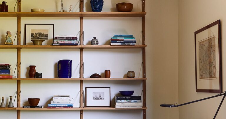
Up the stairs, the master bedroom features custom oak wardrobes and vintage lighting fixtures, including a Murano pendant lamp and a Swedish table lamp. This space is integrated with a small study, where an oak dk3 Royal System hangs opposite the original brick fireplace. Dutch maps, art books and other vintage ephemera mingle with Flos Kelvin lamps and Mies van der Rohe MR Rattan side chairs. Both lead to the master bathroom, which is in the dark heart of the home.
Inspired by Pei's use of transom-style windows, Walliser adapted the technique to let in more light. “It was a way to borrow the language he established for the house and express it in a new way for the owner,” she says. For the bathroom floor, the designers took their cues from Bauhaus artist Anni Albers. The cement tile arrangement was inspired by her work. “We studied her sketches, textiles, traditional and contemporary quilting, and created a series of 'woven' tile schemes,” Walliser explains. The idea is echoed in the other two bathrooms, where patchwork tiles combine pinks and greens with a variety of blues.
From Scandinavian furniture and oak to Albers textiles, TBo's thoughtful renovation stayed true to the building's modernist roots without being bogged down in the past. “It's very airy and has a great scale,” says Walliser of the new interiors. And that stunning blue is sure to make the homeowners feel happy every time they see it.


