Color is one of the most important elements in a renovation project, having the power to control and direct our emotional and behavioral responses to a room. seriously, Isn't it amazing? Repainting is the easiest and most affordable way to transform and revitalize a space. I call it repainting with purpose, and I'm excited to share my tips with you all.
Painting with Intention
Whether it's a bedroom, office, or entryway, determining the right emotion you want to convey is just as important as choosing the color. Each color of the rainbow evokes a different emotional response, so this should be taken into consideration when choosing the right color for your space. Other factors to consider when choosing a paint color for your unique space include lighting, layout, and spatial perception.
Choose your kitchen colours with intention
Here we will discuss the importance of choosing the right colors for the heart of the home, the kitchen. The design objective for this space is to promote productivity and organization while making the kitchen a cozy and inviting space.
In kitchens with plenty of natural light, try trendy or darker colors to add depth and character. In small kitchens or kitchens with limited natural light, opt for lighter, softer shades to create a more spacious, open feel. The key is to choose a paint color that matches your desired feel and functionality.
Once you've decided on the colour you want to use, try out a sample in your kitchen and observe it in different lighting conditions to ensure it achieves the mood you want before applying it to the entire space. Morning, afternoon and evening are the best times to view your paint samples.
The colors listed below will inspire organization, cleanliness, and productivity — all elements you want in a kitchen. For these purposes, avoid browns, reds, and blacks, which can disrupt the harmony and flow of your kitchen.
Classic and Timeless Kitchen Paint Colors
White: Benjamin Moore Swiss Coffee
Gabriel Santiago
White cabinets get a bad rap because they tend to look basic and mass-produced. But white is a really great color for cleanliness, clarity, and focus. It's also a timeless color that never goes out of style. To choose the perfect white, it's important to pay attention to the tone. Gray-based tones can make a room lack character, increase anxiety, make it seem drab, and prevent us and our guests from feeling at ease. I recommend choosing white paint with a creamy-beige tone that can promote warmth and promote cleanliness, clarity, and focus.
My favorite white color for the kitchen is Benjamin Moore's Swiss Coffee.. Clean hues complement the lines of your kitchen and encourage organization and focus, while warmer hues bring out character and create a more comfortable, uncluttered, and inviting space. I typically pair cabinets of this color with classic polished nickel hardware, a timeless bridge faucet, and marble countertops.
Greige: Benjamin Moore's Accessible Beige
Whipple Home
If you want to add some vibrancy to your plain white kitchen, greige is the color for you. This combination of gray and beige evokes a clean yet comfortable environment. One of my all-time favorite greige colors is Benjamin Moore's Accessible Beige. It's a cool yet warm color with gray undertones. A hard combination to find in paint. This color embodies a warm, calm, and cozy atmosphere during the dreary rainy or snowy seasons, and a cool, enveloping atmosphere during the hot days of spring and summer. It's well-balanced, natural, and clean.
On cabinets, this color pairs well with black hardware, brass hardware, or polished nickel. It's a top color in my design firm because it can be traditional yet transitional. I love pairing it with natural elements like wicker baskets, jute rugs, open shelving, and oil paintings for added color and texture.
Sage Green: Sage Green Backdrop
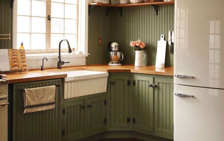
A green kitchen feels like a big hug. This color has a lot of amazing benefits. Green reduces anxiety, increases productivity, and promotes growth. It also improves digestion, making it the perfect color for your kitchen.
When working with greenery, it's important to keep natural light in mind. If you don't have enough natural light, it's best to avoid shades that are too dark, as they can appear dull. Sage green is a better option because it complements other elements without being too overbearing. It's the perfect timeless color with a lot of personality, and pairs well with butcher block countertops and brass hardware and fixtures.
Bold and Trendy Kitchen Paint Colors
Dark green: Lawn party with backdrop
Courtney Halverson
If you have a small but sunny space, a grassy party green is an exciting way to bring in some sunshine—it's bold, but also evokes a sense of health.
Yellow: Farrow & Ball Hay No. 37
Courtesy of Farrow & Ball
Yellow is known to uplift moods and create a cheerful space. It also promotes sociability and gives everyone a dopamine boost, making it a great color for the kitchen. Perfect for the sociable person, there's no way you wouldn't want to host a game night or a festive brunch in this color. For a minimal punch, we recommend pairing your yellow kitchen with white or butcher block countertops and polished nickel hardware.


