Rasmus and Jette Ibfeldt's vacation home in the Danish seaside town of Vajby is very different from the couple's full-time home in Copenhagen, where the walls are covered in bold paint and art, and the high ceilings and herringbone floors give it a Parisian feel. Built circa 1968, this vacation home is the exact opposite, and by design: the cottage's walls and beams are crisp white, there are enough bedrooms for the couple and their two sons, and the kitchen, living and dining areas are all in the same open room.


“It's not about showing off to your friends, it's more about having a place to relax,” explains Rasmus, co-founder and creative director of brand agency e-Types. And for him, it's easier to relax without eyesores of easily stained marble slabs and dusty shelves. In the process of adding about 100 square feet to the home to make way for a new bathroom and third bedroom, the Ibfeldts gutted the main room and began creating a streamlined kitchen and living area. The focus was back where it should be: outdoors.
Layout

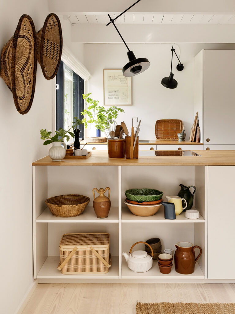
When it comes to kitchens, it doesn't get much simpler than a galley. But to really streamline the look, the couple divided the space according to purpose. On one side is a large island where they can prep food, have breakfast, display things, and cook, while the opposite wall is more of a work area (home to the sink, dishwasher, and refrigerator). “The island is where you sit. The idea was really, 'Let's put some functional stuff here and play over there,'” says Rasmus.
cabinet

For the architecture, they called on two friends who helped them renovate their Copenhagen home years ago, but the cabinets themselves were purchased from Renovation's Basis kitchen cabinet line. The off-white slab cabinet fronts and butcher block counters felt more understated than any other combination. To avoid overcomplicating things, they hung the home's original blueprints above the kitchen sink. “We love the tradition and heritage of this house,” Rasmus says. “Obviously we adapt it to the times, but we don't destroy the original idea.”
illumination
Rasmus is well aware that the combination of flat white cabinets and off-white wood floors can come across as something from an IKEA catalog, so to add a bit more curiosity to the space, the couple opted for some distinctive lighting: Grupa's practical yet playful Arigato lights. The fixture's shade rotates 360 degrees and swivels 125 degrees, so it can be adjusted to hit the exact spot on the countertop you're working with.
Meeting

A key goal of the renovation was for the Ebfeldts to make the room more integrated with the deck. Enter the sliding door. The gray-blue table in front of the large new opening is a second-hand piece that was professionally painted years ago, and the new chairs are from Please Wait to Be Seated. “Being able to come and go without having to open and close the door was very important to us,” says Rasmus.


The backyard is still a work in progress — an outdoor shower was added in the past two months, and a pergola is waiting to be fully covered with vines to provide a shaded dining spot — but by not adding too many doors or windows, the house has managed to keep the look pretty much the same from the outside. Them Their neighbors had ruined their charming little home. Instead, they wanted to be the kind of place where they could invite people over on a whim for a drink and fresh strawberries while watching the sunset. “The key is not to have something too big or over the top,” Rasmus says. “It should have a laid-back feel.”


