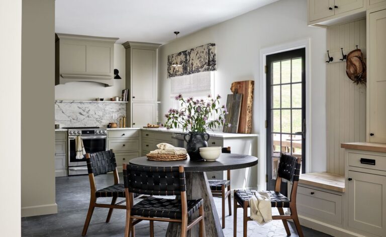
Breathing new life into a kitchen doesn't always mean a dramatic remodel, as this 750-square-foot kitchen renovation in Washington, DC, proves. The kitchen was a small but well-balanced space that needed an injection of style. Outdated wood cabinets made the room feel smaller than it actually was.
Liz Levin of Liz Levin Interiors and Tanya Smith Shifflett of Unique Kitchen and Bath were keen to remove the room's heavy, dark elements and replace them with a transitional space that combined classic looks and premium materials rather than ultra-modern design. “The kitchen needed quite a bit of work, but didn't require any major changes to the structure of the room,” Liz says. “This was a rip-and-replace kitchen filled with classic neutral colours.”
A new colour palette, hand-picked cabinetry, custom furniture and classic accessories fill the space. Here, designer Liz walks us through this kitchen renovation and explains how she made the most of the small space.
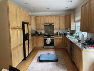
in front
(Image courtesy of Stacey Zarin Goldberg. Design: Liz Levin Interiors, Unique Kitchens & Baths)
The clients wanted a modern kitchen that was easy to use and work in. The existing wood space, with its small windows and textured walls, offered a functional design but felt top-heavy and unstylish. “The original kitchen had too much wood on wood, with oak cabinets on a similarly colored oak floor,” says Liz Levin of Liz Levin Interiors.
Large cabinet moldings, outdated hardware and window treatments also contributed to the space's dated feel, while the kitchen suffered from the most basic lighting scheme, with overhead downlights.
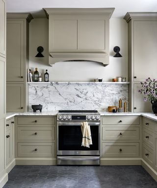
rear
(Image courtesy of Stacey Zarin Goldberg. Design: Liz Levin Interiors, Unique Kitchens & Baths)
The first order of business was to change the kitchen's color palette to make the space feel more airy. “One of our main initiatives was to change the color of both the cabinets and the flooring, which instantly updated the space and added some much-needed contrast,” Liz says. “The kitchen is a warm taupe color, which we think is classic. The white marble countertops bounce light around the room, and the sconces next to the stove help to counteract the old, dark feel.”
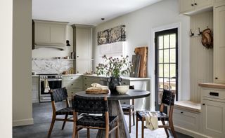
The kitchen floor is dark, but stands out against the warm taupe of the kitchen shelves and cupboards. “We chose charcoal concrete tile, which is dirt-resistant,” Liz explains. “The side door of the kitchen opens onto a field, and the homeowner has a large yard where she walks her dog through the woods. She goes in and out of there a lot, and the mud and wet boots would ruin the original wooden floors. The concrete tile looks modern, but with a farmhouse feel. This is a second home for our clients who live in city DC, and we wanted to maintain a city feel while they're in a country home.”
The beautiful taupe-hued kitchen now has an inherently cozy look. “I redesigned the first phase of the cottage in a modern farmhouse style with a neutral palette of off-whites, charcoals, and browns,” Liz says. “I wanted the kitchen's colors to flow well with the rest of the historic cottage.”

Lancaster 1 1/8 inch diameter knob
size: 1.125 inch diameter
price: $4.55
The kitchen materials have a natural appeal that adds depth and layering to the room, and the veined marble kitchen backsplash and countertops are highlights that enhance the overall look.
When it came to kitchen storage, the designers paid close attention to expanding the space with organizers and drawers. “The homeowner loves to can her garden here and loves to cook,” Liz says. “She also needed ample pantry space. I surrounded her refrigerator with roll-out pantry pull-out cabinets and hid the microwave and canning equipment in custom drawers. She loved a narrow cookbook shelf she had in Washington, DC, so I replicated it to the right of the refrigerator. She loves to can her garden here and needed storage for those supplies here too. The mudroom drawers hide recycling bins and field supplies.”
“The cordless woven grass shade is textured and easy to raise and lower, providing shade and privacy, while the Schumacher toile valance adds a farmhouse feel and matches the dark charcoal and taupe colour palette,” says Liz.
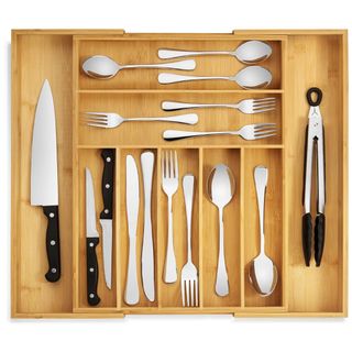
Large Luxury Bamboo Silverware Organizer
size: 17″ wide x 19.75″ long
price: $29.95
(Image courtesy of Stacey Zarin Goldberg. Design: Liz Levin Interiors, Unique Kitchens & Baths)
The space extends into a small dining room, which is outfitted with an eye-catching table and chairs. “The dining table is from Arteriors and the chairs are from Williams-Sonoma Home,” Liz says. “We loved the strong, sculptural feel of the table, and its round shape contrasts beautifully with the right angles of the kitchen. The chairs have a retro-modern feel, which fits with our urban farmhouse aesthetic.”
Finally, for the kitchen's lighting, the designers decided to remove the ceiling spotlights and instead illuminate the kitchen sink with wall sconces and a delicate pendant light. “The lighting is a contrast of modern and country farmhouse,” Liz says. “I love the combination of the Devole white ruffle pendant light above the farmhouse sink with the modern Visual Comfort & Co. bronze sconces. The hardware is more traditional.”
The renovation gives the kitchen a feeling of spaciousness and a quiet elegance – an effortless yet far more considered space than before.

Nathan James Cohen Woven Chair
material: Upholstered seat and solid wood frame
price: $195

Crate & Barrel Andre Brass Wall Light
size: 5 inch diameter
price: $199


