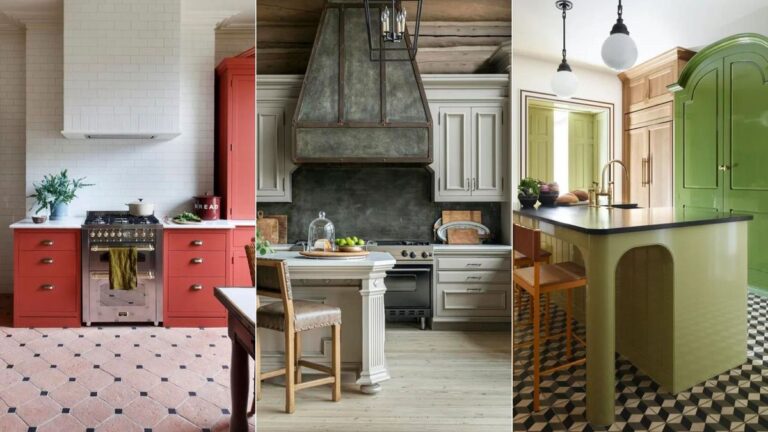
Cabinets are the backbone of any new kitchen, so it’s worth paying attention to the latest kitchen cabinet trends when planning your next remodel. Whether you prefer ultra-modern kitchen cabinet ideas, classical style or a transitional twist that will work either way, we’ve got the inspiration you need to make the right cabinet choices for you and your home.
Not every cabinet trend will suit all style of properties, but it’s worth remembering that, as permanent fittings, cabinets tend to be designed with mass appeal in mind. This is because, unlike a tea towel or toaster, you can’t afford to fall out of love with the cabinetry in your kitchen any time soon. Ideally, the cabinets you choose will make you happy for at least a decade, ideally longer.
Fortunately, kitchen trend forecasts tend to be more timeless and liveable than those on the fashion catwalks. So, whether you’re reading this in January or December, you can rest assured every one of the following 10 cabinet trends are still fresh and relevant.
The biggest kitchen cabinet trends for 2024
Our line-up is also a good place to start if you’re seeking something with a little design difference, or just want to keep abreast of the options so you know what your kitchen designer is talking about when discussing how to plan a kitchen remodel.
1. Embrace the love of red for 2024

(Image credit: HAM Interiors)
If there’s one cabinet color that’s on everyone’s lips this year, it has to be red, in all its many forms. From bold signal red to juicy tomato red, things are warming up on the color front in kitchens.
Uplifting by day, and cozy by night, particularly when paired with natural materials as HÁM interiors have with this earthy terracotta flooring, red is the perfect warm, yet vibrant choice for the heart of the home.
For the bespoke cabinets in this red kitchen, HÁM interiors’ designer Kate Cox chose Farrow & Ball’s Singed Red. ‘I love how the red adds a contemporary twist and maintains a fun and youthful atmosphere,’ she explains.

Kate Cox is a Partner and Creative Director at HÁM Interiors and Studio HÁM, her family-led design firm. Kate has grown up surrounded by an exciting and ever-evolving array of antiques, fabrics, and upholstery, deeply influencing her career path and love for all aspects of interior design.
2. Table islands

(Image credit: Dana Wolter/John Bessler)
We’ve all seen, and loved, kitchen island designs based on the rustic, utilitarian dynamic of the cook’s table, but how about islands inspired by more formal dining table shapes? High-end interior designer Dana Wolter has got the memo with this graceful island featuring elegantly tapered legs and delicate design details.
‘I liked the idea of curves in this space to soften the room without being too fussy,’ recalls Dana. ‘The tapered corners mimic the legs of a handcrafted dining table, and the countertop edge profile and shape are also more refined.’ Perfect for hosting formal dinner parties in the kitchen, this new direction is a little more grown-up and dignified.

Known for her chic Southern style and discerning eye for restful, collected and tasteful interiors, Dana is an award-winning designer located in the Mountain Brook suburb of Birmingham, Alabama.
3. Add interest with curved details
(Image credit: K&H Design/Kate Feather Kitchen Design/Birgit Mons)
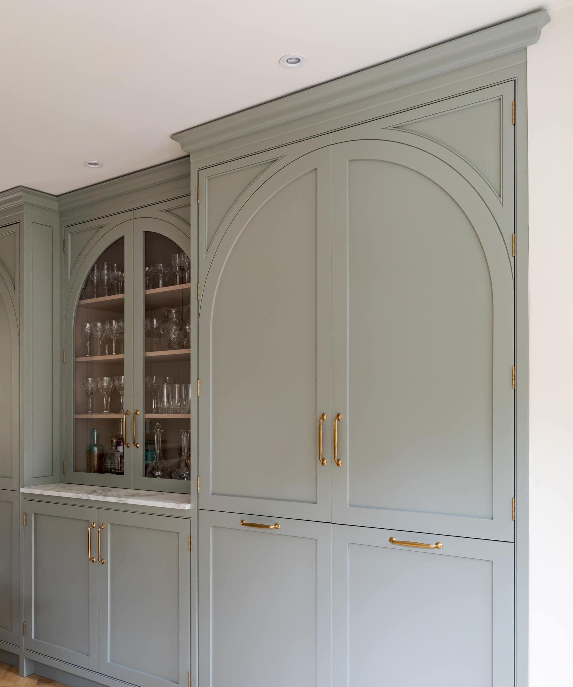
If you still remember the classic Cathedral Arch door, usually in orange pine, it was probably in your gran’s house. While the fussy look isn’t coming back anytime soon, there are strong hints of a return to arch details on cabinet doors. This time they’re big, bold and, thankfully, not orange pine.
‘A wide arch is a fine way to elevate the aesthetics of beautiful cabinetry,’ enthuses Katie Glaister, founder of K&H Design, who designed this space in collaboration with Kate Feather Kitchen Design.
‘Scale and proportion are key, and it pays to commission a bespoke maker, like Kate Feather, to achieve the high levels of craftsmanship required for perfectly pitched curves,’ she adds. The arched detail in this kitchen is inlaid on regular rectangular doors to access the full storage within, which is essential when integrating appliances.
4. Get in the frame

(Image credit: Kara Childress/Julie Soefer)
Another come-back kid on the door design front is the revival of very deep frame details that sit loud and proud. With an air of the traditional Georgian door style we all know and love, this time the raised framework is far more pronounced.
‘This style of ornate detailing on cabinets is becoming really popular and I particularly love to use it in bigger kitchens with high ceilings, where the decorating creates harmony by carrying the weight of an expansive kitchen,’ says interior designer, Kara Childress. A word of warning; this interior design trend is not for the duster averse!

Texas-based interior designer Kara Childress marries timeless style with Old World European charm for liveable homes that exude comfort and personality.
5. The case for display
(Image credit: Roundhouse)
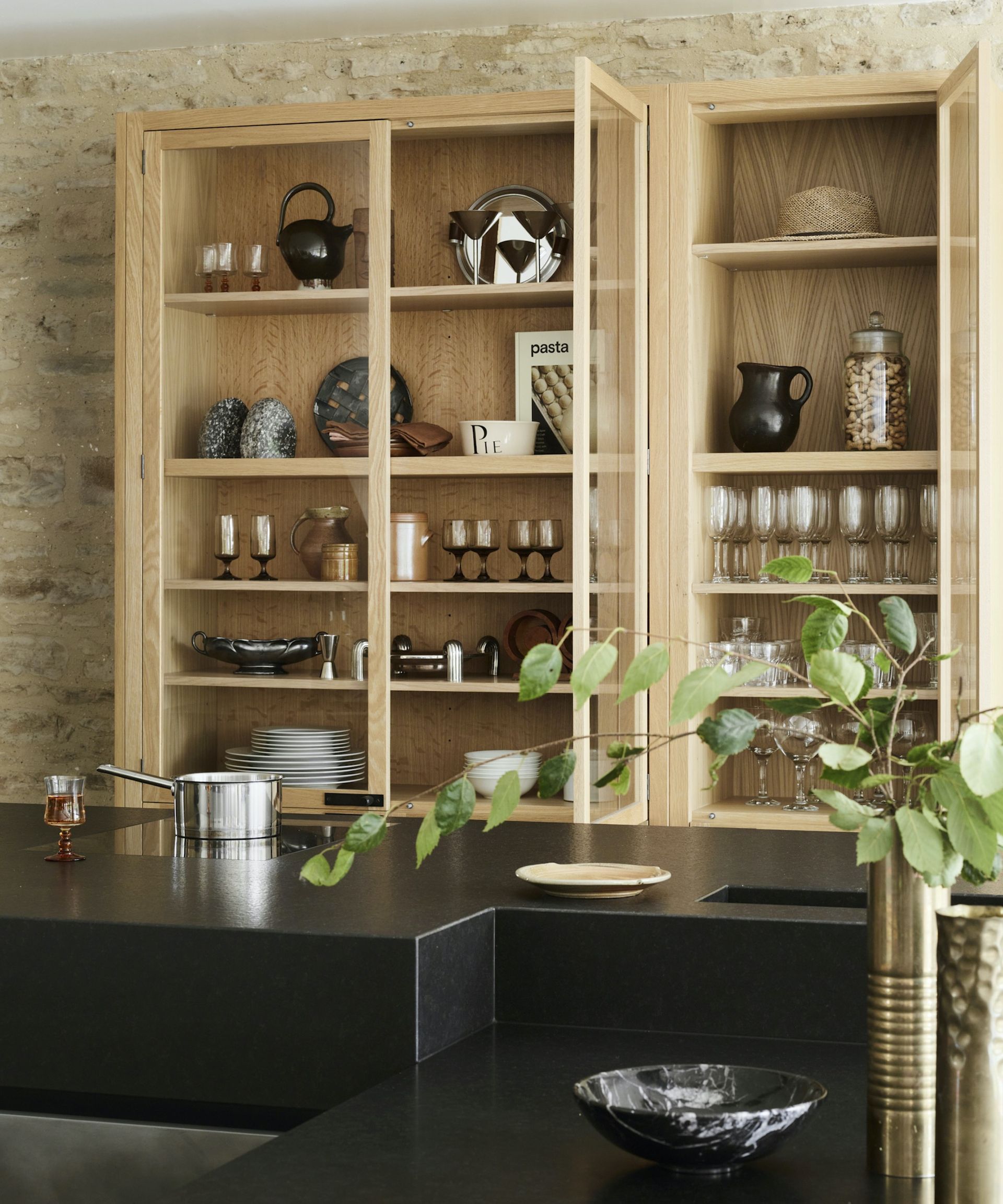
If you’ve ever experienced the downsides of open shelving but still love the relaxed vibe it offers, then the new trend for fitting display cabinet style units in the heart of the kitchen could be for you.
Encased behind glass, but clearly visible, there’s a strong apothecary cupboard air to this trend, particularly when featuring vintage cabinets or simply designed units in natural pale oak. Here, Roundhouse’s Nightingale display cabinet forms a pivotal focal point in the center of this renovated barn.
‘Classic yet cool, glass-fronted kitchen cupboard storage can be used to display your most attractive everyday cookware and glassware, as well as more decorative vases and vessels. Rather than being a purely decorative dresser positioned to one side or within the dining area, there’s a clear trend towards positioning useful display units center-stage,’ says senior designer at Roundhouse, Paul Welburn. ‘As everything is protected by glass there’s far less dusting to deal with and it’s also easier to see what you need than regular enclosed wall cabinets.’
6. Art Deco influences

(Image credit: R. Higgins/ Emily Followill)
You don’t need to be devoted to Art Deco decor to embrace this cabinet style direction, it should appeal to anyone who likes elegant cabinetry or are seeking a fresh alternative to Shaker kitchens.
The brainchild of Nashville-based designer Roger Higgins, these outsized beveled frame doors are timeless yet unexpected. ‘The design was inspired by traditional Shaker-style cabinets, but we added a generous beveled frame that adds a more contemporary spin and a sense of depth,’ he explains.
‘It feels less predictable – and a bit dressier – than a traditional Shaker frame; and because we used a full overlay, the effect is that of a contemporary, paneled wall.’ Are you in?

Roger Higgins is a principal designer at R. Higgins Interiors, which he founded with his partner, Ann Shipp. Based in Nashville, Tennessee, R. Higgins designs projects globally, and focuses on marrying a deep appreciation for the classic elements of architecture with an uncanny knack for executing surprising design choices that still feel effortless and inevitable, once assembled in context.
7. Color splash
(Image credit: Nina Farmer/ Jared Kuzia)
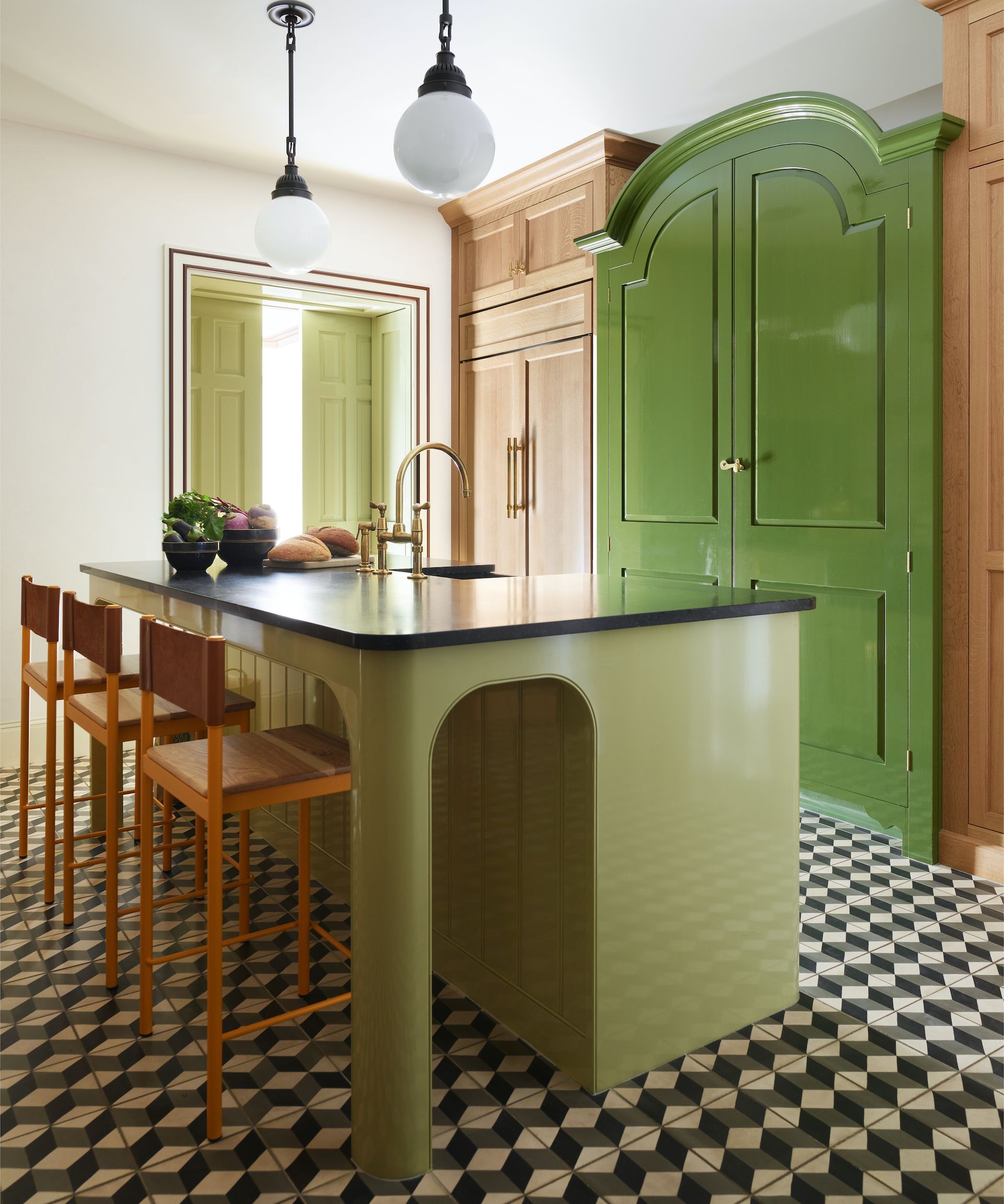
A vertical color switch is the hot new way to achieve a more relaxed, freestanding vibe on kitchen cabinets. Boston-based interior designer Nina Farmer is a firm advocate. ‘I love to play around with different materials in a kitchen to help break up the monotony of the cabinets,’ she enthuses.
‘Here, we used a larder from Plain English, painted in Bancha by Farrow & Ball, to give the appearance of a standalone piece of furniture. We flanked it with white oak cabinetry and paired it with an island featuring curved corners to give the illusion of more space. An important trick when designing a townhouse in the city.’

Nina Farmer’s design philosophy is rooted in a classical sensibility. Her sophisticated eye and use of color leads to interiors that are elegant, comfortable and timeless. The Boston-based designer is a graduate of Tulane University and the New York School of Interior Design.
8. Try a tri-color split

(Image credit: Gunter & Co/Selina Merie)
When exploring fresh painted kitchen cabinet ideas, why go for one paint color, when you can have three? A tri-color split takes confidence, but the results lend three-dimensional flair that can prove far more compelling than flat color.
Convert Irene Gunter employed a subtle trio of colors on the cabinets of her own family home in London. ‘Start by choosing the main cabinet color, as it will often lead the rest of the material choices,’ she recommends.
Next, go for a lighter tone on the center panel, and even lighter on the panel trim, thus creating a three-dimensional look that mimics how shadows fall. ‘Here, the mix of Paint & Paper Library’s Between Dog & Wolf, Porcelain I, and Porcelain III looks considered and sophisticated,’ she adds.
We’ve also seen tri-color doors where the smallest color ratio, on the panel trim, is in a dark contrasting color like black or burgundy, which provides a stronger punch.

Irene studied Art History before training at the prestigious Inchbald School of Interior Design. As Creative Director of Gunter & Co, Irene oversees the design for every project alongside her team of designers who manage the day-to-day implementation.
9. Crafted details
(Image credit: Samantha Todhunter Design/Lucy Butler Walters)
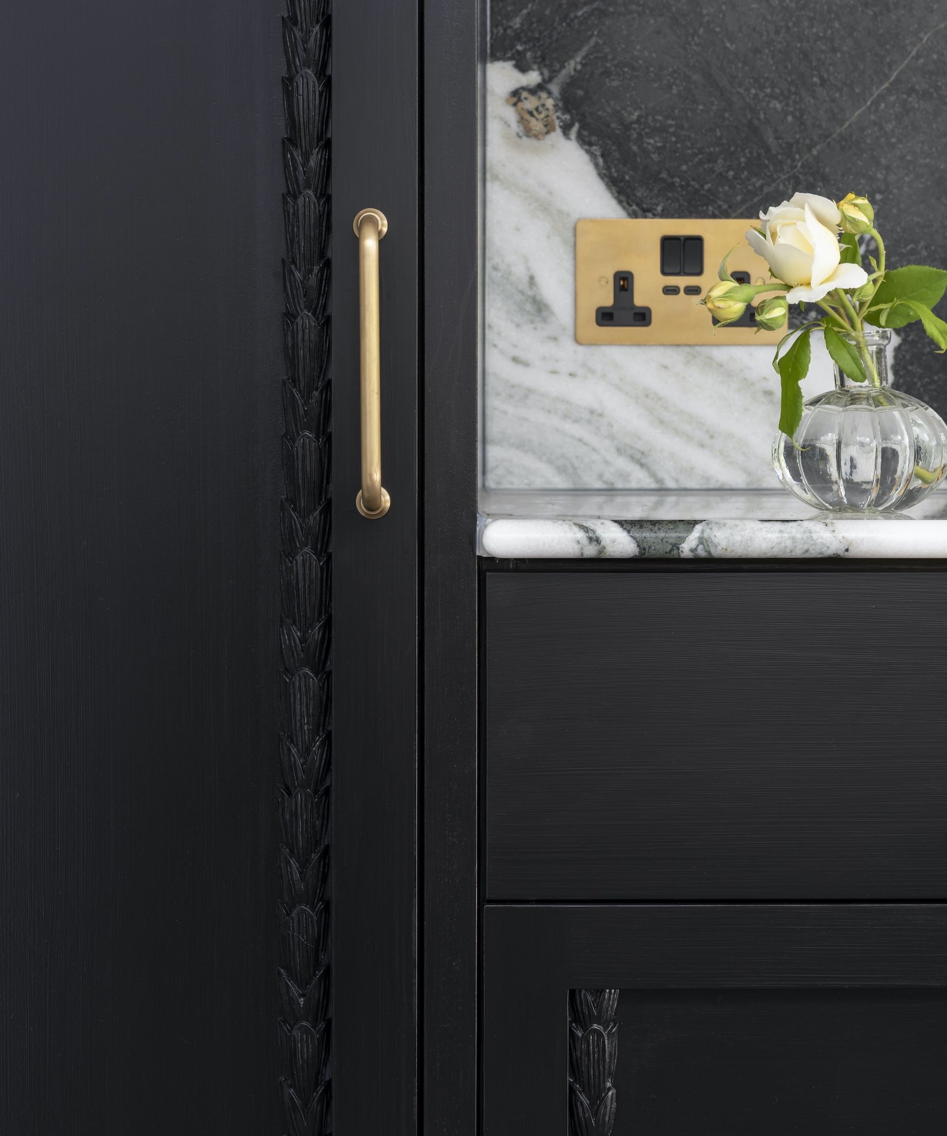
Arts and crafts decor is a celebration of artisanal details and crafted moments that’s coming to kitchen cabinets near you. Or at least, they will soon if Samantha Todhunter has anything to say about it. She recommends molding strips, which come in a huge array of designs from modern bobbins to traditional egg and dart, for adding crafted joy to kitchen cabinetry.
‘Decorative moldings are such a lovely finishing touch to add to even the simplest cabinetry, and I could spend hours combing through catalogs of beading profiles,’ she says.
Here, Samantha used a beautiful woven profile called Husk on standard Shaker doors. ‘It provides instant elevation and, when combined with deep black, the profiles take on a gravitas that belies the simplicity of the design intent,’ she explains.
10. Add skirt style
(Image credit: Bert & May)
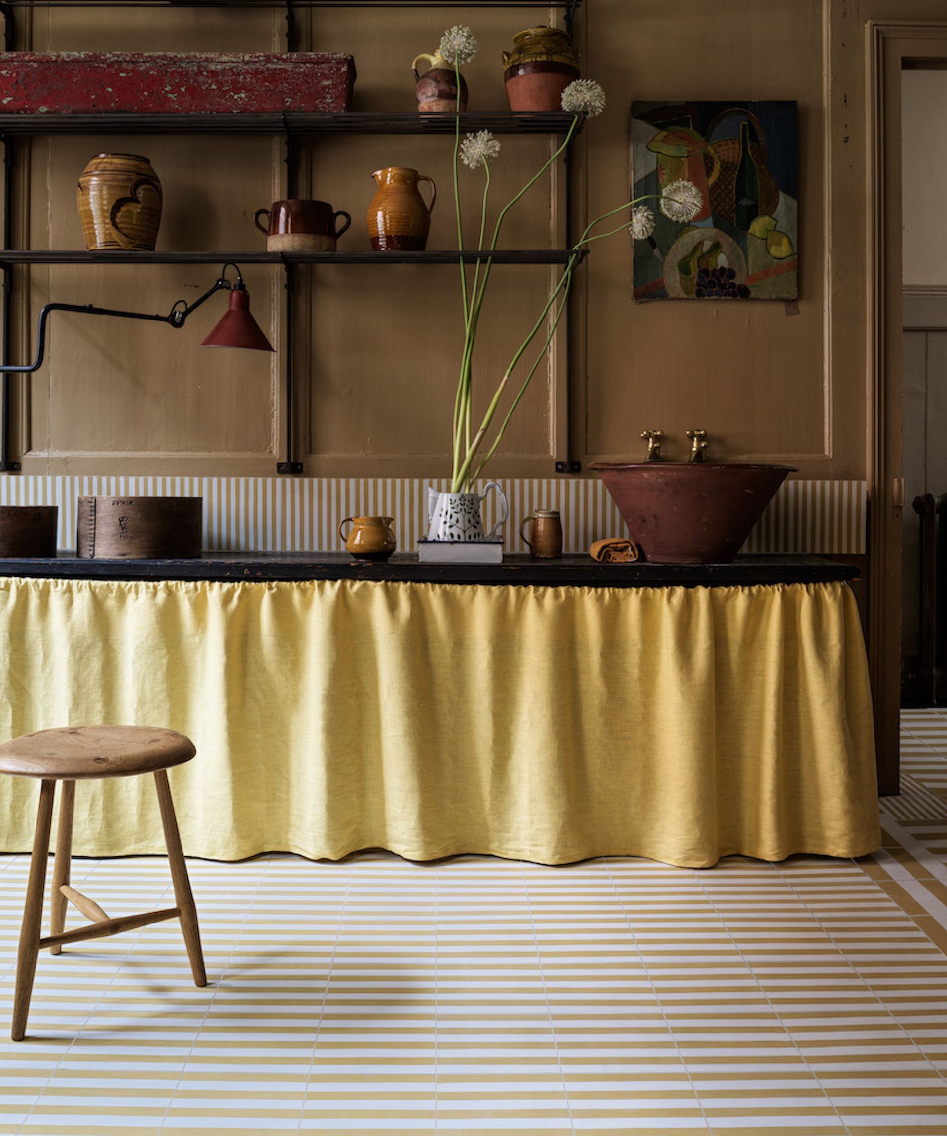
Whether you know them as sink skirts, cupboard curtains or even a kitchen valance, there’s no denying the appeal of switching out solid doors for something a little more relaxed, and frilly! Not only can a dose of fabric add pattern and color, but this trend can also help with small kitchen ideas as you don’t have to consider the swing-out of doors when planning smooth traffic flow.
‘Adding a sink skirt to a kitchen is a great way to add a bit of whimsy and softness to an area of the house that can often feel practical or utilitarian,’ explains interior designer Kaitlin McQuaide. ‘Depending on the fabric and pleat style, it can work in nearly any style of kitchen. Just be mindful of the type of fabric you choose. Stick to high performance or washable, since you are in a kitchen after all.’

Kaitlin McQuaide established McQuaide Co. in 2018. A full-service interior design and consulting studio based in New York City and Nantucket, she and her team create unique spaces that are intentionally designed to inspire life’s adventures.
FAQs
What cabinets are out of style?
As well as finding out what is in trend, it’s just as important to discover what cabinets are out of style. Naturally, the experts’ thoughts on what kitchen cabinet trends to avoid are subjective. If you think something is stylish then that’s what will ensure its longevity in your heart.
But if you are renovating with a mind to move at any point within the next decade, then keeping abreast of unfashionable cabinetry makes perfect financial sense. Usually, this will be colors and finishes, which can quickly date a kitchen. For example, it’s been a very long time since orange pine kitchens were readily available.
If you want to avoid unfashionable cabinets, stick to timeless designs like classic Shaker or a plain painted door and use accessories and accents to add personality and make that show-stopping impression.
What color is replacing gray on cabinets?
Gray is the ultimate crowd-pleasing neutral. Imbued with so much natural elegance, there’s a good reason gray cabinets have held their popularity for so long. With this in mind, you may not be surprised to discover that light gray kitchens are making a comeback. Yes, the color replacing gray…is gray!


