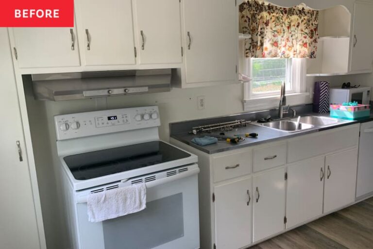
Before and after of this
Home Type: House
Project type: kitchen
style: Colorful, maximalist
Skill level: Handmade
Perfect for rental: yes


Let's be honest: buying your first home, or any home for that matter, is going to be expensive. When 24-year-old artist and interior decorator Maddie Moksi bought her first home in Louisville, Kentucky, she didn't have the money to completely renovate some rooms, especially the kitchen. But she wasn't going to let that stop her from taking a bold step.
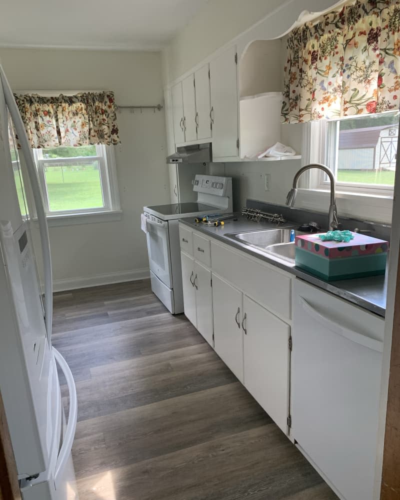

“The kitchen was unattractive, plain and bland,” Maddie says of the original space. “I hated the blue-gray laminate countertops. There was still metal trim in there, and while I admit it added character to the kitchen, it wasn't the focal point.”
Maddie was determined to create a “pop art and fun” aesthetic for her new space. She took the plunge and did most of the room renovation herself, making a world of difference for just $800 (and one month!). “It's crazy when you think about it. So cheap! Shout out to me,” says Maddie.
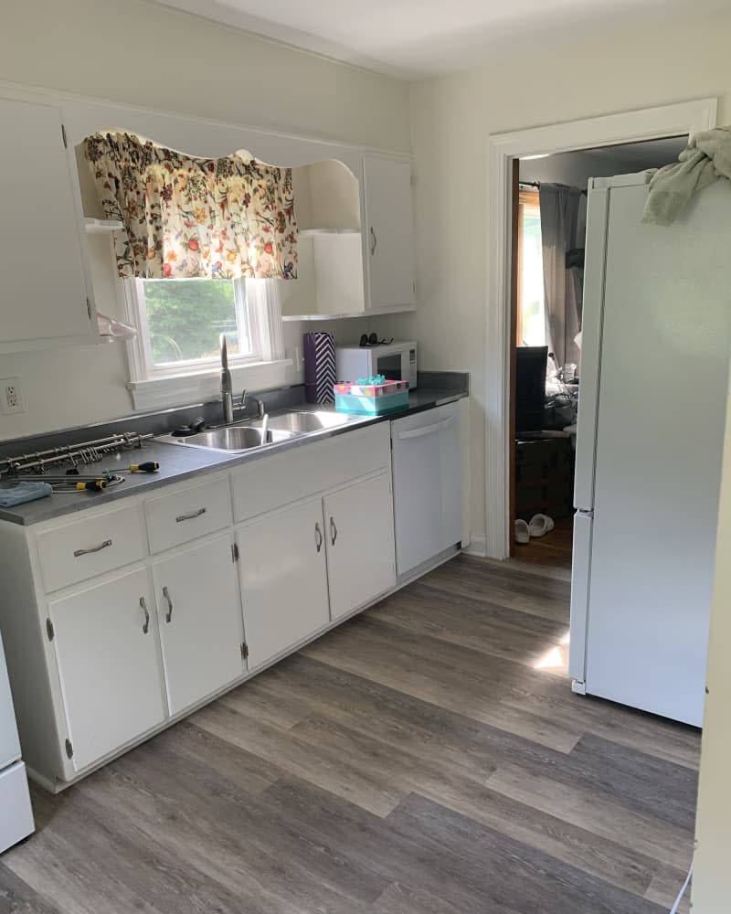

Maddie started with a color palette that included greens, golds, pinks, and whites, and she also wanted to incorporate animal prints. The first step in the kitchen renovation was to update the countertops.
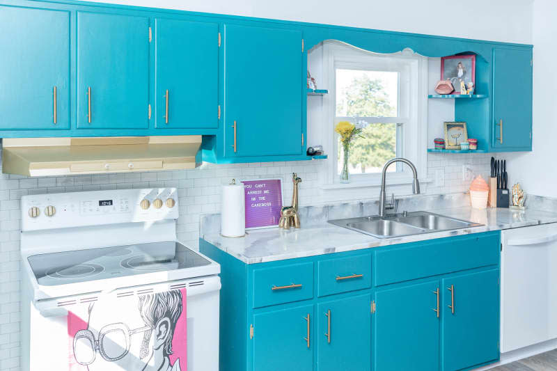

She removed the sink (which she later had a plumber reinstall), covered the entire kitchen in tarps, and used resin to create a faux marble look for the countertops. “It came out great, even though I had no experience with resin,” she explains. “I thought of it as a temporary solution until I could buy countertops, and it was a very inexpensive way to achieve that look.”


One of the kitchen's main gold accents is the range hood, which required minimal effort. Maddie sanded it down, spray painted it gold, and sealed it, which she admits was “a pretty quick process to give it a premium look.” Gold also appears in the new hardware, with silver being another accent color.
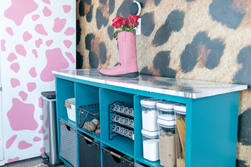

For storage, Maddie DIYed some KALLAX storage shelves from IKEA. She painted them to match the new cabinets and added four hairpin legs to match the height of the countertops. She then took a piece of plywood, cut it to size, and created a matching countertop using the same resin countertop method. “It was super functional, had tons of storage, fit the space perfectly, and was a great, inexpensive solution for someone with no woodworking skills.”


Updating the original white cabinets was one of the most challenging parts of the renovation. “No one talks about how painstaking it is to paint cabinets,” Maddie admits. “If I had to do it over, I'd use a spray gun. It's hellish to keep brushstrokes to a minimum!” But the new cabinets, covered in Bear's Sparkling Emerald, made a world of difference to the space.
Originally, the wall behind the counter was bare, and Maddie admits, “that just didn't work,” so they added a bit of pizzazz with a peel-and-stick tile backsplash purchased from Amazon. And that's not the only thing that added personality to the room: the cheetah print wallpaper is a highlight. “The animal print was neutral and made the room feel boring.” [without it]” says Maddie.


A pink cow print decal on the fridge adds to the animal print, and another eye-catching detail is a photo of Terry Crews. White Chicksthe letter board, Cake Bossand a trophy commemorating her time as the school's mascot. “The kitchen was already beautiful, but these elements made it more fun and, more importantly, my kitchen,” says Maddie.
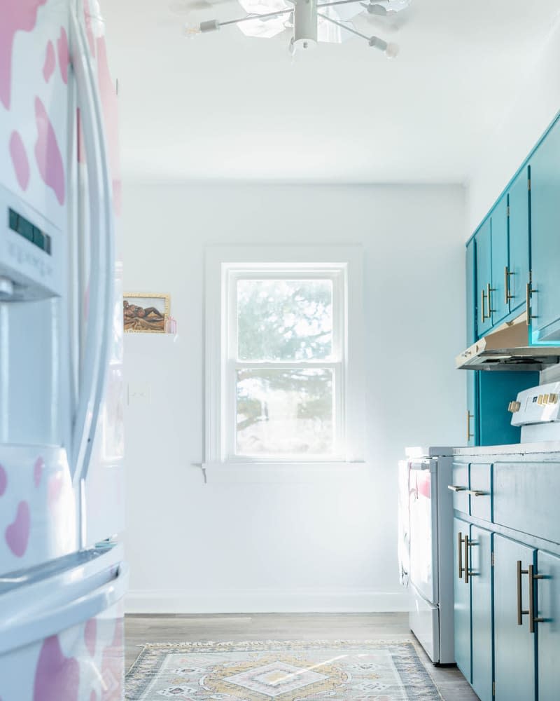

Maddie's kitchen definitely has a lot going for it. Bright colors and patterns come together to create a room that's fun, inspiring, and sentimental. It's amazing that she completed this entire project herself, saving hundreds of dollars over hiring a professional. More than anything, Maddie loves “the good energy of a space.” “It represents who we are as people, and that's forever cool.” To see more of Maddie's colorful space, check out Apartment Therapy's full home tour.
This post originally appeared on The Kitchn. Check it out here: Before & After: A “Boring” Kitchen Gets an Electric Blue Cheetah Makeover (For Just $800!)


