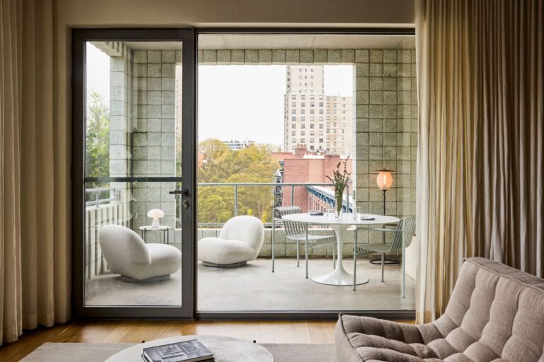
Creating the perfect apartment interior design is a unique task. Fitting contemporary designs within the existing bones of historical buildings, or transforming a blank canvas into a dream home takes precision, flexibility and flair. Architects around the globe are taking a turn at composing the perfect interior with striking results. Here we explore some powerful examples, travelling from Los Angeles to London, Paris, Taipei, Athens, Sao Paulo, Tel Aviv and beyond.
THE FINEST APARTMENT INTERIOR DESIGNS
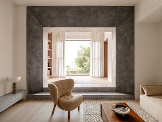
VC Residence by Lim + Lu
(Image credit: Common Studio)
The VC Residence by Lim + Lu elegantly mixes minimalist architecture and Japanese residential design influences. Set within 1300 sq ft at Hong Kong’s The Peak, the project was a meticulous gut renovation to bring an existing unit to the 21st century. Working with a palette of raw and natural elements, such as warm wood, delicate rattan, and textured plaster, the architects aimed for a serene composition. They write: ‘Inspired by the client’s affinity for Japanese design, subtle touches of Japanese aesthetics are thoughtfully incorporated throughout the apartment. Large Japanese-style sliding doors, characterized by clean lines and understated elegance, delicately separate spaces while keeping the flow of the apartment very fluid and infusing a touch of traditional charm. Additionally, the client’s personal touch is evident in the carefully sourced bathtub imported from Japan, elevating the bathroom experience.’
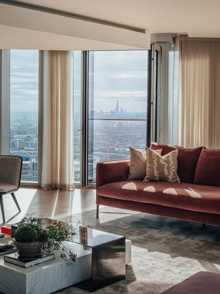
Harry Handelsman’s Manhattan Loft Gardens penthouse
(Image credit: Taran Wilkhu and Sotheby’s)
Harry Handelsman’s Manhattan Loft Gardens penthouse’s recent market listing brought this high-profile house-in-the-sky belonging to the Manhattan Loft Corporation CEO to the public eye once more, after the project’s completion in 2019. The prominent high rise in London’s Stratford, designed by architects SOM, houses the Manhattan Loft Gardens residences and The Stratford Hotel – the latter located on the lower levels of the building. The interior was designed by Alexander Gorlin, and features long London vistas beyond the nearby Olympic park through its sculptural, floor-to-ceiling glazing.
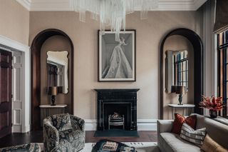
The OWO Residence by Angel O’Donnell
(Image credit: Taran Wilkhu)
The OWO Residences by Raffles has revealed its first-ever interior showcase – the creative imagining of four of its signature homes, designed by leading studios Angel O’Donnell, HBA, Accouter and RJP Design. Angel O’Donnell – the team behind works such as interiors at One Crown Place in the City of London – is led by practice founders Richard Angel and Ed O’Donnell. The designers used ‘restrained refinement’ as their guiding principle, mixing opulent details with practical touches, such as tall bookshelving, curated, strategic art that works with its context, bespoke products and fittings by British artisans, and a sense of playfulness.
50 Oakley Square by Echlin
(Image credit: Nick Rochowski)
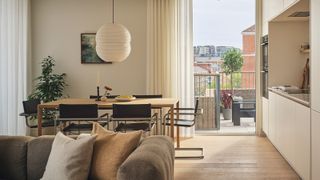
50 Oakley Square offers this rare treat of a combination – a slice of minimalist architecture and residential calm, while set within one of London’s most popular corners. The scheme, designed by Echlin and set near Mornington Crescent in Camden, is a stone’s throw from the hustle and bustle of the nearby market but has been designed to feel anything but – drawing on some cool design tools (soundproofing, natural light, orientation and the right materials) to craft a haven of serenity for its residents and guests.
450 Warren apartment by SO-IL and Sebastian Mendez
(Image credit: GUBI)
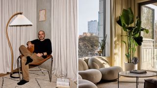
Few properties deliver as well as 450 Warren on the promise of offering ‘a new way of living’ – this boutique collection of 18 condominium residences in Brooklyn seems to stand apart from its peers. Featuring an open façade, mesh-encased walkways, and expansive windows, this project is a collaboration between Tankhouse (an NYC property developer also behind the nearby Nine Chapel residential tower) and So-Il (the Brooklyn-based architectural practice that designed the neighbourhood’s Amant Art Campus and Seoul’s Kukje Gallery). Sebastian Mendez, an Argentine architect who worked for Foster & Partners before co-founding Tankhouse over a decade ago, is passionate about the power of design to present good architectural solutions to concrete urban problems. Mendez and co-founder Sam Alison-Mayne liked 450 Warren – Tankhouse’s first ground-up residential project – so much that they both moved in.
Brigadeiro Apartment by Leandro Garcia
(Image credit: Fran Parente)
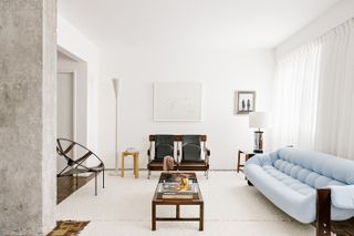
Located in Brazil’s Curitiba, this generous over-100 sq m apartment interior design is brainchild – and personal home – of architect Leandro Garcia and his partner, also an architect. The space is located in an existing, 1970s apartment building in the city. The interior required a full renovation, and the architects took this as an opportunity to fully transform the home, opening it up and bringing it down from a three- to a two-bedroom, in order to craft more expansive everyday living areas. Garcia instilled his warm, minimalist architecture style, peppered with design led objects and furniture.
The Townhouse at The Bryanston by StudioMorey
(Image credit: The Townhouse, The Bryanston, photography by Kate Martin)
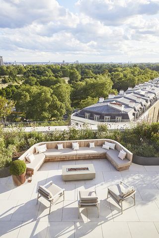
The Townhouse at The Bryanston, one of central London’s most prominent new homes, has unveiled its interior concept – a design by StudioMorey. The home, which occupies the entire 8th and 9th floors of developer Almacantar’s residential high-rise by Hyde Park, featuring architecture by Rafael Viñoly, is an expansive duplex residence overlooking the nearby green and the iconic London skyline. And now, it also has a custom design to boast about, spreading across its some 13,691 sq ft of internal space. ‘When we designed The Bryanston our aim was to celebrate the uniqueness of the building’s position, with its compelling connectivity to historic Hyde Park, to delight in the park views and expanse of nature, and to maximise the light and create the feeling of living in the sky,’ says Kathrin Hersel, executive director at Almacantar, and this statement is embodied in The Townhouse’s concept too.
Apartamento Paraíso by Rúina
(Image credit: Lauro Rocha)
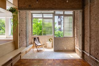
Apartamento Paraíso is Rúina’s renovation of a first-floor apartment in the Edifício Olga Ferreira building in São Paulo. Starting with an existing, fragmented space that lacked natural light, and with poor ventilation in original service areas as a legacy of colonial architecture, the studio has transformed the apartment into a bright, open home brimming with craftily repurposed material touches. An inverted beam embedded in the wall between the living room and bedroom was unearthed during demolition, and reappropriated to support furniture facing both sides, ‘sectoring the environments without visually separating them’. Meanwhile, turning the wall between the kitchen and service area into glass sliding windows brings a renewed ‘visual permeability from end to end of the apartment,’ improving natural lighting and cross ventilation.
432 Park Avenue penthouse by Crina Arghirescu Rogard
(Image credit: Isabel Parra)
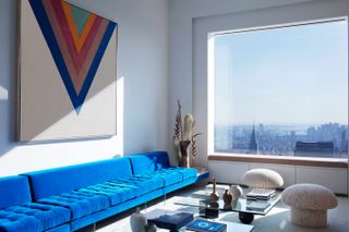
The 432 Park Avenue penthouse has been designed to bridge fine art, contemporary minimalist architecture, and domestic space by architect Crina Arghirescu Rogard. The New York home celebrates the city’s iconic skyline, alongside the owner’s museum-quality art collection, which includes pieces by Richard Long, Morris Louis and Kenneth Noland. When approached for the commission, Arghirescu Rogard instantly saw the project’s opportunities. ‘Stepping inside one of the top floors of the emblematic 432 Park Avenue building, peeking through its signature large square windows, I was drawn to a concept of geometrical shapes, lines and curbs, that would celebrate the New York skyline, the dizzying proportions of the building, and respecting the clients’ unique taste for art. The bold shapes and primary colours of the bespoke furniture we designed for the project are undoubtedly influenced by the client’s love of Pop Art,’ she says.
Lubetkin tower apartment by Studio Naama
(Image credit: Naama)
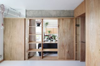
A Lubetkin tower apartment in east London has been given a 21st-century makeover by emerging architecture practice Studio Naama. The small, but dynamic firm, led by co-founders Mark Rist and Natalie Savva, completely transformed the apartment interior design to fit the specific needs of their clients, a pair of keen cyclists, while maintaining the modernist architecture’s bones and Bertold Lubetkin’s original intention. So successful was the space’s reimagining that it won the duo an award (Compact Design) at the Don’t Move, Improve 2023 competition earlier in the summer. Set within Lubetkin’s Grade II listed Sivill House on Columbia Road, Shoreditch, the apartment was originally designed by Lubetkin together with Douglas Bailey and Francis Skinner in 1962. Preserving the space’s modernist legacy was key to the two architects. At the same time, within a modest 65 sq m, the clients wanted to make the most of their two-bedroom property.
Boston Penthouse Loft by J Jih
(Image credit: Chuck Choi)
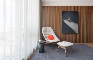
The latest J Jih design is an extensive renovation of an existing penthouse apartment in Boston for a family of art-lovers. Blending minimalist architecture touches with art-filled corners and rich materiality, studio founder J.Roc Jih has completely reworked the interior focusing on softening the light and space towards a gentler, more domestic feel in a previously harshly lit space. ‘We really sought to unify the dichotomy between the clients’ desires through the use of the two liners – one that surrounded the interior surfaces and one that moderated the exterior glazing. Switching between the linen sheers and walnut slats, these liners embrace the space and provide a backdrop for a series of subtly curved furniture selections to define the interior,’ says Jih.
Coppermaker Square by 2LG Studio
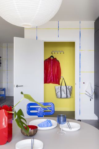
(Image credit: Megan Taylor)
This one-bedroom apartment in East London, part of the new built development Coppermaker Square, has been designed by interiors studio 2LG. Conceived for a young professional with a passion for gaming and biking, the space is bold and impactful. Bright colours, eye-catching art and furniture and cleverly positioned arrangements that make the most of the large windows and long vistas, help craft the identity of this home. ‘The personality comes through in the carefully chosen design pieces, with a smiley mirror, cartoonish shelving, collectible toys and graphic statement rugs. A lot of fun was had designing this space with a view to facilitating the active gamer who lives there,’ say its authors, the studio’s founders Jordan Cluroe and Russell Whitehead.
Berri Residence by ICONIQUE
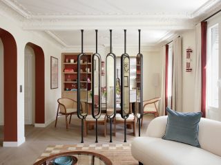
(Image credit: ICONIQUE)
A neoclassical pied-a-terre in Paris’ 18th arrondissement has been transformed into an art-filled, contemporary home by studio ICONIQUE. The space, titled Berri Residence, balances heritage and modern touches, as well as high sophistication crafted out of careful spatial flow and natural materials, with a warm, homely atmosphere. Adriana Schor, founder of ICONIQUE Studio said: ‘With the Berri Residence, we had to strike the perfect balance of a space that oozes sophistication without being pretentious, and maintaining a homely atmosphere. Through the total redesign of the property, we managed to form a new equilibrium in the apartment, maximising on the space for optimal functionality, comfort and aesthetics, whilst celebrating both the original features and new, modern accents.’
D029 by Officina Magisafi
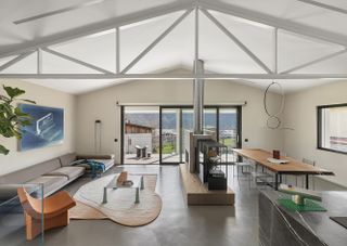
(Image credit: Alessandro Saletta | DSL Studio)
Located a stone’s throw from Italian architects Officina Magisafi main base in Colzate, in the province of Bergamo, D029 is a renovation to an existing 1970s structure. ‘It was an old building, uninhabited for fifteen years; the rooms were narrow and not functional. As we did not identify any particularly valuable elements in the construction, we decided to demolish a large part of the existing structure, starting over and experimenting,’ said the studio’s founders Claudio Acquaviva and Debora Bordogni. ‘The owner relied on us completely; we wanted to reflect his passion for industrial aesthetics and the United States, choosing the most innovative materials and designs.’ It was all about using their imagination, the two creatives explained: ‘We observed the house, the rooms, the corridors, the layout, while our eyes tried to visualise what it could become.’
Bridge Avenue by Gort Scott Architects
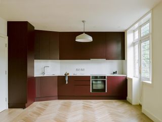
(Image credit: Lorenzo Zandri)
Part of an Edwardian Mansion in the Hammersmith & Fulham Conservation area, this apartment has been sensitively restored by London architecture studio Gort Scott. The existing property has been cleaned and opened up, with period elements restored to their former glory, while new additions (such as an infill to the side) and an overarching new masterplan defining the refreshed home. Meanwhile, improvements to the thermal, acoustic, and fire performances bring this apartment interior design to the 21st century.
Girona St. Apartment by Raúl Sánchez
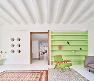
(Image credit: José Hevia)
This apartment interior design renovation is set in the ‘Eixample Dreta’ neighborhood of Barcelona. The space, within a generous 19th century apartment building, was completely transformed using colour and smart spatial arrangements and bespoke furniture, by local architect Raúl Sánchez. White microcement flooring, mosaic details, long walnut wood, brass and stainless steel finishes, and a minimalist, contemporary attitude throughout, ensure the home is not only fit for purpose but also full of texture, flair and light.
Phillips House by Brisco Loran
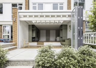
(Image credit: Pierce Scourfield)
Phillips House is part of the modernist campus of the Dulwich Wood Park estate. The architects, Brisco Loran, were invited to refresh a unit within a 1950s residential building by architects Austin Vernon & Partners. The redesigned space features a generous contemporary extension and expressed brick party walls. By opening up the ground floor, removing partitions, the team, headed by Thom Brisco and Pandora Loran, has created a minimalist interior in sync with its 20th century context.
Buxmead’s Penthouse by SHH
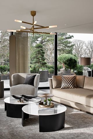
(Image credit: Tom Bird)
Designed by SHH and developed by Henigman in London’s swanky Hampstead, this penthouse interior was created within the empty shell of a new build residential scheme in private development of 2.5 acres of private, gated, landscaped grounds. The team drew inspiration on the residence’s green, serene location and sprinkled on the finest of British craftsmanship to compose an interior that prioritises green and brown shades, timber, bronze and tanned leather. Bethany Prince, associate at SHH said: ‘Our interior design effort was focused on shaping a unique lateral space to bring balance and a subtle feel of luxury for modern living. A combination of carefully selected and unique, bespoke designed pieces of furniture, lighting and artwork by the team contributed to the ultimate living and entertainment pad. SHH worked closely with suppliers such as Art et Floritude, Riviere Rugs, CTO Lighting, Dedar and Tom Faulkner to develop particular elements of the FF&E.’
Casa 311 by Salto Studio
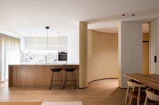
(Image credit: Alexander Bogorodskiy)
Dynamic Portuguese studio Salto is behind this extensive refurbishment of a two-bedroom apartment in the country’s Carcavelos Beach area. The interior is defined by strong, architectural curved lime plaster walls, which while carve the space’s main identity at the same time feel soft, warm and tactile. The home of a couple and their dog, the apartment, titled Casa 311, is arranged in three zones according to privacy levels – all enhanced by texture, colour and minimalist architecture.
Songwoohun apartment by Eccentric Design Lab(EDL), Hanyang University
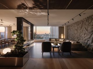
(Image credit: Mingu Kang)
This home in the Gangnam-gu district of Seoul, South Korea, is centred on nature. Its design developed around a Bonsai tree, a small plant the owner owned and which they wanted to have at the heart of the space to be enjoyed whenever they spent time there. This birthed not only the internal arrangement but also the apartments name: ‘Songwoohun(松遇軒)’, which translated to ‘House encountering a Bonsai tree’. The apartment interior design was led by Eccentric Design Lab of Hanyang University and the team of Studio Eccentric, and it incorporates a variety of materials that bring the outdoors in – included are a mix of mud panelling, wood flooring, concrete, rock-textured plaster and paint.
Rue d’Hauteville by Laune Architecture
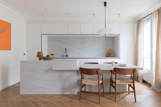
(Image credit: Laura Jacques)
This 100 sq m apartment in Rue d’Hauteville in Paris was designed by emerging architecture studio Laune, headed by Laure Grabulos and Pauline Marcyniuk. The designers opened up the interior and bathed it in light, using light tones and a natural, neutral colour and material palette. This minimalist architecture background is peppered with accents such as a mural on the main circulation space, carefully selected artwork, and a bespoke kitchen elevated through the use of white marble. Meanwhile, timber flooring anchors the whole to the ground, providing a soft, organic backdrop for daily life.
Apartment Oostduinkerke by TJIP
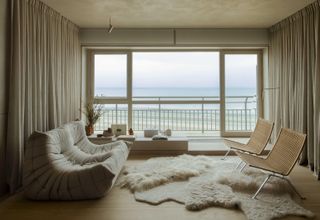
(Image credit: Alice Mesguich)
This compact weekend residence offers minimalist interiors with long, sea views, set on the 16th floor of an apartment building in Belgium’s Oostduinkerke. The parquet floor was chosen to continue visually the tones of the sandy beach beyond, while the walls’ clouded greige hue is a nod to the sea’s colours through the day. Soft textiles, neutral colours and large openings that direct the gaze towards the calming waters, make this small (at 40sq m) but perfectly formed, one bedroom apartment the perfect getaway. The project was the work of interior architecture studio TJIP, led by founders Jakob Vyncke and Thomas Meesschaert.
Focus Hangzhou by Cheng Chung Design
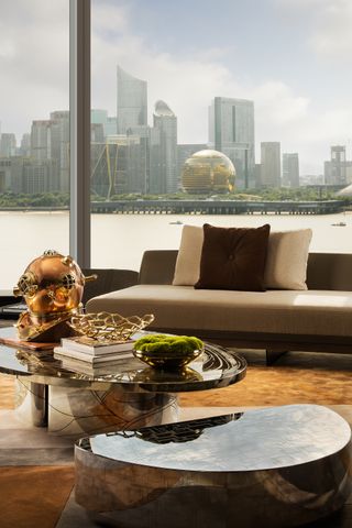
(Image credit: Wang Ting)
Focus Hangzhou was designed around its incredible views of the Chinese city’s urbanscape and the river beyond. ‘Urban landmarks are not so much about a name, but more about a pattern, a kind of power and grandeur, and a poetic lifestyle that integrates Eastern artistic conception with Western form,’ said its creator, architect Joe Cheng of Hong Kong based Cheng Chung Design. Here, luxury meets contemporary design, but always with a sense of grandeur that was conceived to match the property’s unparalleled 270-degree river vistas.
Palace Gate by Tala Fustok
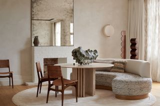
(Image credit: Michael Sinclair; M.A.H Gallery vase, Vessel Gallery & Dominic McHenry sculptures)
Conceived as an urban sanctuary by designer Tala Fustok, this apartment in London’s Palace Gate sits comfortably on the fourth floor of the Victorian mansion block. The design team matched important structural work with wrapping the interior in warm, neutral tones and the client’s art collection for a balance of a sense of character and serenity. Themes span understated luxury and timeless elegance, achieved through natural materials and a restrained colour palette. Vintage finds and contemporary pieces mix, along with clever bespoke elements throughout, such as the bespoke 1960s-inspired bed, which takes centre stage within the master bedroom.
Istanbul apartment by OZA
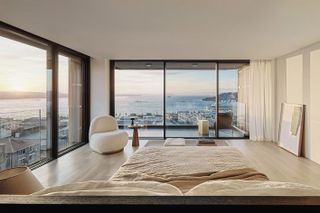
(Image credit: Fevzi Öndü)
London based architecture studio OZA, co-founded by Özge Öztürk and Alexandre Simeray, is behind this new apartment in Istanbul’s Galata neighbourhood. The project East and West references as well as panoramic views of the city and water in a composition that feels light, contemporary and open. ‘From the interior layout design to the material selection, we got inspired by the location of the project, the great history of Istanbul and especially by the soul of the city and lifestyle of its people,’ say Öztürk and Simeray. ‘Every element of the project has been thought to sublimate this ‘living artwork’, which becomes even more poetical when the monuments are theatrically enlightened and the boats pass by the Bosphorus at night. This is the most dramatic scene this home offers.’
Versailles apartment by Saba Ghorbanalinejad
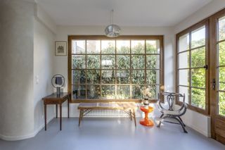
(Image credit: Mary Gaudin)
Located in the heart of historic city of Versailles in France, this ground floor apartment in a historical building measures some 90 sq m, with a garden that is more than double its size. When architect Saba Ghorbanalinejad was called upon to work on a restoration and reimagining of the space, she crafted a meticulously detailed, minimalist intervention that turns the gaze towards the property’s rare green expanses. Opening up rooms and establishing a contemporary flow and connection were key to the redesign, as the architect improved vistas and links between interior and exterior. Meanwhile, bespoke touches such as using fragments of Murano glasses, collected by the client’s family, in the in-situ concrete kitchen worktop, add personality and colour.
DB apartment by Hallett Ike
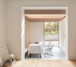
(Image credit: Stale Eriksen)
A double extension and refurbishment of a ground floor apartment interior in London’s De Beauvoir Town, this project by local architects Hallett Ike occupies a historical Georgian townhouse. The team worked with tight parameters to create a space that feels flowing, open and calm for the owners’ daily life. A key move was opening up the kitchen and dining areas towards the living space and the garden beyond, adding internal vistas and a sense of generosity. At the same time, the space has been reimagined using Hallett Ike’s signature pared down, Scandi-inspired minimalism throughout.
Duplex apartment in Prague by MeaCasa
(Image credit: Jiri Bednar)
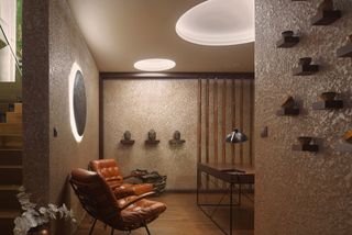
Czech architect Jarmila Kopečná, head of studio MeaCasa, has created an apartment interior design for a duplex space in Prague’s Holešovice district. The architect worked with light and colour to open up the space and create a serene, welcoming interior that draws on earthy elements, such as the sun, moon and soil. Natural materials, such as stone, wood, and textiles (particularly linen and leather), have been used throughout, to compose a soft, organic feel.
Malabar Hill apartment by Rajiv Saini
(Image credit: Giorgio Possenti)
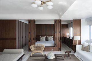
This Mumbai apartment on Altamount Road, Malabar Hill, mixes fun with urban retreat in one of India’s swankiest addresses. Crafted by Rajiv Saini, the project, a terrace apartment interior design that blends indoors and outdoors with contemporary elegance, is a bespoke residential jewel for a private owner – one of the designer’s long term friends and clients. Saini worked on the same client’s primary residence, another Mumbai apartment on the same building, some 15 years ago. The designer recalls: ‘Over the years we’ve often spoken of doing another project together, a holiday home for weekends, but somehow that never materialised… So, when the terrace apartment came up for sale, [the clients] grabbed it, with the intention of using it as their entertaining pad, and for use over weekends.’
Chelsea apartment by Deca Architecture
(Image credit: DECA Architecture)
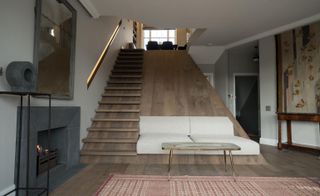
A wide timber slide with a built in staircase connects the floors of this unconventional, two-bedroom apartment in London designed by Greek practice Deca Architecture. Designed for a long-time client and friend of the practice, the 140 sq m home is spread across the first and second floors of an Edwardian London terrace house in Chelsea. Formerly two separate flats, the new larger apartment is an imaginative amalgamation of the two, executed in a tactile material palette of aged oak, metal and marbles. Most notably, Deca decided to buck the tradition of placing social spaces on the lower floor and private spaces on the upper. Instead the studio created a layout that blends the two across both floors. ‘A lot of London conversions are very formulaic, so we asked ourselves: how do we break this paradigm while creating something totally unique for our client?’ explains Carlos Loperena, who founded DECA alongside Alexandros Vaitsos.
Wonder House by Xigo Studio
(Image credit: Li Ming)
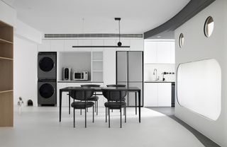
This reimagined interior in Beijing, by Xigo Studio, was created with children in mind. ‘Once Picasso said he wanted to “paint like a child”, and the “face figure” has long been used repeatedly as the object of painting by modern masters, and it is also represented in contemporary entertainment by familiar archetypes such as robots, Pac-Man, and Mickey Mouse Clubhouse. The symbolic nature of the face gives people a more childlike, joyful and friendly feeling,’ the architects write. A playful, minimalist and strongly graphic quality defines the resulting two-bedroom interior.
Ferguson by Arrant Land
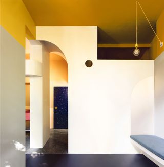
(Image credit: Pierce Scourfield)
Arrant Land worked with architect Lee Ivett and artist and maker Simon Harlow on this boutique apartment redesign in Glasgow. The project, created by and for the company’s founder Duncan Blackmore, is situated on the ground floor of a Victorian tenement building, as a base for when the owner is into town for work. It’s a compact space elevated by extreme attention to detail, and a touch of playfulness. Its owner says: ‘The design evolved from an understanding of how much structure we could remove relatively economically. There are three further stories of flats above so internal walls, all of which are ’supporting’ to a degree, can’t just be taken out. Instead we raised existing openings to ceiling height (3.4m) and replanned the space so that a journey could be taken ‘around’ the flat. I’m very drawn to the idea of being able to ‘do a lap’ or ‘go for walk’ even in such a tiny space, rather than going into a ‘dead end’ space and reversing out again. We also wanted to preserve the views that removing the structure opened up, so you can see the windows as soon as you enter the flat for example. The result is a space of surprising scale and with only one door (on the bathroom). The main move in section was to put the sleeping area above the bathroom and to install the stair up to that. This makes full use of the section and ceiling height and allows for further views around and over the space.’
Avenue Montaigne by After Bach
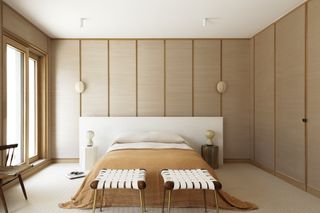
(Image credit: Annick Vernimmen)
This Paris apartment is the first residential project by the emerging design studio After Bach. Set up by Jessica Berguig, owner of the JAG gallery, and Francesco Balzano, designer of high-quality, limited-edition objects and furniture, the young practice focuses on bespoke, boutique creations that make a mark through their elegance and contemporary feel. The interior at Avenue Montaigne represents this well. Clad in warm materials and neutral colours, the space is inviting – but full of character. ‘[We] drew inspiration from David Lynch’s film Mulholland Drive. The space has been designed like a 1950s American house, with walls panelled in French oak and natural plant fibre textiles,’ the designers explain.
WKA Penthouse by Bruno Spaas
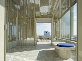
(Image credit: Jeroen Verrecht)
Belgian architect Bruno Spaas is behind this sculptural apartment interior design in one of Antwerp’s newly built high rise residential developments. The unit belongs to the dynamic architect, who founded his emerging studio in Antwerp in 2018. Crafted with a tactile quality and using chunks of local light brown stone for cladding and texture, the penthouse was bought by the architect as a blank canvas (it is situated in a new scheme in the city’s northern harbour, designed by Swiss architects Diener & Diener). It is now full of personality and 21st century appeal. Opening up the interiors to create flowing spaces, while adding mirrored elements, and a minimalist architecture throughout, perfect for framing the long penthouse views, Spaas conceived a space that is appropriate for everyday use, while offering spatial richness and drama at the same time.
Maher Gray by Tang Kawasaki
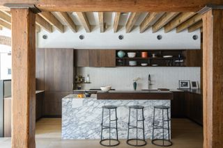
(Image credit: Zach Pontz)
Architecture studio Tang Kawasaki was commissioned to modernise this Tribeca loft, belonging to an Australian-American couple. The design solution? The team recommended that the owners dig back into the past, and strip away the series of existing DIY installations by artists and artisans, created there over the past forty-odd years. This way, they would reveal and celebrate the bones of the 1882 prewar building, reframing it for the 21st century. ‘We were most interested in echoing this thread between ornamental and primitive architectural languages within the loft and focused our initial agenda around deeper investigations of the materiality of the building’s structural systems. After uncovering the heavy timber superstructure which had been concealed since the 1980’s, layers of plaster, burlap cloth, and creosote which had impregnated the wood joists, girders and columns, were carefully removed to expose the soft heart pine. Restoration of the natural wood finishes were then completed with plant-based hardwax-oils,’ say the architects.
Mexico City apartment by Archetonic Architects
(Image credit: Arturo Arrieta)
This spectacular Mexico City apartment is a true transformable space, a complex assemblage of sliding walls, moving partitions, and blinds. Archetonic Architects, founded by Jacobo Micha Mizrahi in 1991, and including Alan Micha Balas and Jaime Micha Balas, set out to turn this generous double-height apartment into a place of endless opportunities. ‘We sought to take advantage of the double-height space, insert maximum natural light and permeate the interior with the exterior environment through large windows,’ the architects explain.
The home of Liraz Charhi and Tom Avni by Dari Shechter
(Image credit: Rotem Lebel)
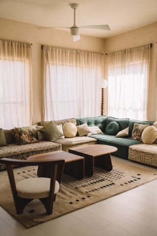
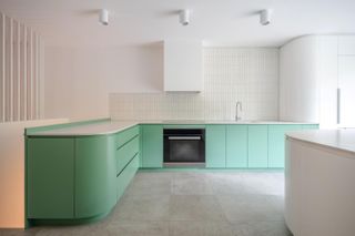
This entirely custom made interior was created by designer Dari Shechter for husband-and-wife team Liraz Charhi and Tom Avni using Persian influences – a nod to Gharhi’s roots. Famed musician Charhi worked with Shechter to compose an interior brimming with personality, including works by local artisans, such as custom produced tableware, pottery, pots and vases. Mud plaster offers a warm, tactile feel to the walls, while a mint green pastel coloured kitchen creates a colour accent in the living space.
MC Residence by DeDraft Architects
(Image credit: John McDavid)
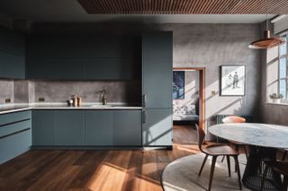
This penthouse apartment interior design is a masterful renovation and repurposing of the top floor of the ‘Old German Hospital’ in London Fields, Hackney in London. The architecture studio, DeDraft, worked with the modernist bones of the original building, created in the 1930s by Burnet, Tait & Lornein, which is currently Grade II listed. The interiors work with tactile materials, light and shadows, to compose a space that feels modern, but also warm and domestic. Crittall windows and exposed concrete meet fumed oak floors and the owners’ rich collection of art and design.
Philbeach Gardens by Roz Barr Architects
(Image credit: Thomas Adank)
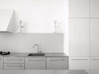
An existing apartment within a 1882 red-brick Domestic Revival style mansion in West London, Philbeach Gardens, has been completely transformed into a haven of minimalist calm by Roz Barr Architects. The space, belonging to a family of three, was conceived to maintain the overall identity of the original piano nobile apartment interior design while introducing further natural light, flexibility and interconnectedness that is needed for a functional, modern home. ‘Our approach was to develop a series of elements that responded to the domesticity of day-to-day life,’ the architecture team explained. ‘The rituals of everyday life, such as cooking, eating, resting, sleeping and bathing were internally reconfigured. Using natural materials, we configured a series of furniture that became a family of elements within the space.’
RA apartment by Maya Sheinberger
(Image credit: Itay Benit)
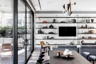
Tel Aviv interior designer Maya Sheinberger revamped an apartment in her home town’s city centre for a couple and their two young children. Working with the apartment interior’s existing layout, Sheinberger divided the space in two areas: the east wing, containing a large and spacious space with a living room, kitchen, and dining area facing a large terrace; and the west wing, where the main bedroom, two children’s rooms, and a bathroom that overlooks a second terrace are located. Wood, iron and stone make up for a minimalist interior with a natural feel, while a monochromatic colour palette keeps things neat and simple. The cityscape experienced through the large openings becomes a central focal point for the design.
The Aerie by OPA
(Image credit: Joe Fletcher)
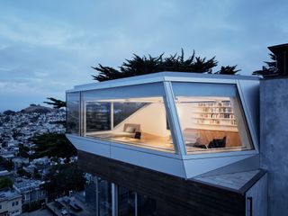
Architects Luke Ogrydziak and Zoë Prillinger of studio OPA were asked to return to a residential project they designed in 2005 – T House – for the addition of a San Francisco home office atop the existing structure. Nicknamed The Aerie, the new design not only crowns a relatively clean and sober building with a somewhat flamboyant extension, but also offers a next-generation home office for its owners, a couple with three children. While the project’s impressive, angular forms might be the first thing to catch the eye, it was the shaping of the internal lighting conditions that led much of the design development. OPA worked with parametric systems and consultants Loisos & Ubbelohde in order to perfect every little detail and corner, inside and out. ‘We wanted to create the effect of “floating” above the home and downtown San Francisco. To achieve this, we decided to make the walls and ceiling disappear,’ Ogrydziak says. ‘Wrap-around glass provides a panoramic view of the city and Marin [County] beyond. Above, the roof consists entirely of skylights sitting above a multi-layer system of diffusers, which reduce glare and react to different lighting conditions. The result is an unusually soft, even light which varies with atmospheric conditions and makes the room feel like being outside, while still maintaining visual comfort.’
Kichi Skyline Apartment by Simone de Gale with Arshak Architects
(Image credit: Nathan )
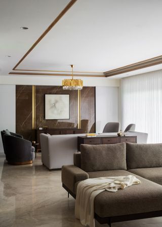
London architect Simone de Gale with Kerala’s Arshak Architects in this apartment interior design in southern India’s city of Kochi. The 3500 sq ft luxury space is a combination of Indian and international design influences, set on the 17th floor of the recently completed Legend Sky Mansions, an eco-conscious high end tower by developers Skyline. A generous, open plan living space brings together minimalist furniture with a handful of more ornate, crafted pieces for a glossy touch. The space includes four bedrooms, and outdoors areas in the shape of a near-wraparound balcony that offers 270 degree views. ‘This modern apartment home reflects its natural environment, extends into its natural environment while incorporating all the touches of modern luxury into an elegant sanctuary within Kochi,’ the architecture team says.
A Collector’s apartment by Campbell Cadey
(Image credit: press)
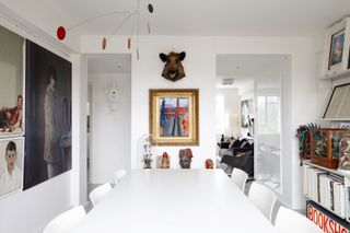
Set in Ruskin Park House, a striking set of modernist apartment buildings by Watkins Gray Architects from the 1930s, this apartment is the work of London studio Campel Cadey, founded by Ruth Campbell and Andrew Cadey. The client’s top floor appartment features long lines, bow windows and large metal windows, which the team was called upon to refresh for a costume designer and art collector. ‘Our aspiration was to remodel and update the layout to make the most of the abundance of natural daylight, clean air and views, whilst complimenting the existing 1930s architectural character to create a peaceful and calm setting within. A more open and free-flowing arrangement was introduced that included hidden storage spaces and a strategy for the curated display of the client’s varied collection of artefacts and artworks,’ the architects say.
Origin Realm by XIGO Studio
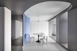
(Image credit: Li Ming)
This apartment in Beijing, designed by XIGO Studio for a family of three, is conceived around the clients’ needs for a clean, minimalist space. The architects prioritised hidden storage, crisp surfaces and a pared down approach. This doesn’t mean the space is without its drama. A curved partition in the living room, visible as soon as a guest would enter the apartment, provides visual interest, helps with light reflection and distribution, as well as offers privacy to the spaces behind – the home’s three bedrooms. A muted colour palette throughout makes for a calm and restful interior, while the flowing, open place main living spaces open up to a terrace looking out to city views.
Lancer Square by 1508
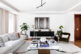
(Image credit: Taran Wilkhu)
Lancer Square is the newest kid on the block in the Royal borough of Kensington & Chelsea, just moments from Kensington Palace Gardens. This apartment is part of the elegant 36 residence property, all set within three distinct buildings ranging from six to seven storeys. Architecture practice Squire & Partners is behind the complex’s building design, but interiors are the work of international studio 1508, who took its cues from the area’s historical, regal and horticultural past, as well as the nearby Kensington Barracks. As a result, spaces feel refined and contemporary, yet featuring touches of heritage and glamour throughout.
Sequoia penthouse by Gantous Arquitectos
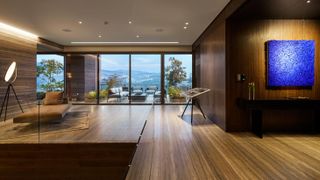
(Image credit: Aldo Garcia)
This expansive, two-storey penthouse in Mexico City was created by Gantous Arquitectos for a family of five – a couple with adult children. As a result, ‘the program focused on creating extensive indoor and outdoor social areas, as well as cozy spaces for relaxation, work or study,’ explain the architects. A dramatic entry, generous and directing the eye to long city views, is clad in earthy tones of travertine marble on floor and walls. Luxurious dark oak floors and bronze details define the spaces further in, leading to a staircase that guides visitors upstairs to the more private areas in the home. An art piece by Polish artist Xawery Wolski sits in a prominent position in the stairwell, exemplifying how art, architecture and natural materials come together in this Mexican urban retreat.
Elevate by Studio IAAD
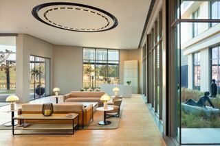
(Image credit: Noughts and Crosses)
Part of a housing project marking the collaboration of Indian developers Hines and Conscient, Elevate combines biophillic design with modern comforts and a cosmpolitan attitude. The home, located in India’s Gurugram, is a showcase of life in the property. Acting as a glass box at places, it contains planting and green views for the residents. At the same time, elsewhere, the apartment becomes more opaque, promoting calm and privacy. The interior in this three bedroom unit is made up of neutral tones and contemporary furniture, matching the architecture’s modern aspect and ambition. ‘Envisioned as a boutique hotel, the building is averse to the prevailing treatment of experience centres as an afterthought to housing developments. The ethereal slow-burn experience compels the visitor to sit and ponder, escaping in the forest’s therapeutic solitude, away from the outer world, becoming a placid haven that people want to connect to, engage with and inhabit,’ the designers explain.
Acropolis 13 by Natalia Bazaiou
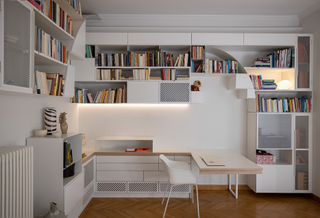
(Image credit: Cathy Cunliffe)
Athens based architect Natalia Bazaiou employs honest materiality and clean geometris to reimagine an interior in the city’s historical neighbourhood around the Acropolis. Built in furniture is treated like sculputral objects to add plasticity and flair to the otherawise conventionally laid out space. A distinctive, bespoke bookcase helps define the living space and the home office within it. The palette includes thin metal sheet, pleated and perforated surfaces, and wooden elements, set within light and natural colours that help maintain a sense of calm within this highly articulated domestic space.
Penthouse in Chaozhou by AD ARCHITECTURE
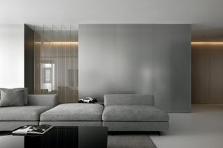
(Image credit: Ouyang Yun)
Clean, ‘rational’ aesthetics and the teachings of Bauhaus inspired the interior of this penthouse apartment in China’s southern city of Chaozhou. The space, also drawing on principles of 20th century minimalism, offers a 270-degree view of natural landscapes in Shantou, Chaozhou and Jieyang. To help direct the focus on this rich, surrounding environment, the architects at AD ARCHITECTURE, opted for a pared down interior, balancing simplicity, reflections and an almost ethereal atmosphere. The open plan arrangement alludes to a generosity of space, while a monochromatic colour palette allows for strategically placed moments of colour to shine.
Soho Loft by Ghislaine Viñas and Alexander Butler Architects
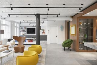
(Image credit: press)
Working with a 2000 sq ft space full of handsome architectural features, such as high ceilings, large windows, beams, this New York artist’s loft was thoroughly revamped by Ghislaine Viñas and Alexander Butler Architects for a local family. Mixing a meticulous restoration of existing elements with a carefully planned colour and material plan, the team drew on the clients’ needs and passions, such as their fascination with Lewis Carroll’s book Alice in Wonderland to populate the interior with contemporary furniture and art. Open spaces meet fun details in a home that feels at once warm and modern.
Psyche by One Space Design
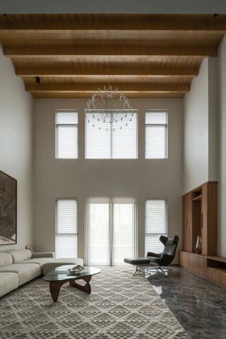
(Image credit: Chuan He / HereSpace)
This generous Chengdu apartment is designed by local Chinese architecture practice One Design Studio. The architects worked with the structure’s tall ceilings to emphasise the sense of space throughout by keeping the decor minimalist, bar some strategically selected pieces of contemporary and midcentury inspired furniture. The architecture team says: ‘The clean and bright living room is matched with simple and advanced soft furnishings, use the bookshelf as a partition to divide the living room and the game room, breaking the conventional space division method, making the space more transparent and bright.’
101 on Cleveland penthouse by Bergman & Mar
(Image credit: press)
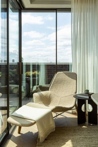
London interior outfit Bergman & Mar masterminded this new collection of penthouses in the UK capital’s Fitzrovia district. The scheme, a high end residential development by Art-Invest Real Estate, ECE and Dukelease Properties, mixes historical design with contemporary bespoke pieces in a look the designers describe as ‘modern bohemia.’ Petra Arko, creative director and founder of Bergman & Mar says: ‘The location of Fitzrovia played an important role in our design for the penthouse at 101 on Cleveland. Informed by the district’s rich history as the home of craftmanship and bohemia, we wanted to create a subtle modern continuation of Chippendale’s appreciation of art and eclecticism by carefully selecting over 40 different furniture designers, artisans and artists to create an inimitable space with a lasting impact.’
SoMa Loft by Malcolm Davis Architecture (MDa)
(Image credit: Joe Fletcher)
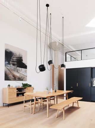
San Francisco based architect Malcolm Davis and his team were approached by a young couple who were looking to update their loft space in an industrial building, now used as live-work units. A distinctive, tall vaulted concrete ceiling with fluted concrete columns led the design towards a pared down, utilitarian interior language. The overall design feels bold and clean, ensuring a calming but strong environment. The mezzanine was extended to its maximum potential, creating space for an additional bathroom upstairs in the primary lofted bedroom area. The space below the extended mezzanine became a home office. Custom steel and fluted glass barn doors provide privacy where needed, in this otherwise flowing, open plan domestic space – an apartment interior design that is balanced to cater to both work and play, contemporary sensibility and serene retreat.
Tribeca loft by Andrea Leung
(Image credit: Sarah Elliott)
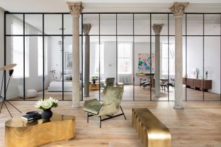
When called upon to renovate a 1600 sq ft historic apartment in New York’s Tribeca, architect Andrea Leung drew on the hidden spaces of her grandmother’s apartment in Vancouver. As a result, she approached the design as a type of cabinet of architectural curiosities, playing with surprises and reflections. ‘As an architect, I thrive on the satisfaction that comes from arriving at elegantly simple design solutions,’ says Leung. ‘But more importantly, it’s the promise of emotions created by beautiful spaces that drives my architecture. I am always interested in how ostensibly static configurations of materials can evoke poetic tensions that speak to our thoughts and memories, that touch upon aspects of our subconscious and prompt reactions we may not necessarily be able to fully articulate.’
Sursock 14ème by Karim Nader Studio
(Image credit: Walid Rashid)
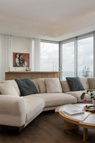
Lebanese architect Karim Nader has recently worked on the careful restoration of this apartment in Beirut, following the devastating explotion there in 2020. Situated within one of the city’s modernist residential landmarks, near the port area, Sursock 14ème is a project that celebrates the building’s original architecture, the region’s sun and the sense of openness it offers. It is also unmistakably contemporrary. ‘I refuse to be labeled as an architect of the generation of war. I do not find interest in architecture as a war machine, nor in the war-torn building aesthetic. Beirut should be architecturally represented as always alive, forward looking, because forward is the way of life,’ Nader has said.
Tableau penthouse by KSR Architects & Interior Designers
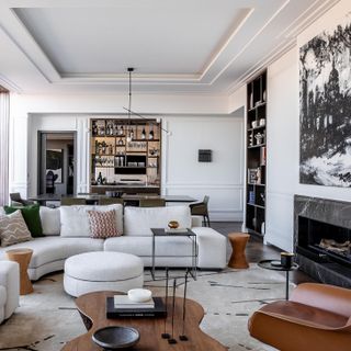
(Image credit: Taran Wilkhu)
This elegant apartment interior design was composed by London based KSR Architects & Interior Designers. Originally the show home in a development of 23 units, now the space belongs to a private owner, who worked with the design team to create a a luxurious yet comfortable interior that blends old and new. The property is located in Marylebone, Central London. Inside, bespoke joinery mixes with statement furniture in an atmosphere that is nothing like the typical ‘blanc canvas’ show home. Instead, dark woods, craft based details, and bags of personality offer a characterful interior for the resident’s life and extensive art collection – which is proudly showcased in the apartment.
Ourânia by Studio MK27
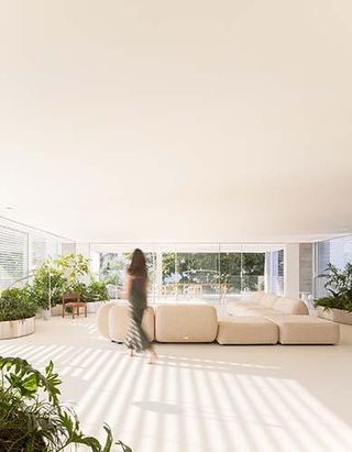
(Image credit: Fernando Guerra)
This boutique apartment building in São Paulo, placed on the edge of the bohemian neighbourhood of Vila Madalena, is the latest urban housing scheme by Idea!Zarvos – the Brazilian developer known for a design-savvy, architecturally led approach. Ourânia, containing just eight apartments within a relatively compact, nine-storey building, is the brainchild of Marcio Kogan and his colleagues at Studio MK27 for this client, and offers contemporary living wrapped in warm, textured minimalist architecture. A combination of quality materials, well-proportioned volumes, and flexibility were key in delivering the Ourânia living experience, a domestic space befitting the 21st century. The architects explain: ‘Its modular structure, an orthogonal grid of concrete pillars and beams, results in completely flexible plans, where each apartment owner could define its layout. The 20 columns are rhythmically positioned in the perimeter of the 48 x 11m plan and, together with a central core that shelters stairs and elevators, structures the building – leaving generous spans to be arranged as desired.’
9 Millbank Heritage Collection by Goddard Littlefair
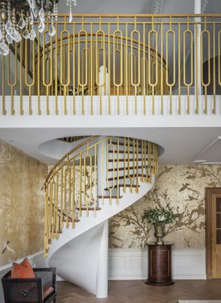
(Image credit: Mel Yates)
Central London, steeped in history and glamour, is no stranger to grand period architecture and chic lifestyle offerings. 9 Millbank is one of the newest kids on this block, but lacks nothing compared to its predecessors. The development is currently under construction, with its final touches set to be added so that it can open its doors to residents fully completed in 2023. St Edward, the developer behind 9 Millbank, has now revealed the project’s latest interiors offering for its top-of-the-range Heritage Collection, a series of five apartments right at the top of the scheme. The development sits within the impressive former headquarters of Imperial Chemical Industries (ICI), a Grade II-listed, majestic structure facing a green park and the river Thames beyond. Long vistas of the London skyline (including glimpses of iconic sights such as the House of Parliament and Big Ben) match the building’s original features and decor, most of which have been lovingly preserved and restored to their former glory. In areas where the original building fabric was too damaged, the architects worked with conservation specialists to create new elements that faithfully maintain the identity of the old.
The Cortland by Robert AM Stern Architects and Olson Kundig
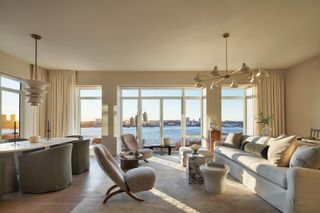
(Image credit: Colin Miller)
Designed by Olson Kundig, The Cortland interiors have been revealed for the first time through a series of photographs that gives a hint of what living inside this finely tuned New York luxury residential development would be like. Crafted inside a building created by Robert AM Stern Architects, this is Seattle-based Olson Kundig’s first multi-family project in the Big Apple – and the practice has employed all its flair, sophistication and well-balanced, rich aesthetic, while drawing on the context and the wider area’s industrial heritage. ‘Because of the materials Robert AM Stern Architects used for the exterior and the way the building is assembled, The Cortland has an almost handmade quality. An urban tower can feel scaleless and oversized, but this is a very human-scaled building, honouring the traditions of New York City and the craft of construction,’ says Tom Kundig, owner and principal of Olson Kundig. The studio is known for an approach that is rooted in craft, tactile materials and function.
Apartment Arluzia by MATÚ Arquitetura
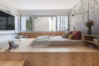
(Image credit: Cris Farhat)
This apartment interior design, in western Sao Paulo, has been designed to serve the needs of a couple and their three cats and two dogs, one of them being visually impaired. The architecture studio behind it, MATÚ Arquitetura, headed by architects Fernanda Lins, Gabrieli Azevedo, Ana Pernambuco and Bruna Marchiori, responded to their clients’ request to create a space where all inhabitants – both human and animals – can feel comfortable. ‘A social area was created with the purpose of meeting the demands of each one: a shelf-playground for the cats, a low and modular sofa to help with the accessibility of the dogs, an office for the resident to work and play guitar, and a large bench, under the window for the resident to have her moments of reading, contemplation and exhibition of some works of art, of affective value,’ they explain. Fun patterns and colours and natural materials make for a warm, playful yet functional home.
Apartment XVIII by Studio Razavi Architecture
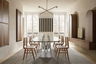
(Image credit: Vincent Leroux)
This Parisian apartment is set on a prominent spot, overlooking the Luxemburg gardens and located in a XVIIIth century mansion. Past owners, lives and extensive remodels over the years left little of the grand home’s original design, so when Studio Razavi was invited to take on the unit’s transformation, the team decided to gut out the apartment completely and start from scratch. ‘This being one of the oldest areas of Paris (the street was recorded as a Roman road) and surrounded by a unique landscape of private buildings, churches, convents, squares, our inspiration drove us to envision a monastic space. Natural light was our material of choice (it comes in from three different directions) and the quality of the building could be expressed inside by generously celebrating the load bearing walls and columns, highlighting their materiality furthermore by applying a plaster stucco against which the light would bounce,’ they explain. A restrained material palette adds to that effect and helps compose a space full of sophistication and subtle drama, furnished with a mix of modern and vintage pieces.
Celerina penthouse by NENMAR
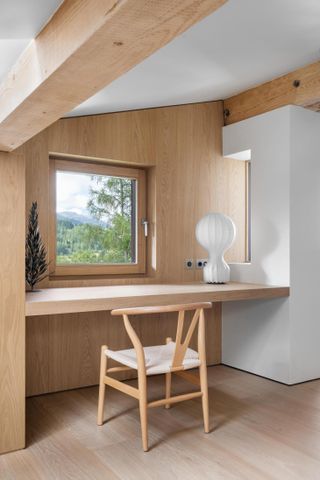
(Image credit: DSL Studio)
Bespoke joinery, a blend of old and new, and a touch of Brazilian modernism help make the most of this penthouse apartment interior which has just been renovated to a design by NENMAR. The project, set in Engadine, in the Swiss Alps, was transformed by the multi-disciplinary practice, which was formed through the union of GN Architecture and Maresca Interiors. The design team approached the space in the same way they would boat design – making sure every corner adds something special to the interior, everything is functional and custom made cabinetry and hidden storage ensure the penthouse kicks well above its weight, in spatial terms. As a result, fixed furniture and soft furnishings are made to measure everywhere. At the same time, natural materials, such as knotless natural oak in water-based finish, Matraia stone and limestone render, create a warm, earthy feel for this domestic, mountain cocoon.
The Great Unit apartment by K.O.T. Architects
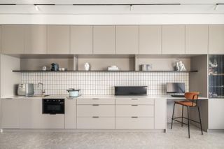
(Image credit: Peled Studios – Yoav Peled)
Functionality and a contemporary take led the redesign of this apartment interior on the outskirts of the Florentin neighborhood in Southern Tel Aviv. Set in a 1938 building that forms part of the city’s well documented legacy of modernist architecture, the space was addressed as a ‘living machine,’ say the architects. ‘I appreciate comfort. In general, I believe in clear statements: clear and defined spaces in context, without whimsical and presumptuous elements that do not serve the client’s interest,’ explains architect Kfir Galatia-Azulay of K.O.T. Architects, who led the project. By removing internal walls and partitions and opening up the space, the refreshed home is now improved through the abundance of natural light and a series of bespoke elements, such as a new, tailor made kitchen. A minimalist apporach to colour – using mostly white, off-white and black veneer details – underlines an overall feeling of calm.
Campo Grande Apartment by FCstudio
(Image credit: Pedro Kok)
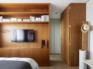
Set in Brazil’s city of Campo Grande, this modern apartment interior design is the result of a commission to transform an existing unit’s living areas into a generous, flowing space full of spatial luxury and craft infused detail. FCstudio, the Sao Paulo based practice of Flavio Castro, worked on cleverly uniting parts of the house and partially repurposing its terrace in order to create the sense of a much larger living and dining room. Furniture was selected by Castro’s team too, while many of the fittings and some of the lose pieces too were bespoke creations by the studio. ‘In this project, we translated the client’s passion for design into architecture, without forgetting functionality and the charming view of the city park in front of the apartment,’ say the architects.
Moscow apartment by Nido Interiors
(Image credit: press)
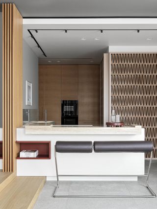
This brand new apartment interior by Moscow based firm Nido offers a 21st century renovation that updates an existing unit in the Russian capital. Using clean shapes, neutral colours and quality materials the interiors team worked with textures and architectural shapes to dramatic effect – that is at the same time subtle and soiphisticated. ‘A large monolithic travertine stone sink element extends through the wall near the terrace entrance while the corner opposite to the kitchen island is decorated with Mutina blocks designed by Patricia Urquiola. The furniture textures are smooth, soft and natural with warm color palette – terracotta and sandy shades are a constant reminder of traveling to distant places and endless beaches,’ the team says.
Los Angeles penthouse by Dan Brunn
(Image credit: press)
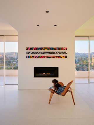
This minimalist apartment interior design in Los Angeles is the brainchild of local architect Dan Brunn. The generous, some 5000 sq ft space is the result of uniting two adjacent unit into one, streamlined, flowing home. The client, a property developer and yoga enthusiast, asked for an atmosphere that is calming and functional. Brunn, a deft hand in minimalist architecture of the greatest attention to detail, obliged and crafted an uncluttered interior guided by light and volume. Decor and material choices were also critical to the overall approach, as were details such as the smooth white cabinetry of the Boffi kitchen and the DePadova furniture selections. ‘The use of a clean and light palette of materials such as: white terrazzo, white cabinetry, and white wood are ultimately what sets the simplistic and modern style for the entire unit,’ the architecture team explains.
Bleecker Street by Tala Fustok Studio and Crina Architecture
(Image credit: Isabel Parra)
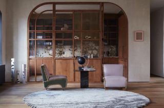
‘What makes this apartment so striking is the blend of artistic influences and natural materials that create layers of intrigue and beauty, designed to engage the senses,’ says designer Tala Fustok. The project is a Manhattan apartment in the West Village, which has been artfully redesigned in a loft-style, drawing on the residential building’s industrial heritage. Pops of colour, different textures and a mix of old and new (such as the reclaimed walnut flooring) make for a dynamiic, yet warm and homely composition. Fustok collaborated on the design with Crina Architecture. ‘[We wanted] engage the imagination against a beautifully layered architectural backdrop, and encourage thoughts of restfulness and calm,’ says Crina Arghirescu Rogard. Natural light and bespoke touches contribute to the overall atmosphere.
Neuilly Project by Sandra Benhamou
(Image credit: Gaëlle Le Boulicaut, Cyrille Jerusalmi)
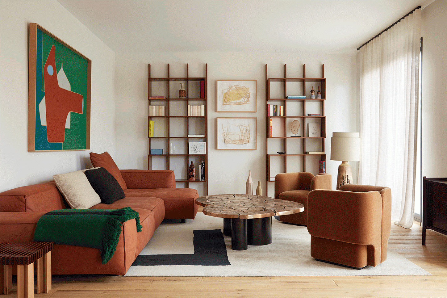
This Parisian home is an apartment interior design for a couple of art and design collectors. The 120 sqm apartment, which is set within a 1970s building opposite the green area of Bois de Boulogne in western Paris, has been reimagined as a flowing, open space – almost like a single room. This is divided into volumes defined by usage and decorative composition. ‘A kitchen opens into a living room on one side; and [there are] two rooms with their own bathroom on the other side,’ the design team explains. ‘The bookshelves, kitchen and wardrobes are all made bespoke in natural wood and give a graphic style through their lines.’ Warm colours and textured materials, such as wood and leather, work towards a rich interior, featuring pieces by Living Divani, Gianfranco Frattini, Knoll and Benhamou herself – among others.
The Penthouse of the OPUS ONE by T.K. CHU Design
(Image credit: Di Zhu)
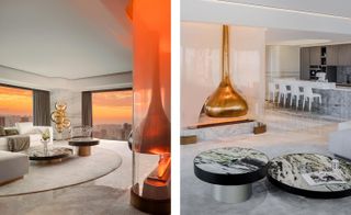
This striking penthouse sits on the 34th floor of OPUS ONE, a mixed use complex in China’s Hangzhou, which was spearheaded by two local developers, Excellence Group and Greentown China. The eye catching design, which mixes luxurious materials, calming neutral tones and intense colour pops, was composed by T. K. Chu Design, the Shanghai based firm led by interior designer T. K. Chu. The white-dominated interiors were conceived as a nod to the clouds, a feature frquently spotted from the large, floor-to-ceiling openings at this home, along with the apartment’s panoramic views of the Qiantang River and the West Lake. Back in the penthouse, playful furniture from designers such as Alessandro Mendini and Jaime Hayon, mixes with contemporart art pieces, incuding a sculpture by Tengfei Yang by the window.
The Opus Arisugawa by OEO
(Image credit: press)
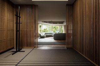
This contemporary apartment interior is the brainchild of Danish design studio OEO and sits within an upscale housing complex for developers ReBITA and NTT Urban Development Corporation in Tokyo. The scheme, set in a central, relatively low-rise luxury residential area, rich with greenery, contains several apartments. Each of them has been designed by a different creative studio. OEO was responsible for apartment number 302, which they composed merging modern Danish style with Japanese influences, full of natural materials and bespoke joinery.
Palm Penthouse by Kart Group
(Image credit: press)
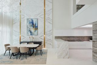
The client asked for ‘a cosmopolitan multi-functional sophisticated living space that embraces family living and serves as an exquisite space for various social functions,’ explains the Dubai based team at Kart Group, the designers behind this minimalist interior design in a petnhouse in The Palm Jumeirah development. Playing with the regions light, the client’s requirement for a modern, confident space fit for entertaining, and a colourway that draws inspiration from the Arabian Gulf’s sea views beyond, the design team personalised this 462 sq m home to perfection. ‘The colours artistically reflect the Palm’s influence and bring the splendour of the outside in. The main design feature is the full height marble walls with two brass ornaments vertically recessed with a hidden light that naturally creates an inspiring piece of art. A three-dimensional mandala in a white textured finish adds a sense of drama and intrigue to the sitting room,’ the design team explains.
kartgroup.net
Natural Modern Home by Henkin Shavit Studio
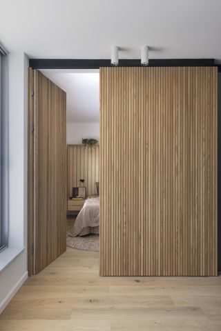
(Image credit: Assaf Pinchuk)
Henkin Shavit Studio spearheaded the redesign of this apartment interior in Tel Aviv. The main concept was built around the ida of a retreat – domestic have away from the city’s bustle. The designer’s solution was to treat ‘the existing apartment as a box that wraps with its outer walls an inner box which creates the feeling of detachment, gently using the element of wood partitions.’ Warm timbers can be found throughout the interior, creating a cocooning feel. At places, oak wood panelling features vertical grooves, creating a rhythm but also a sense of verticality that highlights the tall ceilings. Details such as creating an additional bathroom, selecting natural materials and carefully picking furniture, such as the dinning area’s 1950s vintage Hans Wagner chairs, help fine tune this apartment interior design.
henkinshavit.com
Third Avenue by Studio 397 Architecture
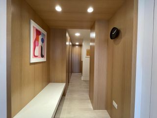
(Image credit: PNR50MM)
Architecture studio principals Samantha Josaphat and Luis Medina’s expert handling of the renovation of an apartment in New York’s East Village resulted in a residential space with a cohesive, flowing interior. The Studio 397 team worked with their clients, a family of four, to brighten up the space and maximise its potential in design quality and storage. Bespoke joinery and customised touches throughout offer a tailor made feel and neatly responds to all of the client’s needs. Light colours and crisp surfaces create ample sense of space, composed of oak wood and veneer, off white paint and lacquered cabinets. ‘We are passionate about live/work spaces and creating the ultimate oasis on a single property,’ says Josaphat.
studio397architecture.com
Casa Sanchez by Studio Plow
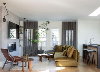
(Image credit: press)
‘For this Mediterranean-inspired refresh of a two-level flat situated just blocks from Mission Dolores Park in San Francisco, we focused on using a light touch to enhance the existing interiors without making massive architectural changes,’ recalls Studio Plow founder Brit Epperson. ‘It was the family’s first home, and while they loved both the views and the layout of the 2000 sq ft home, they did not love all of the elements left over from the previous owners.’ The studio focused on infusing warmth and colour into the minimal and cold shell of the space. The design draws on the client family unit’s mixed heritage – combining North America’s Great Plains and Mexico City. Plow used soft textures and raw materials, as well as bringing the outside in with an abundance of plantlife.
studioplow.com
Opéra Garnier duplex by Louis Denavaut
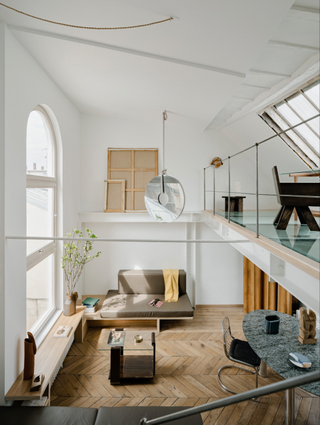
(Image credit: press)
Interior architect and designer Louis Denavaut is behind this chic refresh of a Parisian duplex apartment near the city’s famous Opéra Garnier. Owned by two artists, the apartment is now flooded with light, its double height living room offering a striking sense of spatial generosity. A white steel mezzanine with a glass floor and a large bleached oak-frame window inserted above makes the most of the high ceilings, and hosts the master bedroom. Here, modern touches blend with the building’s Art Deco original character.
louisdenavaut.com
Casa PMA by Patricia Martinez
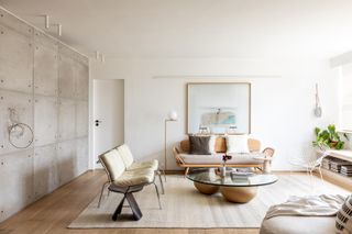
(Image credit: Fran Parente)
This Brazilian apartment was created by Patricia Martinez Architecture Studio for the practice founder’s own use. The primary goal was to create a cozy and relaxing domestic environment that would transform the home into a moment of calm – a restorative space for relaxing and recharging. Indeed, the interior is dominated by calming colour tones, natural materials and soft lines; offset by a gentle rawness provided by crisp timber floors and smooth exposed concrete walls. Researching and combining vintage and contemporary furniture pieces, this apartment interior design is a labour of love. ‘We don’t need much, I believe we just need items that relate to us,’ says Martinez.
patriciamartinez.com.br
Apartment in Udine by Cristina Celestino
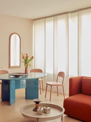
(Image credit: Mattia Balsamini)
Architect and designer Cristina Celestino has just revealed the complete remodel of a private residence in a striking, brutalist concrete apartment block in Udine, Italy. Originally designed in 1978 by architect Bodini Massimo Camillo, the building features expansive apartment interiors with private balconies, bronzed aluminum windows frames, travertine stone clad communal areas and pink, textured plaster in the stairwells. Spaning some 120 sq m, this home was redesigned to respond to the existing materials and original architectural concept, Celestino explains. ‘I tried to enhance all these aspects, respecting the materials and taking inspiration from the existing geometries. The customer requested a functional home, sober but elegant and refined, with a balanced and thoughtful use of colors and materials.’
cristinacelestino.com
Encino Negro Apartment by dıreccıon | arquitectura + interiores
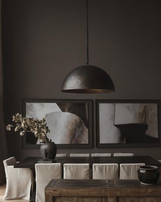
(Image credit: Fabian Martínez)
Created for a family of five, this apartment redesign is the brainchild of Mexican architect Mariana Morales, and her studio Direccion. ‘Before remodeling the condo felt cold and empty, it had finishes of red tzalam wood and gold Tepeji marble on bare white walls, and there was a lack of privacy and independence between the different living areas,’ Morales explains. ‘In the new layout, private and common areas are markedly separate and independent from each other, and the use of a darker palette of materials and colors accentuates the new found cozy and intimate charm of each space.’ Working with a simple, chic, dark colour palette, the architect created an atmospheric, yet warm interior, which is juxtaposed by the bright lights and cityscape offered by the large windows and expansive views of Mexico City.
direccion.mx
KOA Apartment by Marty Chou Architecture
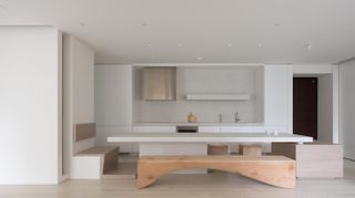
(Image credit: Kyle Yu)
A 3.5m long bespoke countertop becomes the main centrepiece in this newly designed apartment interior in in Taipei City, Taiwan. The piece serves as a multifunctional table, from formal dining place, to kitchen island and anything in between. Created by the architecture studio of Marty Chou, the project sought to unite functionality that can negotiate the demands of daily family life, and minimalist, contemporary, multi-functional design. The highly tailor made interior works hard to cover the young family’s needs. For example, its series of recessed windows not only bring lots of natural light in, but also transforms into private sleeping quarters when closed off with a partition at night.
martychou.com
Quesnel Apartment by naturehumaine
(Image credit: Ronan Mézière)
Part of the ground level of a 1920s building located in the Little Burgundy neighbourhood of Montreal, this apartment interior design is the work of Canadian architecture studio naturehumaine. The project, commissioned by a local family, aimed at opening up the previously dark interior with mininalist gestures, while reconnecting the space with its garden and bringing in plenty of natural light. The intervention not only preserves the original character of the building and several of its existing decorative features. It also draws on them to create new, bespoke elements, such as ‘the curves of an arch, the fluting of the columns and cast iron radiators or the colored stained glass doors,’ the architects explain.
naturehumaine.com
Sun Dial Apartment by Manuelle Gautrand
(Image credit: Gaelle Le Boulicaut)
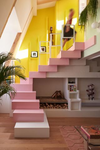
This Parisian project involved the major refurbishment and redesign of a duplex apartment in the city’s picturesque Le Marais district. This is the well known French architect Manuelle Gautrand’s very first private apartment interior design project. A bespoke, colourful staircase becomes a key centrepiece in the concept, which combines clean surfaces and the owner’s rich collection of art and decorative items. ‘The goal was to create a strip of natural light, through which the sun, whether it be cold white winter light or warm summer, could cast its shadow and influence the interior experience, upstairs and down, throughout the day,’ says Gautrand. ‘A traditional staircase would have interfered with the continuity of this strip of sky and so I began playing with the relief that these 20cm thick pieces of cellular concrete would make and the stairs came out of this. Then I decided to make it even bigger, so that it extended up the wall of the mezzanine and onto the wall under the skylight.’
manuelle-gautrand.com
Apartment ACL by Arthur Casas
(Image credit: Fran Parente)
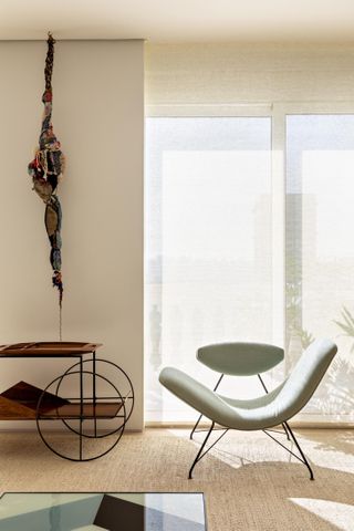
This lush Brazilian apartment was designed around the client’s art collection. Crafted by famed interiors architect Arthur Casas from his Sao Paulo headquarters, the project is set in a modern apartment block and was created as a collaboration with Cristiane Trolesi, from C+AD Arquitetura e Design. Meanwhile, the interiors were conceived jointly by Casas and the owner – they are ‘a longtime friend of the studio,’ explains the architect. ‘The biggest challenge was to simultaneously meet the demand for free walls for works of art, for shelves to house decorative objects and for generous environments, with wide spans and an adaptable layout,’ says the design team. ‘The solution was to extend the apartment’s social area and optimize the existing and new walls as much as possible.’
arthurcasas.com
The Independent Penthouse by Urbanspace Interiors
(Image credit: Sophie Epton)
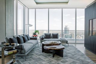
Set in the heart of downtown Austin in Texas, USA, this penthouse combines generous space, striking city views, a modernist simplicity and natural materials and textures that give the expansive apartment interior swathes of personality and a tactile feel. ‘Our focus was on creating a space that felt expansive, yet intimate,’ explains Urbanspace Interiors principal Merrill Alley. ‘When you’re standing in any area of the home, the openness gives the illusion that you are floating up in the clouds, and when you turn inward, the focal points found throughout the space are appropriately appointed to the size of the space to make a statement while still feeling intimate.’
urbanspaceinteriors.com
Bard College Berlin Student Residences by Civilian
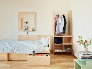
(Image credit: Robert Rieger)
Great apartment interior design doesn’t always mean lush penthouses and private residences. Created by dynamic and emerging architecture and interiors firm Civilian, these are the new student apartments at the campus residences for Bard College in Berlin, Germany. Inspired by the city’s rich design legacy and modernist architecture, the team composed a series of spaces that feel fun and contemporary but also work hard and are highly functional. Opening to their first residents this month, for the new academic year, each unit features sleek bespoke joinery designs in warm, natural timber colours – while brighter hues dominate the communal areas.
civilianprojects.com
Mexico City Penthouse by Simon Hamui
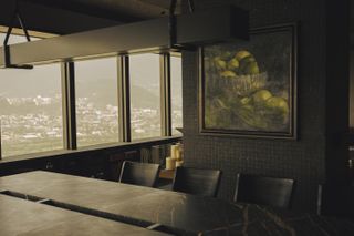
(Image credit: Victor Stonem)
Moody, dark chocolate woods and rich leathers dominate this luxurious apartment interior in central Mexico City. Crafted by Mexican design firm Simon Hamui, the space balances warm and bespoke apartment interior design with long views of the cityscape, areas that ensure privacy, and plenty of space for the clients’ art collection. The modern domestic interior is enriched by a range of custom pieces created especially by the Simon Hamui team. They include a bespoke dining table, a silver leaf ceiling, a stylishly curved door, fa ireplace, and bookcase joinery.
simonhamui.com
Memories for Cruising by Antonino Cardillo
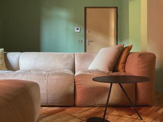
(Image credit: press)
This renovation of a 100 sq m apartment in Parma, Italy transformed what was a tired interior near the city’s station, into a modern feast of colour and light. Designed by architect Antonino Cardillo, the project had a limited budget, but what it may lack in scale, it makes up in creative ambition. Colour zones define various areas and functions in the flat, some discrete, some overlapping. The colourful architecture spans muted greens, yellows and reds, natural wood and MDF doors in an eggshell finish. Drawing on the colours of nature, ‘the theme of the design is the metamorphosis of plants,’ explains Cardillo.
www.antoninocardillo.com
Mota Apartment by Flavio Castro
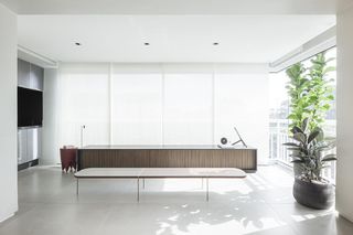
(Image credit: Pedro Kok)
Created for a businessman and his family in São Paulo, Brazil, this contemporary apartment is the work of the local architecture and design studio of Flavio Castro. The space effortlessly combines modernism and minimalism, in a blend that feels generous and elegant, but not too precious, and as such, fit for everyday family life. Taking down walls and opening up spaces and views were essential in the architect’s approach. Bespoke furniture and details abound, including a large horizontal panel of freijó wood that enriches the living space, and a bookcase that divides that space from the entrance hall, and serves as a tailored display for the owners’ personal collection of objet.
fcstudio.com.br
No.1 Grosvenor Square by Lodha UK
(Image credit: Billy Bolton)
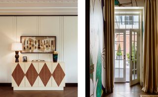
No.1 Grosvenor Square is one of London’s most recognisable addresses – formerly the home to the American Embassy in London and neighbour to the later US embassy home by modernist architect Eero Saarinen at 24 Grosvenor Square. Now the prestigious historic London building at No.1 Grosvenor Square is being reinvented as residential, with Eric Parry Archtiects overseeing the architecture and more design work unfolding inside by globally acclaimed firms. The transformation includes this newly revealed apartment interior design by developer Lodha UK’s expert design team. The building’s past life was a huge inspiration to Blandine de Navacelle, Lodha UK’s creative director, who oversaw the works. ‘In its past life as an embassy, the building would have hosted many a party and evening soirée,’ she says. ‘Grosvenor Square has also long been the centre of London’s social set; Oscar Wilde used to live on the square and was infamous for his parties. I wanted Residence 4.3 to nod to this, and to create the perfect place to entertain. The apartment, in terms of proportion and layout is a tribute the 18th century European lifestyle, where people wanted to host big parties and display their art collection.’
www.lodhagroup.co.uk
Residence 0110 by Raul Sanchez
(Image credit: Jose Hevia)
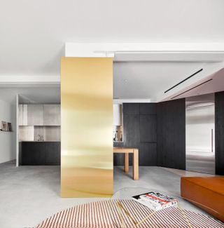
Spanish architect Raul Sanchez has a knack for creating striking, geometric worlds that come alive with shapes and colour, and nowhere is this more evident than in his latest residential space – an apartment interior design in Barcelona’s Poble Nou neighbourhood. The project, Sanchez’s own home, is a modest apartment containing four main rooms within a chamfered floorplan. Using simple geometric shapes, the architect creates complex environments clad in raw materials, such as exposed concrete, dark stained oak, brass and stainless steel. Textures play an equally key role in the composition. ‘[The materials] form a sober and elegant universe, but at the same time offer playful and fresh counterpoints, reflective and matt, smooth and rough, simple and complex,’ says Sanchez.
raulsanchezarchitects.com
Grenelle flat by Studio Vincent Eschalier
(Image credit: Studio BCDF)
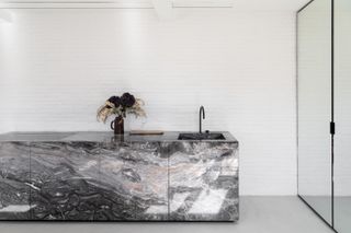
This Parisian apartment created by Studio Vincent Eschalier is composed around an all-encompassing lightness and openness. The apartment interior design sits in the 7th arrondissement and draws on the sense of sobriety and minimalism of the area’s ‘art gallery and luxury retail,’ explains its creator. Located on the fourth storey of an apartment block, the space is a skilful mix of raw and refined materials – so, stainless steel and wood sit side by side with marble, terrazzo and travertine stone. An open plan arrangement, mirrors and light colours as well as the apartment large openings, help enhance the sense of space throughout.
vincenteschalier.com
Jaffa Roofhouse by Gitai Architects
(Image credit: Dan Bronfield)
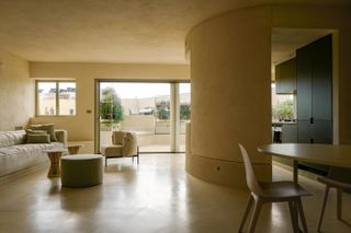
A brand new penthouse interior located in the ancient port of Jaffa, Isreal, this minimalist architecture space is the brainchild of a team: it was designed and co-curated by Gitai Architects and Isabelle Wolf, and built by architects Ben Gitai and Charly Chrochu. The open, generous living space’s interior is defined by a large, curved earth structure that hides within two bedrooms, a dressing area and bathrooms. This feature is made from compressed soil and straw with earth plastering. Its earthiness is complemented by neutral, soft colours throughout the apartment, creating a calming overall composition.
gitaiarchitects.com
Biscuit Loft by OWIU
(Image credit: Justin Chung)
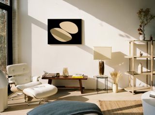
A Japanese-inspired apartment design in Downtown LA’s burgeoning Arts District, this is the work of emerging architecture studio OWIU, headed by Amanda Gunawan and Joel Wong. Drawing on the principles of Ryokan (a type of traditional Japanese inn), the interior design transformed an old industrial space – as its name suggests, an old biscuit factory, from the 1920s – in a two bedroom, calming urban haven. Working with the building’s existing historical bones, the architects worked on a palette of natural materials and neutral colours, and an uncluttered aesthetic that favoures key furniture and art pieces that are also practical.
owiu-design.com
Botzaris by Ariel Claudet, Dechelette Architecture
(Image credit: Cyrille Lallement)
This 90 sq m apartment has been re-imagined by its author as a cross between a living space and an art gallery. Designed by architect Ariel Claudet and located in a post-war late modernist building facing the Parc des Buttes-Chaumont in the XIXth arrondissement of Paris, the interior is defined by its clean, pared based treatment. Created for an artist, Sara Naim, the space consolidates many uses – it is a home, a studio, a gallery space and an archive. The architect worked in close collaboration with his client to craft a collaborative space that is entirely fit for purpose and tailored to its resident’s needs. ‘The white walls of the gallery space unfold and stretch out to all rooms,’ says Claudet. ‘Sara Naim’s artworks break out from the studio and spread out freely on the wall surface of the entire home.’
arielclaudet.com
DN apartment by Bruno Carvalho Arquitectos
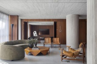
(Image credit: Denilson Machado)
This clever apartment interior redesign of a unit within a 1970s residential block in Sao Paulo’s Jardins neighbourhood, is the brainchild of local architecture and design firm BC Arquitectos, headed by principal Bruno Carvalho. Drawing on modernist architecture influences and minimalist poetry, the space uses exponsed concrete and dark timber cladding to compose a tactile and warm interior. The timber’s natural walnut hues shine through against the roughness of the concrete, granilite and cement mixture around it. The furniture collection uses works by Brazilian modernist masters.
brunocarvalhoecamilaavelar.com.br
Bankside Loft by EBBA
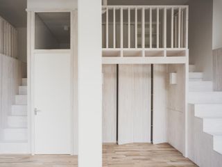
(Image credit: Lorenzo Zandri)
This apartment renovation in London’s Southbank area is designed by emerging architecture studio EBBA, headed by architect Benni Allan. Bankside Loft was conceived as an open-plan, smart interior. It cleverly makes the most of a relatively compact surface, while creating an impact through its overall aesthetic. To achieve this, two mezzanine spaces were created either side of the apartment block’s structural frame, which was stripped back and is now visible in the unit. Underneath the mezzanine areas, the architect placed the kitchen and bathroom. The mezzanines, which feel spacious and comfortable due to the original concrete structure’s especially high ceilings, house a bedroom and a study. The pine wood used for the joinery is treated with a white stain, creating a minimalist, yet soft effect in the apartment interior.
eb-ba.co
Florfield Road Penthouse by Common Ground Workshop
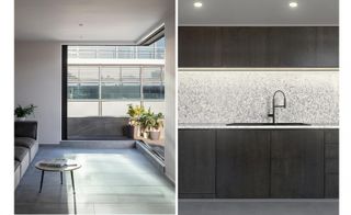
(Image credit: Luca Piffaretti)
Transforming an unassuming, contemporary residential block’s top level into a sleek and open, modern penthouse, this project is the brainchild of young and dynamic architecture studio Common Ground Workshop. The space, which is situated in the heart of London’s Hackney, is now wrapped in zinc cladding. It features smooth, high-quality materials inside and makes the most of the property’s large windows and sliding glass roof-terrace doors. Instilling spatial flexibility to this two-bedroom apartment, the architects favoured flowing, open-plan spaces, for both living and working. Quartz and timber surfaces, concrete-effect floor tiling and a frameless glass balustrade make for a minimalist, contemporary material palette.
commongroundworkshop.co.uk
House by the Bailucchi by llabb
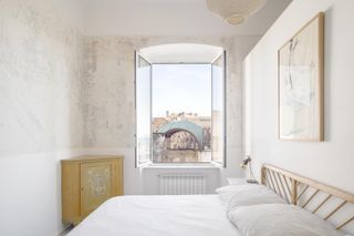
(Image credit: Anna Positano, Gaia Cambiaggi / Studio Campo)
Designed to be flooded in Mediterranean light, this apartment interior in the northern Italian city of Genoa was designed by Luca Scardulla and Federico Robbiano of local architecture studio llabb. The concept combines a contemporary approach with the existing building’s period details. The property spans two floors and the architects focused on opening it up in order to allow light to travel to every corner. They also wanted to connect the two levels in a visually meaningful way. As a result, a dramatic staircase links everything together, with continuity ensured by a minimalist palette that mixes white plaster, exposed period features and sleek modern fittings, such as window frames and radiators. The owners, an international couple working in the creative industries, especially appreciate the craftmanship displayed in the construction and details (Scardulla and Robbiano originally established their business in 2013 as a carpentry workshop).
llabb.eu
Home for the Arts by i29
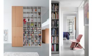
(Image credit: i29 / Ewout Huibers)
This striking apartment interior is located in a contemporary building in the former industrial area of northern Amsterdam. Conceived for clients – an art collector and a writer – who were very involved in the design process, the interior occupies a spacious, double-height unit. The architects, i29, completely gutted it to redesign from scratch. The architecture studio took the clients’ collection as a cue. ‘To display the enormous collection of art in the ultimate way was our starting point, so we designed double-height open cabinets to store most of the extravagant art pieces,’ say the design team. As a result, the apartment interior appears clean and minimalist, and features high-end bespoke joinery, including plinths and an impressive, tall bookcase. The last conceals a staircase, leading to the sleeping areas above the main, open-plan living space – which has a gallery feel, allowing the artwork to take centre stage.
i29.nl
Icon Wood House by Henkin Shavit Design Studio
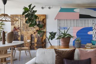
(Image credit: Assaf Pinchuk)
This clever apartment interior design sits within a 1960s concrete residential building in Tel Aviv. When the client, a family of four, purchased the space on the 12th floor, the apartment was divided by three long and narrow rooms in a layout that felt dated and unwieldy. They came to local architects Henkin Shavit Design Studio to transform the interior into a bright, unified and contemporary home. The architects tore down nearly all the partition walls to reveal a generous, open-plan area. This contains a number of functions. It includes the living room, a kitchen, a spacious work area and the children’s room, playfully placed within a freestanding, timber, house-shaped structure. The parents’ bedroom, bathroom and a guest bedroom are situated off it, slightly separately. A neutral material and colour palette of greys and whites, timber and concrete, ensures the furniture and the daily life within the apartment become the highlight of this home.
henkinshavit.co.il
Apartment BDD, Jean Benoît Vétillard Architecture
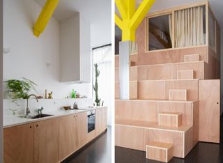
(Image credit: Giaime Meloni)
Apartment BDD by Jean Benoît Vétillard Architecture transforms an open-plan apartment with an ‘open valley’, a steep arrangement of storage and steps that leads up from the kitchen and dining space to two sleeping pods tucked away on the upper level of a double-height space. Working within just 60m2, the architects have somehow managed to create three sleeping areas (two upstairs and one below, in the heart of the ‘mountain’), a modest shower room and separate WC. ‘This is a generous, luminous shared space,’ the architects say, ‘with no walls, just surfaces that can be walked on. The project is the total transformation of an apartment that’s also like a change of life.’
jeanbenoitvetillard.com
Additional writing: Jonathan Bell
Barbican apartment, Takero Shimazaki Architects
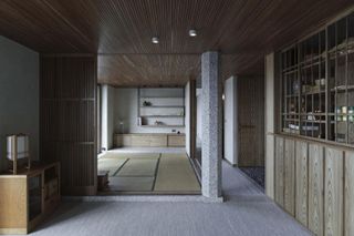
(Image credit: Anton Gorlenko)
Takero Shimazaki Architects’ project for an apartment interior design within London’s Barbican makes the most of the Shakespeare Tower’s cluster of three long, linear apartments on each floor. By extending the living/dining space and removing internal walls, t-sa has created a spacious sanctum for clients who have spent many years in Japan. Shimazaki worked with lead designer Haruka Nogami, Edward Pepper and Giacomo Pelizzari to find an approach that melded traditional Japanese architectural language with the Barbican’s familiar palette of brutalist concrete and heavy timber. Taking inspiration from early Japanese Modernism – in particular the work of Seiichi Shirai – t-sa’s design pairs light timber screens, tatami mats, stone pebble flooring and a terrazzo column inserted into the main living space to act as a ‘bridge between the two conflicting languages of this interior architecture.’ Shirai often deployed the column as an ordering device and here the whole plan pivots off this central point, which cleverly retains the original galley kitchen and bathroom layout while maximising the visual distances available. Carpets are soft and grey to match the existing concrete, while the timber slats, screens and cladding is a warm counterpoint to the original heavy wood window frames. ‘The resulting architecture does not belong to Japan, to classicism nor any specific time,’ says Shimazaki, ‘It is a site and client-specific architectural dialogue in language, tradition, renovation and ultimately, a spatial drama that is borne out of a gentle, yet conflicting encounter of language of the details in a small universe, inside a tower in London.’
t-sa.co.uk
Additional writing: Jonathan Bell
Athens Apartment by Point Supreme
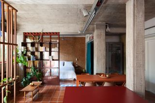
(Image credit: Yiannis Hadjiaslanis)
An unfinished, lower ground level apartment in an existing block of flats in the sleepy neighbourhood of Ilioupoli, Athens, coming in a fairly compact size – just 56 sq m – and a small budget for a residential redesign, may not seem like the most exciting commission at first glance; but architecture studio Point Supreme’s Konstantinos Pantazis and Mariana Rentzou beg to differ. The architects composed a design that feels a world away from your typical apartment interior. Embracing the existing space’s rawness and the structure’s exposed concrete, the Pantazis and Rentzou worked with a range of different materials and textures to create a tactile, playful, largely open plan home. Timber and glass partitions separate various uses and heavy, brightly coloured curtains add privacy where needed. The architects employed their signature approach of uniting different styles and often, seemingly mismatched features into a coherent, unexpected whole. Now, the redesigned space includes from wood to steel, fabric and salvaged cotto ceramic tiles in a variety of colours and shades. ‘[The tiles] were typically used during the 1970s in holiday homes throughout Greece to cover exterior surfaces such as verandas and porticos next to gardens,’ the team explains. ‘Their roughness complements ideally the roughness of the concrete, and is reminiscent of an earthy surface.’
pointsupreme.com


