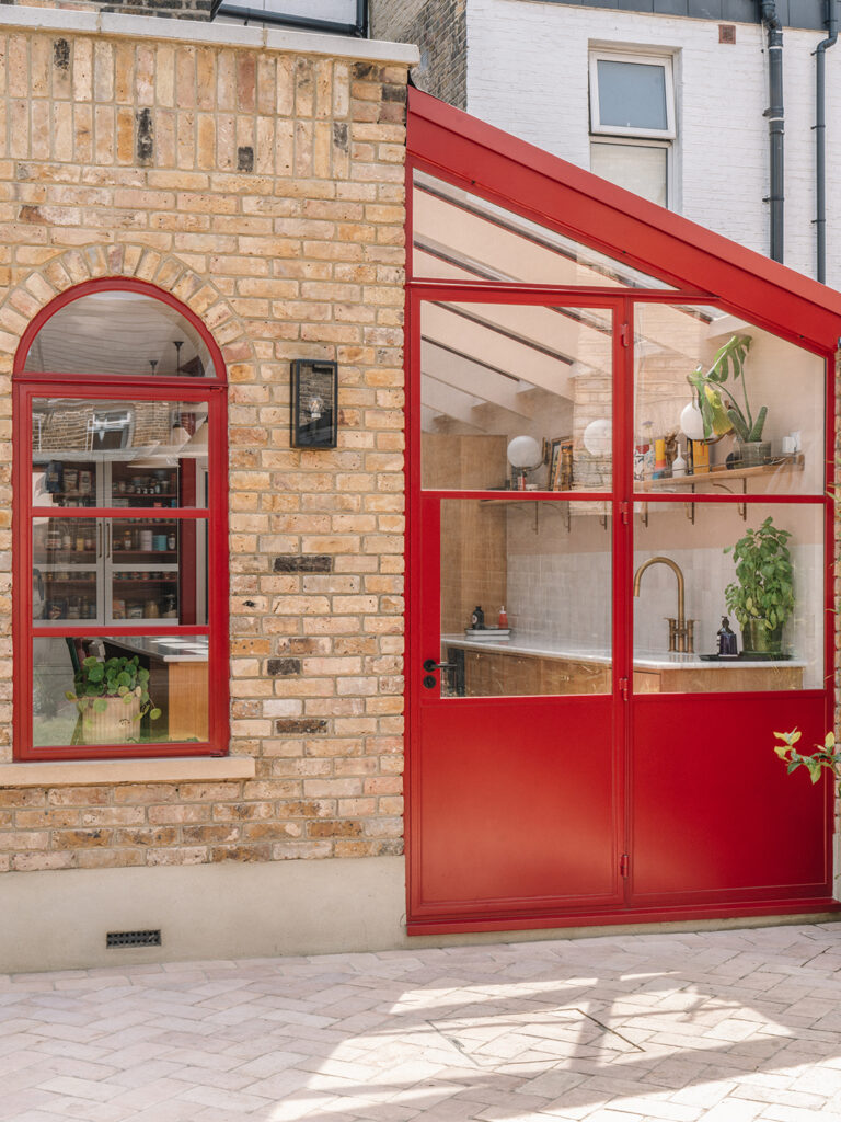
When it came to renovating the sub-optimised kitchen in her East London home, architect Mel Backes knew she wanted a light-filled, garden-room-style extension with arched windows. She spent two years between paid jobs tweaking the kitchen's proportions. But what about the interior? Mel admitted she needed help. “Architects think they can design anything. Sure, if I wanted a plywood kitchen, I could have done that,” she explains. “But I wanted it to be cosy, warm and fun. I was afraid it would end up looking like a box at the back of the house.”
That's where neighbor Laura Parkinson, the budding interior designer at Palmer & Stone, comes in. Parkinson had previously employed Mel on her own structural renovations, so the two naturally blended skills, and Parkinson's understanding of flow and furniture planning set Mel's designs apart. Upon seeing Mel's initial blueprints, Parkinson's first suggestion was to move the row of kitchen cabinets to the opposite wall, so that the dramatic windows would be on full display from the moment you entered the room. But she had plenty of other careful considerations in store.
Plan your mood from the start


Mel had the plans down so well that she knew how long the dining table needed to be before construction began, which allowed Parkinson to plan exactly where to place task and accent lighting, each on its own separate circuit. “Creating a little ambience or nook was something that Mel and I were really keen on,” says the designer.

Music is also important to Mel and her husband, Bev, but they didn't want to take the chance on an integrated sound system, which can be unstable, so they opted for syncable Alexa speakers. One often sits on a small shelf in the dining nook, where scented candles are placed for quieter evenings.
Choose a color that shines brightly in the sun


Mel wanted to highlight the new windows and exposed steel, and what better way to do that than to add an unexpected splash of colour? Bev was totally on board, saying “if you're going to use colour, use colour” – and that's where Mel's RAL charts came in.

They chose Ruby Red (Ral Colour 3003) for all the steel and Farrow & Ball's Rectory Red for the woodwork, which matches well with the setting plaster on the ceilings and skirting boards. “Bev wanted a lighter colour but it really stands out when the sunlight comes in. It's a liveable colour,” Mel declares.
Open shelves for an artistic look


It was Parkinson's idea to divide the cubbies into open shelves for the family's coats and shoes, but it was Bev who suggested making the shelves heart-shaped: “The builders said it looked like a bum or a breast; we got comments from a couple of people,” Mel says, chuckling. Alongside a shapely opening for the built-in dining banquette, there's further open storage for table linens and toys, providing another opportunity to play with colour.
Mel's favourite detail is the pantry cupboard with grooved glass doors. “They're purposely shallow so you can immediately see what's in there,” she says. “When we moved, we found things that were five years old because they'd been pushed to the back.”
Chopping while watching the game – and cleaning up

Bev is the cook in the house, so his number one request for the kitchen was a TV to keep him entertained while he prepared food at the island. The trick was to make the room look more than just a lounge area. Parkinson's charming solution was to hide the wall-mounted monitor behind a patchwork cover handmade by Lizzy Scarlett.

The custom fabric features the birth flowers of the couple's two young daughters, a personal touch that keeps the kitchen from feeling like a soulless extension.


