midcentury minimalism
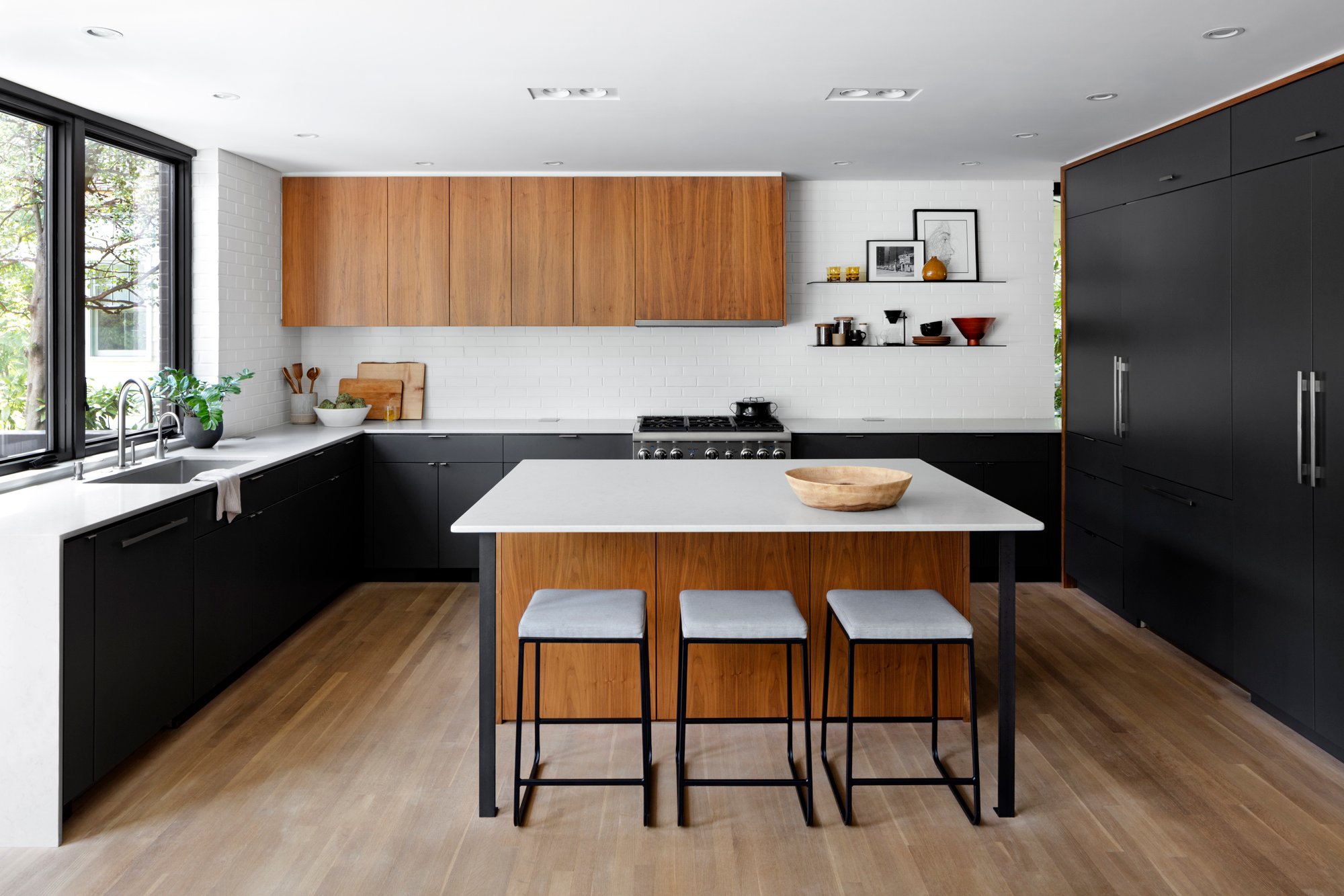

A 1962 midcentury modern home in Chevy Chase sat vacant for years until its new owners worked with architectural firms Fowlkes Studio and Assembledge+ to renovate the home. The family wanted to give it a 21st century feel while paying homage to its roots. In the kitchen, that meant focusing on clean lines and walnut wood elements. “It's not uncommon in midcentury homes,” says architect VW Foulkes. The walnut on the upper cabinets and island are both by Ferris Custom Cabinetry, with honey, gold, and black veins, which complement the ebony bottom and walls painted in Sherwin-Williams' “Iron Ore.” is tied to the cabinet.
To further enhance simplicity, Fowlkes eliminated hardware in the upper cabinets and opted for minimal, barely-there DP3 tab pulls by Mockett for the lower cabinets. Crisp white elements come in through Caesarstone quartz countertops, and the walls feature pale brick painted white, giving the illusion of actual exposed brick. Meanwhile, dark bronze windows and glass swing doors take advantage of natural light, frame the outdoor greenery, and create a consistent flow between the kitchen and the outdoors.
big divide
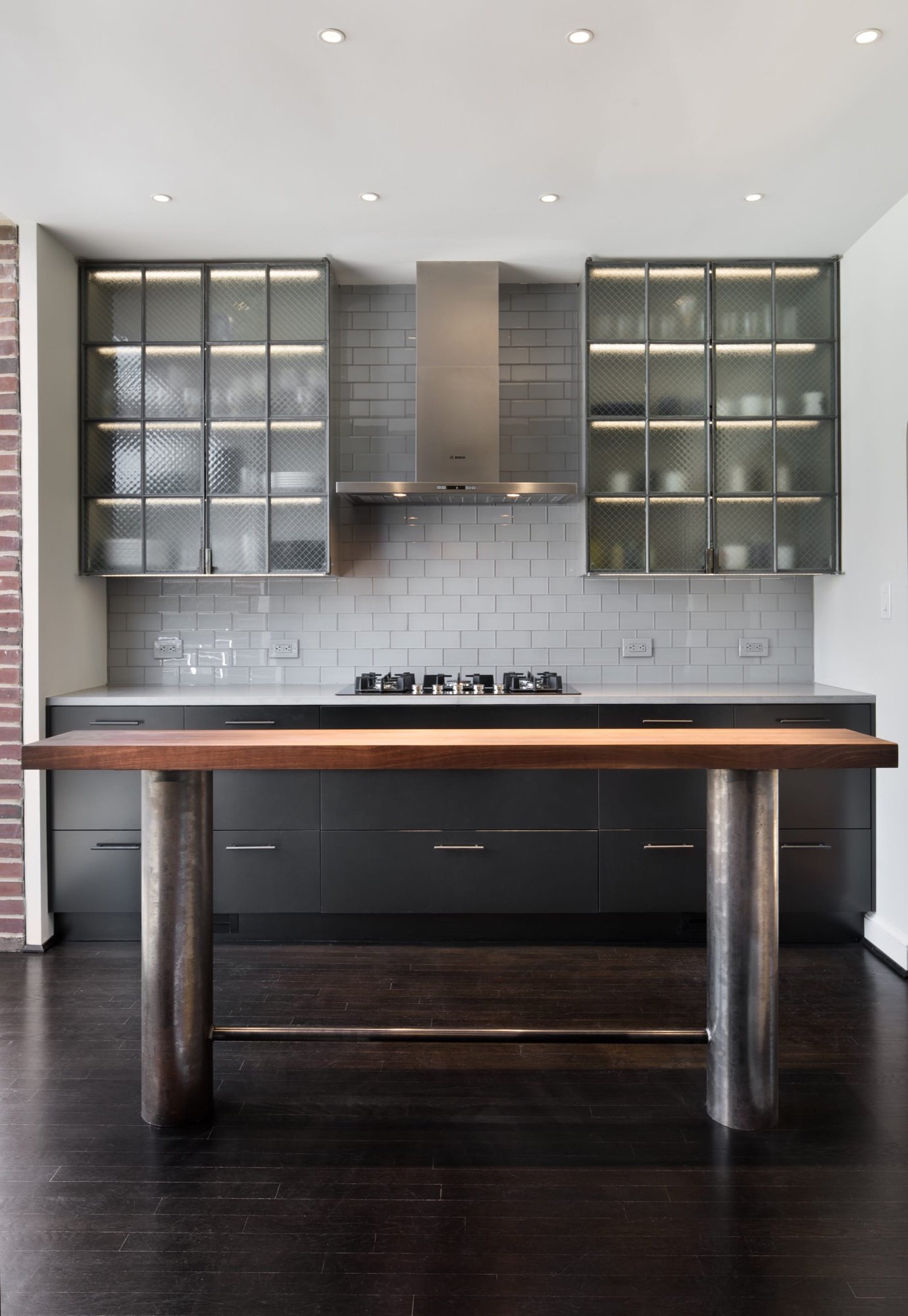

Architect Eric Colbert worked with the design and construction firm Four Brothers to expand and update the previously cramped kitchen of his 1940s Friendship Heights Colonial. The addition increased the square footage and divided the kitchen into two distinct parts, separated by exposed brick from the original exterior, allowing for greater versatility. The new section is surrounded by glass walls and skylights and features frosted glass backlit floors, white cabinetry, and white quartz countertops. Meanwhile, the existing space features matte black lower cabinets and black steel upper cabinets custom-designed by Colbert and fabricated by Four Brothers, as well as black-stained flooring and gray quartz countertops, to complement the corresponding space. It's much more dramatic than that. An old crank-out casement window in the previous kitchen inspired the black multi-glass cabinet doors made from pebble-filled wire mesh glass.
The two areas are also used for different purposes. The bright add-on is used for dishwashing and cleanup, while the original dark part is used for tedious prep work and cooking. Colbert says: “The contrasting black and white is a symbolic expression of function.”
high contrast colors
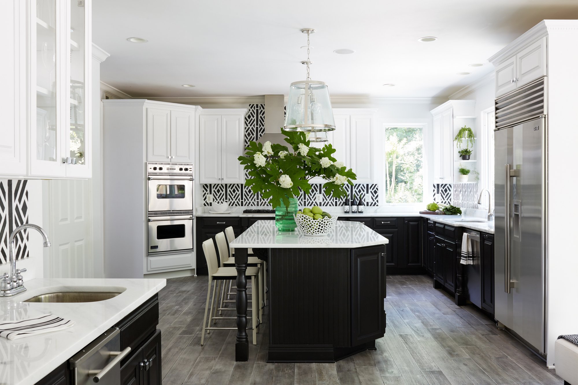

Sally Lord, owner of the design firm GreyHunt Interiors, worked with a longtime client to refresh the kitchen of her Great Falls home. The owners had rented the house for years, but when they moved in again, they decided it was time to say goodbye to the outdated Tuscan-style palette of rust, cream, and brown. For the road, we aimed for a high-contrast black and white appearance. The lower cabinets have a coat of Sherwin-Williams' “Caviar” and are visually connected to the white upper cabinets thanks to the quartz countertop. Touches of chrome on the range hood and visual comfort light fixture add to the clean, modern feel.
What looks like a black-and-white tile backsplash is actually a painted stencil design, which Lord has at home. Sealed with top coat and glass. After all, it was important to keep the beauty practical. “This is a real place of work for this family,” says Lord. “They cook well and entertain frequently.”
anything other than basics
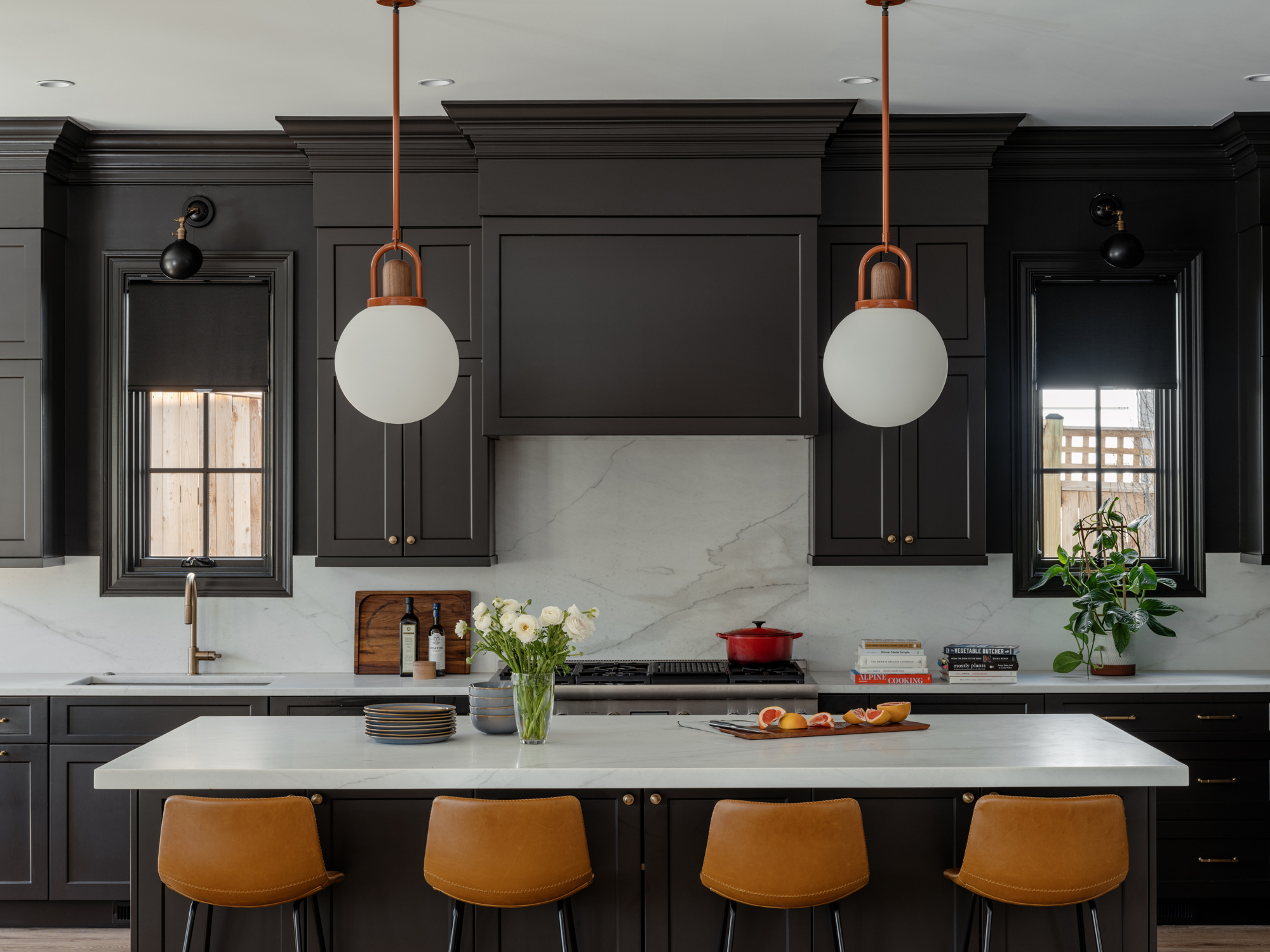

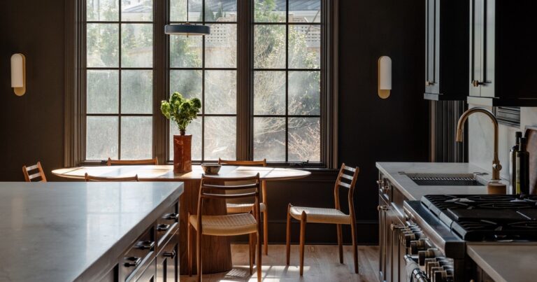
When a family of four moved from New York City to this new Palisades home, they wanted to add depth and charm to their existing blank-slate developer-built kitchen. Interiors designed by Zoe Feldman “The basic all-white space leaves a lot to be desired,” says his designer, Zoe Feldman. So she upgraded her aesthetic with black paint, dramatic light fixtures, and high-contrast stone.
Feldman chose Benjamin Moore's “Black Beauty” for the cabinets and walls. To avoid a cavernous feel, she paired the inky color with white Calacatta gold marble that runs from the countertop to the backsplash and white oak hardwood floors. Feldman added further warmth with burnt orange and wood pendant lights from Allied Manufacturers hanging above the island and gold-tone cabinet hardware from Top Knobs. Meanwhile, Olde Brick Lighting's “Osborn” adjustable arm sconce above the kitchen window blends into the wall and adds to the dark drama. “The house still has traditional bones, so painting it black modernizes it, adds class, and creates impact,” says Feldman.
This article appears in the October 2023 issue of The Washingtonian.


