All seven of these kitchens had two things in common: a small footprint and some unsightly features. Let's take a look at how you can successfully remodel a small kitchen and transform the space while maintaining its small proportions.
Previously: U-turn required
In addition to not having much to see in this small kitchen, the awkward U-shaped layout meant it was crowded. It also created inefficient flow lines between the adjacent living and dining areas.
AFTER: Blue Beauty
Abolishing the peninsula and creating a narrow island proved to be a game-changing choice. Blue cabinetry contrasts with dark hickory floors, and brushed metal drawer pulls nod to the room's underlying rustic aesthetic.
Before change: Basic box
This tiny kitchen in the home of blogger Melissa Michaels (The Inspired Room) wasn't bad. It lacked the personality and openness that Melissa wanted in the center of her home. This builder-grade kitchen posed a problem because there was no storage space on the peninsula that blocked traffic. To make a big difference with a small remodel, Michaels took a hard look at the kitchen and used what she had to create a fresh space.
AFTER: Fresh and functional
Thanks to some innovative thinking, Melissa Michaels updated her kitchen to be bright, airy and modern, on a minimal budget and without major disruption. Removing the peninsula and upper cabinets created an open and airy feel. Quartz countertops, a tile backsplash, and a narrow island in shades of white give the kitchen a visual makeover, while the lower cabinetry was painted a luxurious shade of gray. The space where the microwave used to be was moved to the wall next to the refrigerator and replaced with a sleek range hood.
Before: outdated and dingy
This 1943 kitchen lacked modern efficiency and style, with an awkward layout and even more awkward cabinetry (as seen in the before-renovation photo of the small kitchen).
After: Red Hot
The big change in this small kitchen remodel was to rearrange the layout while keeping the same basic footprint. IKEA's glossy red cabinets give you a sleek, modern look on a real budget. DIY concrete countertops were a cost-effective approach to creating a luxurious look. Counter-depth refrigerators look like built-in models, but are more affordable. Finally, 24-by-24-inch floor tiles and a stainless steel backsplash complement the room's modern trends.
Before: small and dark
The homeowners wanted to live in a 15×7 lot in the kitchen, but wanted to address its shabby appearance.
After: An energetic update
Widening the doorway to the dining room instantly brightened it up and visually expanded the space. Lacquered juicy orange lower cabinets add a whimsical pop of glossy color. Chrome cabinet pulls complement the silver-gray speckled quartz surface countertop. Open shelving and white beadboard add a classic feel befitting the 1875 founding. The new dishwasher drawer is hidden behind the cabinet front, giving a continuous look to the lower cabinets.
Before: Falling into a time warp
This kitchen had hardly been updated in 60 years. As a result, not only did it lack style, but its narrow, boxy footprint was dysfunctional.
AFTER: Latest vintage
In this small kitchen renovation, the narrow 9-foot width was maintained, but the wall between the kitchen and dining room was removed. This small change (and relocation of the appliance) improved both sight lines and traffic flow. Bright white cabinetry, large floor tiles, a sleek range hood, stainless steel worktops and built-in oven showcase fresh vintage style. Blue and yellow accents stand out against the crisp neutrals and enhance the vintage aesthetic, as do the butcher block countertops, porcelain apron front sink, and classic cabinet pulls.
Before: Small but loved
A sunny yellow color scheme and printed wallpaper define this small but hard-working kitchen. Homeowners were looking for an unexpected way to gain square footage and increase functionality in this small kitchen renovation.
AFTER: Gray and gorgeous
To make the most of every inch of space in this small kitchen renovation, we reimagined the back porch as a breakfast nook. The cabinet extends to the ceiling and is 15 inches deep compared to the standard 12 inches to maximize storage capacity. A tone-on-tone color scheme, like this warm gray palette, keeps the eye moving and visually expands the space. A small island provides additional prep surfaces and storage.
Before: Living with the old
When planning your renovation, think about what you'll use and what you won't use. Here, bulky desks have been removed and replaced with discreet cooking zones that reuse storage space and create better circulation and functionality.
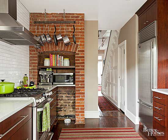
AFTER: Modern Mind
By removing the desk, a space for smart storage was created. A small pot rack puts frequently used cooking utensils within easy reach of the range while freeing up cabinet space. Clean lines such as the kitchen's built-in refrigerator, straight hardware, no-fuss cabinetry and the elimination of ornate details keep this small kitchen clean. Open shelves give an airy touch to the kitchen's original hearth.
A small kitchen remodel doesn't have to be expensive. Also, it is not always necessary to remove the wall. When space (and budget) is limited, focus on making your space as efficient as possible.
Possible. Keep your kitchen's “working triangle” in mind to ensure comfort and safety. This means his three main work zones: sink, refrigerator, and stove are all within 4 to 9 feet of each other. If needed, add counter space for preparing food or storing frequently used small appliances. Sometimes just adding a freestanding island or prep table can make an inefficient kitchen seem more functional.


