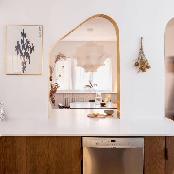
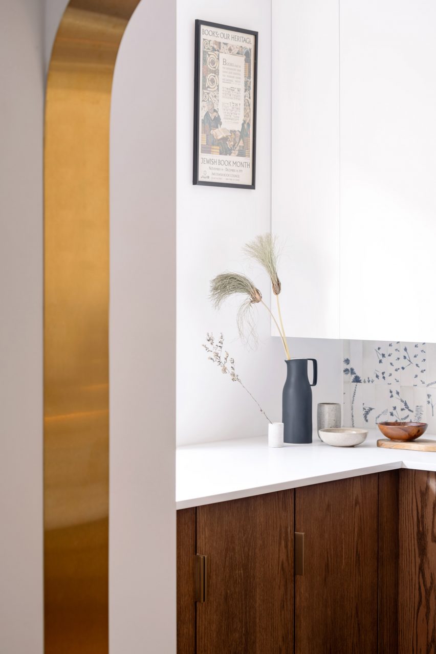
Brass ribbons line the asymmetrical portal that connects the kitchen and dining room of this Toronto mansion renovated by local architecture and art studio Svima.
Portal House was designed for a couple who had wanted to refresh their home for 10 years but had very different aesthetic tastes.
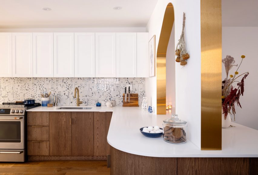

Toronto-based studio Svima found a compromise by combining his desire for “taut minimalism” and her love for “bright French country kitchens” in the design.
The result is a combination of dark oak in the lower half of the ground floor space and clean white surfaces in the upper half, creating a 'cozy country feel'.
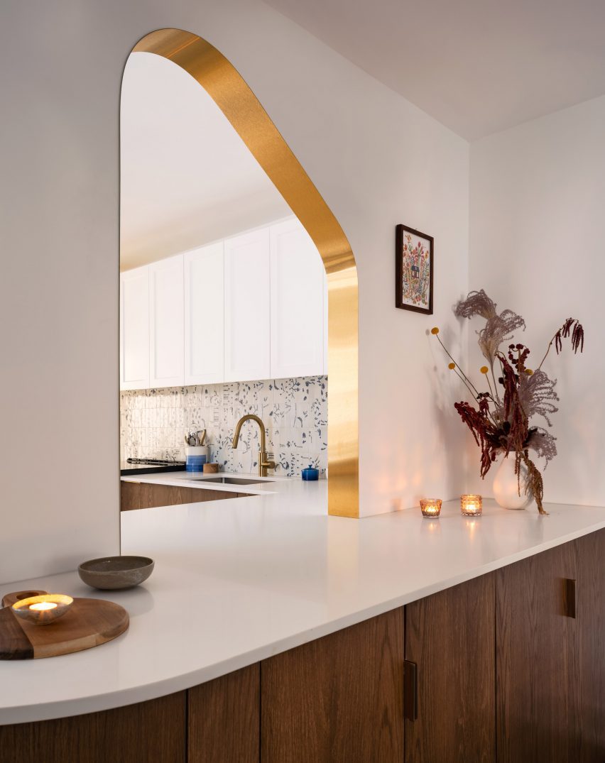

The meandering kitchen layout is narrow, so Svima curved the corners of the cabinets and counter surfaces to create extra space for circulation.
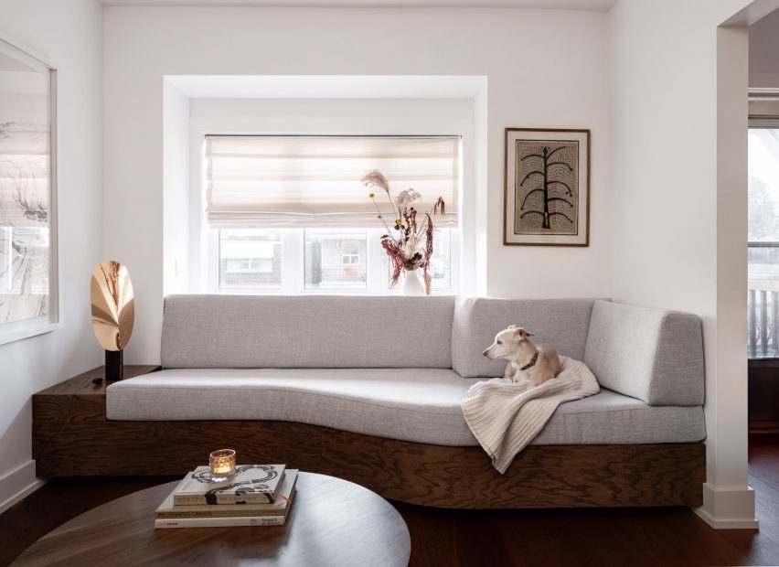
This theme continues in the woodwork in the living room. The bookcase has filleted corners and meets the wall diagonally, and the built-in sofa under the window also slopes gently inward.
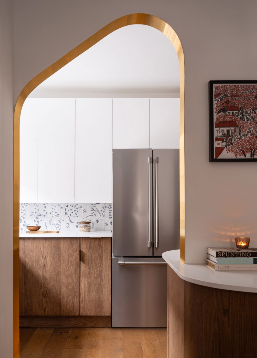

“The design hinges on 'ribbons' that flow through the space, guiding the movement of the room,” Svima said.
“The ribbon bends where sharp corners don't meet or stop the flow of motion.”

The kitchen's curved oak door was handcrafted by a cabinetmaker who created a special jig to cut and groove the oak into a radius.
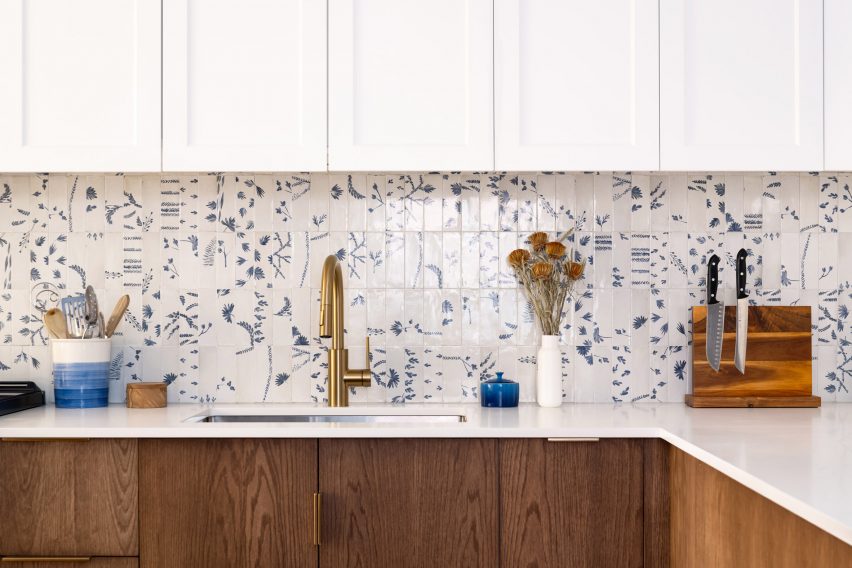
A contemporary take on Dutch Delft porcelain tiles form the backsplash, adding a little touch of blue to the neutral space.

The two portals connecting the kitchen to the adjoining dining room are both mirrored, asymmetrical and framed in brass.
One serves as a doorway, and the other sits above a deep counter and is used as a pass-through for food, drinks, and utensils.
“It was an artistic process for the contractor to lay the brass on the wall because there was no room for error and the brass had to fit perfectly onto the curved drywall,” the architects said.
The living room at the front of the home was outfitted with midcentury furniture, including chairs, a coffee table, and a media console.
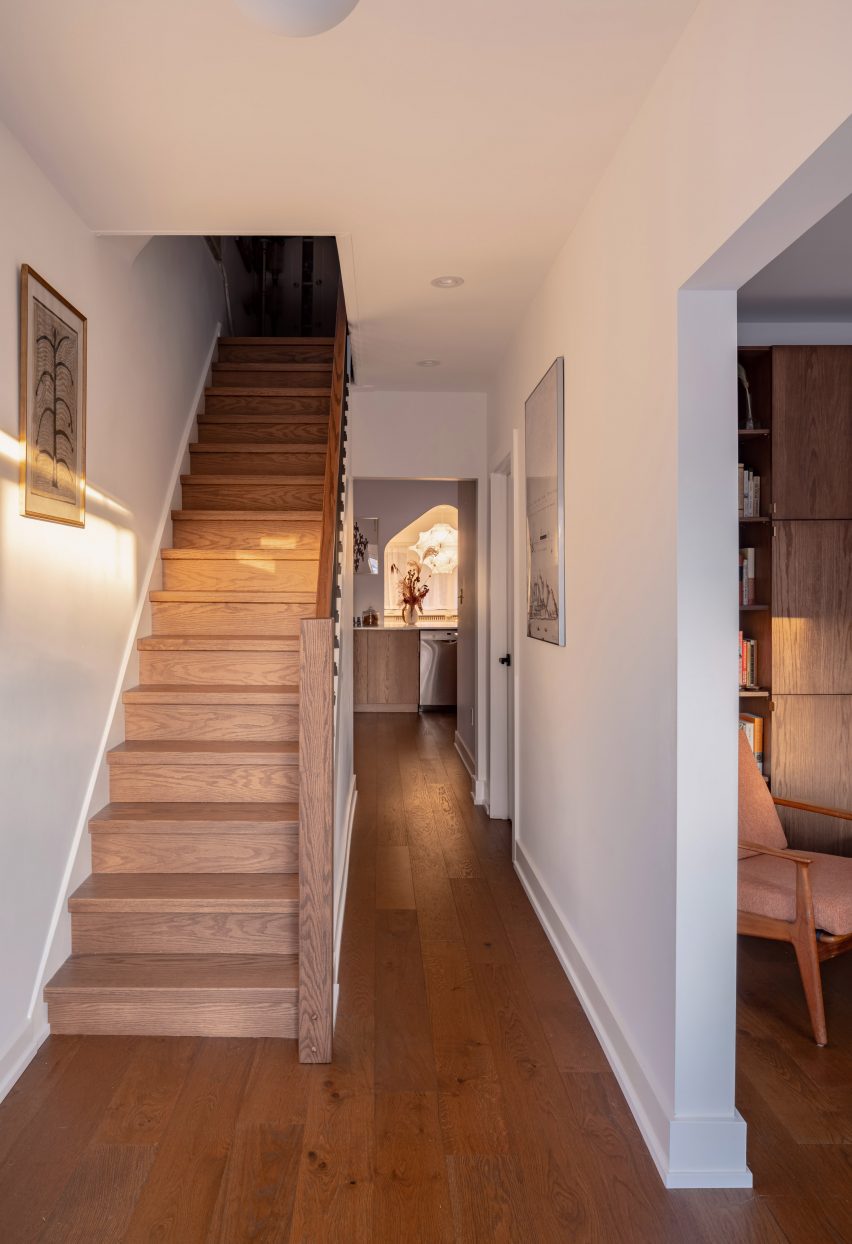

A retractable shelving unit organizes the family's books and belongings, and the side windows let in more light.
A built-in sofa on the other side eliminates the awkward space under the bay window and allows the sitter to face the TV to one side.
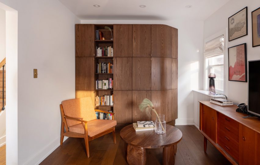

“The custom sofa extends wide into the space and allows you to sit at a sideways angle that's perfect for viewing the media unit, reading or gathering in the lounge,” Svima said.
The floors throughout the house are in harmony with the rest of the mill, giving the space a rich, dark tone.

Founded by architects Anamaria Colorgi and Leon Lai, Svima is not the only studio in Toronto that has had to get creative with a tight floor plan.
When Studio Vaaro overhauled a house in the city, the company created a series of minimally detailed volumes to form the kitchen cabinets, the staircase, and the living room's signature bookcase.
Photographed by Scott Noseworthy.


