Before and after of this
Home Type: Apartment
Project type: kitchen
style: colorful
Skill level: Professional
Perfect for rental: no
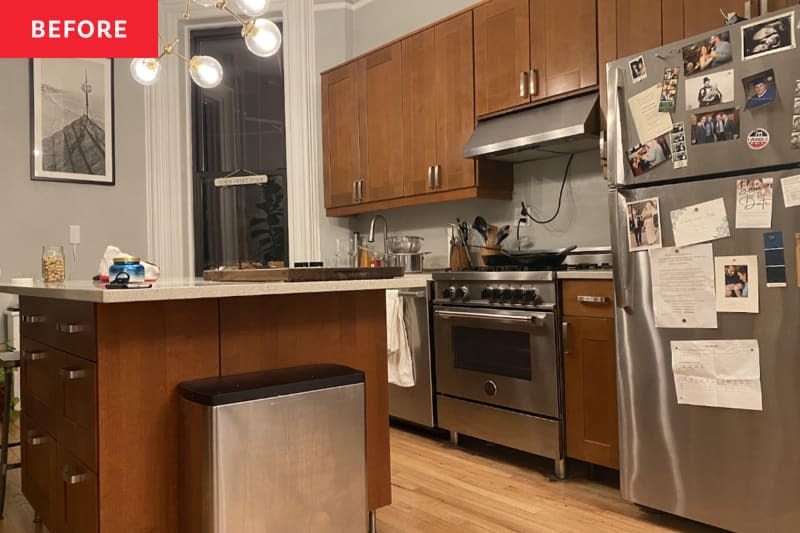

Even dream homes aren't always 100% as dreamy as they once were. When Beach (@cbeachsilver) and Michael Silver (@mcarlinsilver) bought an apartment in Brooklyn's Park Slope neighborhood in 2020, they were “over the moon.”
They'd come a long way from becoming homeowners, and the house had pretty much everything they'd dreamed of: high ceilings, a great location, and private outdoor space. But there were some things they wanted to change, namely the basic 182-square-foot kitchen, which needed a thorough renovation.
The goal was to “create an interesting and inviting transitional look while still maintaining the old-world charm of our apartment,” says Michael, “and we also wanted a place to fit an island and dining table and store a ton of cooking equipment.”
So the couple spent six months working with architect Anya Gribanova to design their dream kitchen with plenty of storage space. and Cozy dining spot.
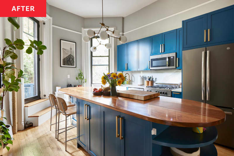

A sleek kitchen island adds storage and dining area
Though they had plenty of time, the design of their new kitchen required multiple iterations before they landed on the final idea. “When we were planning the renovation, we struggled for a long time to find a layout that would accommodate both an island and a dining table – both of which were crucial for counter space – but we just couldn't get it to work,” Michael says.
Unfortunately, the curved area closest to the balcony doors and windows wasn't the best place for a dining table, because the doors open inward instead of out, so they found a compromise: Their contractor, Bahar Roudiani of Teoria Interiors, built them an 11-foot round island that seats four to six people.
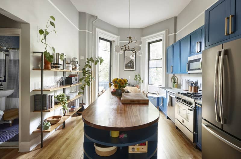

And it's not just the island's rounded shape that made it a perfect fit for the space: The new kitchen had to focus on “maximizing storage on all sides,” Michael says, so a double-width cabinet was added beneath the dining portion of the island to store less-used cooking equipment (think pasta rollers, propane torches, and cookie cutters).
“We have more cookware than you'd think, so it's always a challenge to find a place for everything while keeping the things we use most close at hand and not getting buried in piles,” explains Michael. “The large cabinet under the island was perfect for storing the things we love but don't use every day.” When it comes to kitchen storage, it's important to work smarter, not harder.
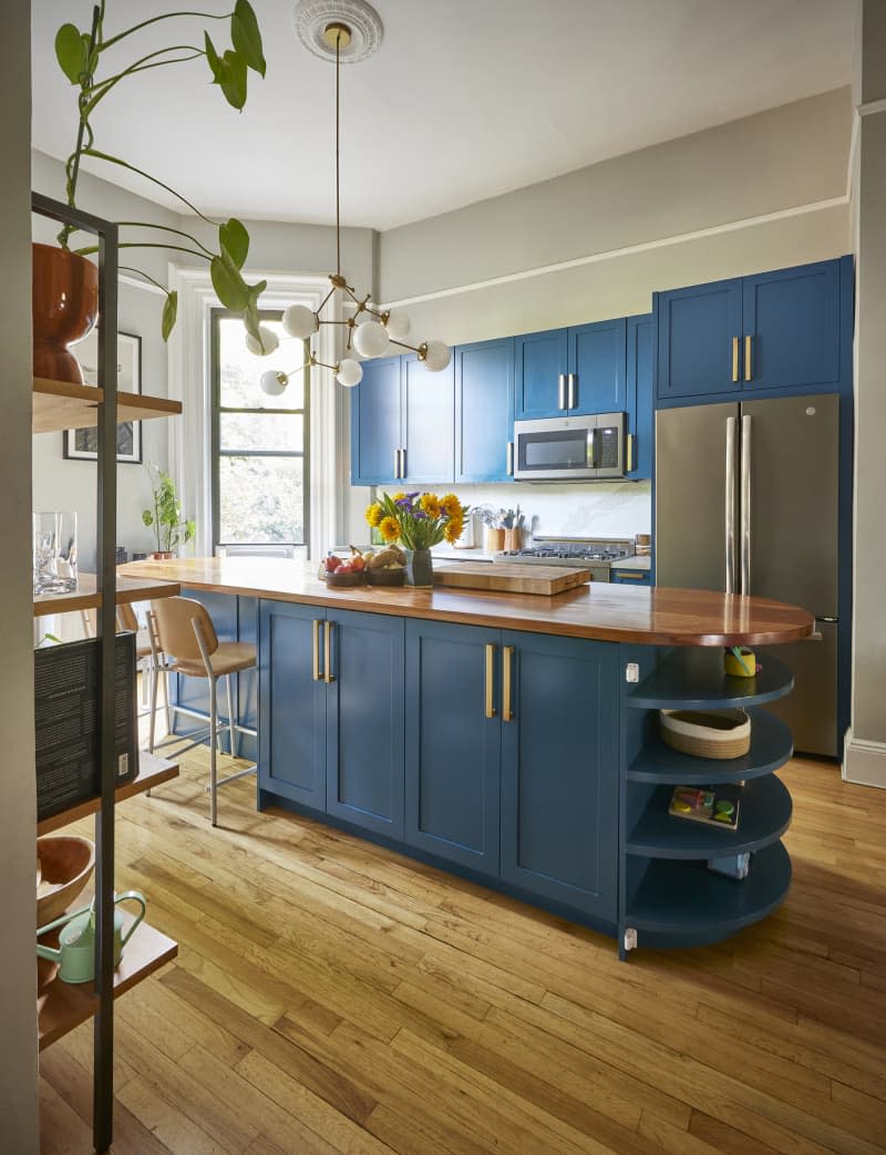

And the countertop turned out to be just as special as the rest of the island. The couple chose hardwood as a material because it could “add a soft, organic element to the kitchen design and be more comfortable to dine on than quartz or marble,” Michael says. The couple enlisted their friend Dan Scrima to design custom countertops out of sapele, which Michael says is a less expensive and more sustainable wood similar to mahogany.
“Two years later, the countertops are exactly what we hoped for: beautiful design and a functional focal point for our apartment, serving as a prep space, dining table, work surface, art space for the kids, and a gathering spot,” Michael writes. “And the fact that a friend made them for us makes them even more special.”
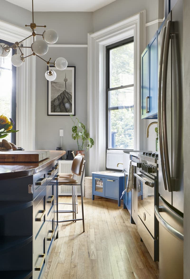

The cabinets were painted a bright blue color.
But that's not all. Of course, another star of the space is the stunning blue cabinetry. New kitchen cabinets (painted in Benjamin Moore's Blue Danube and adorned with pulls from Restoration Hardware), a new chandelier, and a matching kitchen that she DIYed for her daughter, CeCe, add flair and personality to the gorgeous kitchen. Examples like this truly prove how much adding a splash of color can elevate a space.
The kitchen isn't the only room the Silvers have renovated in their Brooklyn brownstone. Apartment Therapy's Full House Tour.
This post originally appeared on The Kitchn. Check it out here: Before and After: Bold blue cabinets transform a drab brown kitchen


