Four local experts share their recipes for designing your clients' movie-star dream kitchens
By Alison Lane Farmer
Cinematography: Andrew Fraser, Michael Schalk
In Nancy Meyers' cult classic film “It's Complicated,” Meryl Streep's Jane Adler exclaims to Steve Martin's architect that he understands her: “I'm finally going to have a proper kitchen with four walls and a place for everything I want,” Adler/Streep exults. “You really do understand what I want.”
Though Myers is known for capturing incredible, aspirational kitchens, this scene underscores a very real idea: Given the importance of those sacred walls, maybe it's time to consider what we do when the space no longer functions.
In four real Savannah homes, four talented teams of architects, designers, builders, and homeowners picked up pens and took on the challenge of reimagining what works. “It's no fun to fight with your home every day,” says Reshma Shah Johnson, founding principal of SHAH Architecture & Interiors. “When renovating a space can support or set the stage for life, even better.” Put on your favorite movie soundtrack and read on to learn about four Jane Adler-approved kitchens that breathed new life into them.
Mid-century charm
Photo by Michael Schalk
After purchasing a neglected 1950s brick one-story house in Ardsley Park, Cathy and Craig Hull quickly realized it was time to call in reinforcements. With mold in the walls, water damage and a kitchen that was unusable for a couple who love to cook and entertain, interior architect Stephen White of Smith Hall Studio and Alchemy Restoration came to the rescue.
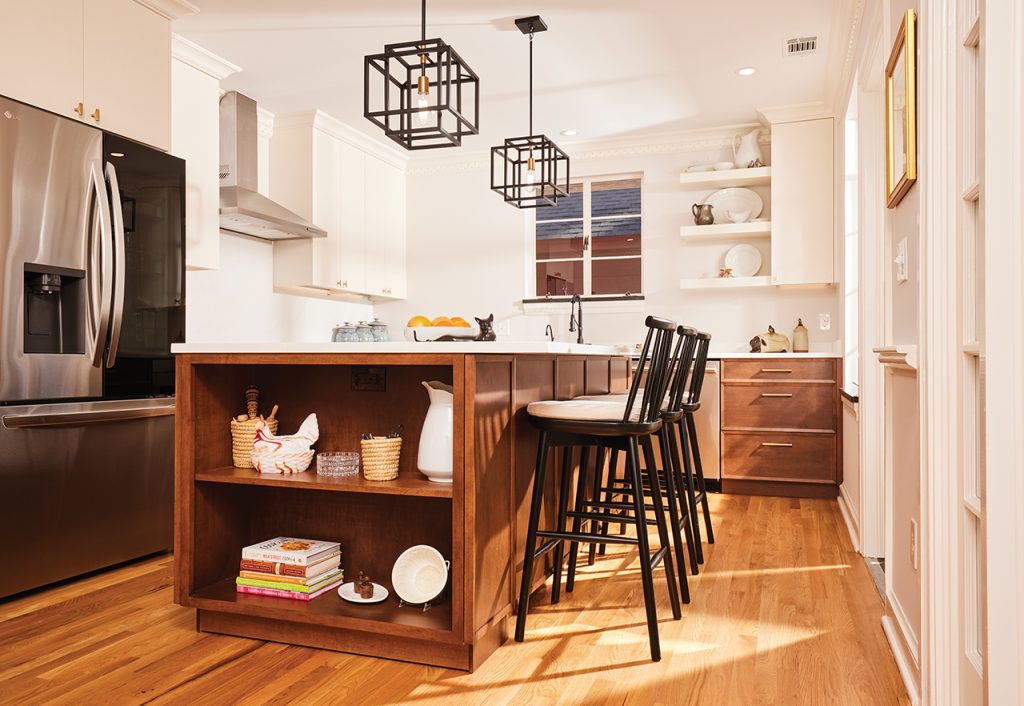
Their first move was to remove the wall separating the kitchen and dining room to create one open space. With more space available, White took to heart the couple's desire for a space that would accommodate serious cooking, entertaining, and retirement. Playing to the home's midcentury charm, White kept the space streamlined with a combination of mocha, brass, and black accents.
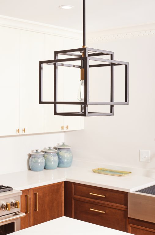
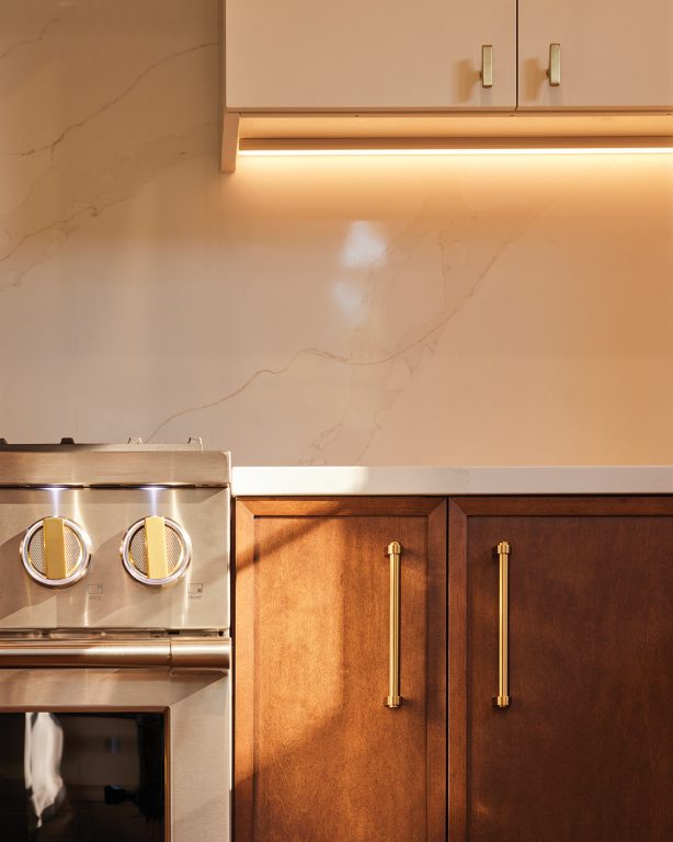
Realizing that a small space could feel cramped, White combined shelves with open walls to make the room feel airy. “Storage doesn't have to be cramped,” White says. “I want my small kitchen to feel spacious, so I maximized the space with a vertical layout.”
For the homeowners, the space has been a huge success: “Some days I even stand here and eat dinner in the kitchen because it's fun,” Cathy says with a laugh. “What I love most is that everything is functional but still allows me to enjoy the beauty of my surroundings.”
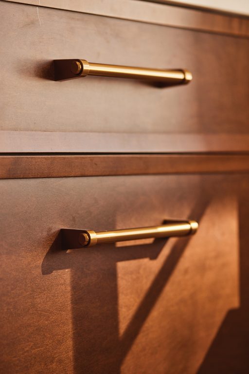
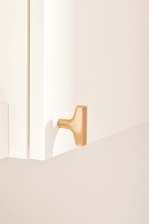
detail
- Homeowners: Cathy and Craig Hull
- neighborhood: Ardsley Park
- Year Built: 1950
- area: 1,520
- Architect/Interior Designer: Stephen White, Smith Hall Studios
- General Contractor/Constructor: Alchemy Repair
- Kitchen Hardware: Top Knob; Kraus
- cabinet: Plato Woodworking
- Countertop: AGM/Creative Stone
- Flooring: Original/matching refinished oak
- furniture: Refinished midcentury finds
- paint: Benjamin Moore
- Windows and doors: Original/Refinished
- Home appliances: Monogram; Faber; LG
Pub
Cinematography: Andrew Fraser
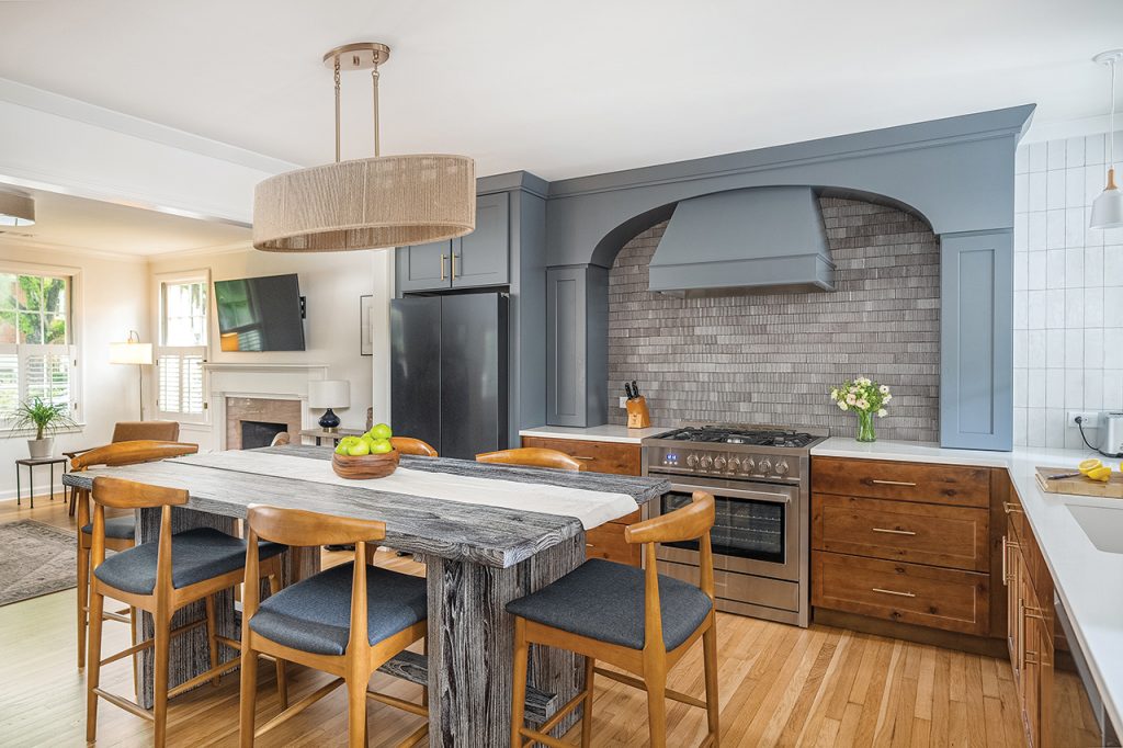
When Adrienne and Brett Bell enlisted the help of their best friend, architect Reshma Shah Johnson, she saw firsthand how little their home suited their everyday life. As a busy family of three, their 1957, single-story brick home in Ardsley Park was long due for a serious rethink. But at just under 1,900 square feet, the existing home didn't offer much space to play.
Shah Johnson of SHAH Architecture + Interiors was given considerable free rein to focus on the dining room. She, along with partner Michael C. Johnson and contractor Capers Martin of Martin Construction, decided to repurpose the underutilized space as a kitchen and pull the kitchen out to the front of the home, opening it up to the living room.
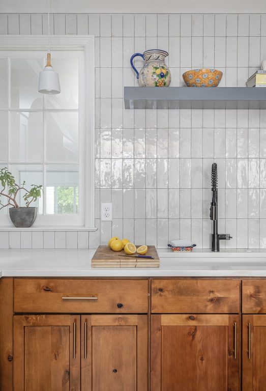
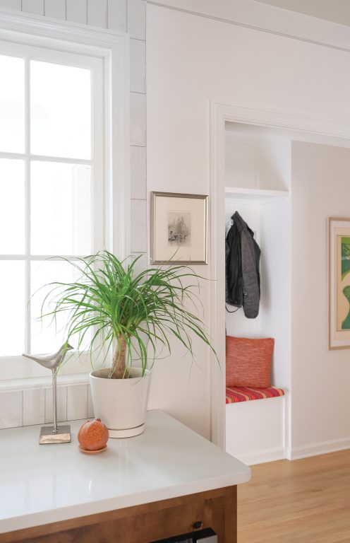
The move made the kitchen the focal point of the family's living space, and the idea of a “family pub” took hold. Along with that, a palette of textured neutrals, dark cabinetry, and pub-inspired paneling began to take shape. The team recognized the importance of incorporating existing details from the living room into the new kitchen, and selected Shaker-style JSI Cabinetry by Savannah Millworks to coordinate with moldings throughout the rest of the home.
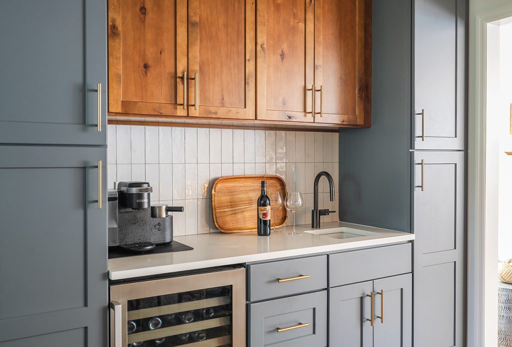
The kitchen's island doubles as the family dining table and pays homage to the traditional pub table, and a secluded “coffee-to-cocktail” nook has been a boon for the homeowners, who love to entertain. “It's made it a much more social atmosphere for us, because we can all gather together and have a glass of wine and the kids can pick up their own things,” says Adrienne.
For Shar Johnson, the change is night and day. “It's just the way they live,” she says. “Nothing about their lives has changed. They're still working, they're still busy, they still have kids, they still have neighbors that pop up unexpectedly. But now the house sets the stage for their lives in a way that doesn't feel like they're fighting.”
detail
- Homeowners: Adrienne and Brett Bell
- neighborhood: Ardsley Park/Chatham Crescent
- Year Built: 1957
- area: 1,899
- architect: Michael C. Johnson, AIA, SHAH Architecture + Interiors
- Interior Designer: Reshma Shah Johnson, AIA, NCIDQ, ASID, SHAH Architecture + Interiors
- builder: Capers Martin, Martin Construction
- Kitchen Hardware: Sandpiper Piping & Supply
- cabinet: Savannah Millworks
- Countertop: Counter Fitter
- Flooring: Cowart Floor Surfacing
- paint: Knight Painting
- tile: Garden State Tile
- Windows: Custom interior window sashes by Old Mill Woodworks
- Home appliances: Livingood appliances and bedding

Modern Blue
Cinematography: Andrew Fraser
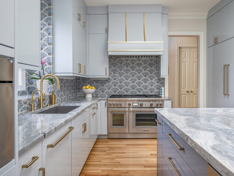
Blue ombré glass mosaic tile with brass inlay inspired Curry & Co. owner and principal designer Curry Salandi to transform an early 2000s kitchen into an elegant, modern space fit for stylish homeowners Ida and Warren Zeger. Salandi covered the kitchen walls from top to bottom in dazzling glass tile, using it as a guiding palette for paint colors and blue-striped quartzite countertops that allude to the central motif.[Ida] “She definitely didn't want a white kitchen,” Salandy says. “She wanted color and character in the backsplash.”

Salandi worked with the homeowners to increase storage and develop a more functional layout within the confines of the existing space. The cabinetry was fitted with modern flat panels in light blue, paying homage to the homeowners' modern European tastes. The 48-inch Thermador range also featured a custom range hood with brass straps that matched the blue hue, installed by AWD.
For the homeowners, the end result exceeded their expectations: “Callie translated my requests with great style into what is now a beautiful kitchen,” says Ida. Her favorite part is the built-in Thermador coffee/cappuccino maker that she enjoys every morning.


detail
- Homeowners: Ida and Warren Zeger
- neighborhood: Landings
- Year Built: 2001
- area: 3,616
- architect: Derevis Design
- Interior Designer: Curry Sarandi, Curry & Co.
- builder: Stone architecture
- Kitchen Hardware: Top Knob; Visual Comfort & Co.
- cabinet: automatic
- Countertop: Walsh Custom Surfaces
- Flooring: Old Savannah Hardwood
- paint: Benjamin Moore
- tile: Savannah Surface
- Pantry Door: Curry & Co. designed AWD.
- Home appliances: Thermador, Livingood appliances and bedding
- furniture: Front; Hickory chair; Lillian August

Island Cottage
Photo by Andrew Fraser // Courtesy of Summit Construction
For Karen Karp, co-owner of Tybee Beach Cottage, built in 1929, there was no question that the cottage was overdue for a serious makeover, having been in her family since the late 1940s and not been renovated in nearly 30 years. But the key was finding a team that could respect the home's historic value.
“What had been a perfectly functional 1930s kitchen had understandably become outdated and dysfunctional,” explains architect Frank Stevens of Stevens & Associates. “We were given the freedom to clear the space and start over with Karen's vision, so it wasn't difficult to design a beautiful, highly functional kitchen with an emphasis on counter space, storage and openness.”

Along with Stevens, Karp enlisted contractor Steve Szczeczynski of Summit Construction Services and Hartmann Interiors. The walls separating the kitchen, dining room and family room were quickly removed, and a full renovation of the home was planned. But maintaining the feel of the original Tybee Cottage was a top priority. “We feel like our home is better,” Karp says.
Working on a tight budget, Karp spent countless hours preserving the beach cottage's original charm. The homeowners combined affordable cabinetry options from Mantra via Savi Interiors with custom finishes from Stevens, then added open shelving and angled base units that Szczeczynski custom-fabricated to match. “We filled in the gaps with custom, and everyone was happy,” Szczeczynski says.
To achieve a Scandinavian-meets-beach-cottage feel, Karp chose dark quartz countertops and two yellow pendant lights she found online in Poland. “I knew exactly what I wanted here, and I feel like I achieved that,” Karp says. “I'm really excited about it.”

detail
- landlord: Karen Karp
- neighborhood: Mid-Island, Tybee Island
- Year Built: 1930
- area: 1,700
- architect: Frank Stevens, Stevens & Associates
- Interior Designer: Hartmann Interior
- builder: Steve Szczecinski, Summit Construction Services
- Kitchen Hardware: Sandpiper Supply
- cabinet: Savi Interior
- Countertop: Multi-Stone
- Flooring: Coastal Heart Pine
- tile: Garden State Tile
- Windows and doors: Coastal Sash and Doors
- Home appliances: Livingood Appliances & Bedding, Home Depot
- Lighting Repair: Brian Dasher, Re-Enlightenment
- Piping: Henry Plumbing
