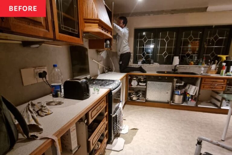
Before and after of this
Home Type: House
Project type: kitchen
style: colorful
Skill level: DIY, Professional
Perfect for rental: no
When illustrator Salma Chatto (@chateauchatto) moved into her four-bedroom home in Billingham, UK, the kitchen layout was “unnatural.” There was a utility room, which, at first glance, might have seemed useful for adding extra storage, but to Salma, it “just didn't feel right in the space.”
Plus, the room wasn't connected to the playroom, making it hard for Salma to cook and look after two kids at the same time. Salma had big plans for the space.
“We wanted to open it up by knocking down walls,” says Salma, “and make the whole back of the house one big open space, so that the playroom would connect with the kitchen and better connect with the garden.”


The first step in the renovation was to demolish the existing kitchen. Salma and her husband Stuart teamed up to gut both the kitchen and the playroom (you can read more about the playroom makeover here), creating an opening to create flow between the two spaces, but from there it was mostly a DIY project.
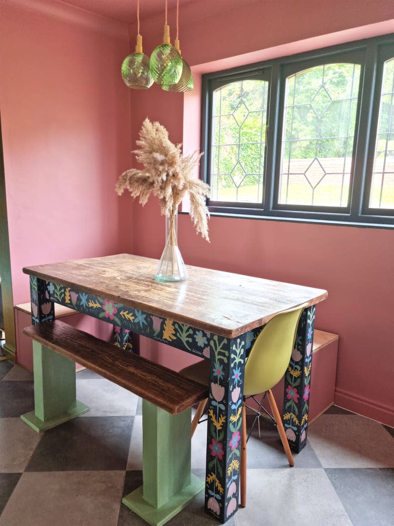

In front of the beautiful leaded-glass window in the “before” photo, Salma painted the kitchen island, which now doubles as the dining table. On the other side of the room is the main kitchen, and the Chatos decided to add a large green IKEA unit (All Green in Rust-Oleum) for storage, where there was originally a utility wall.
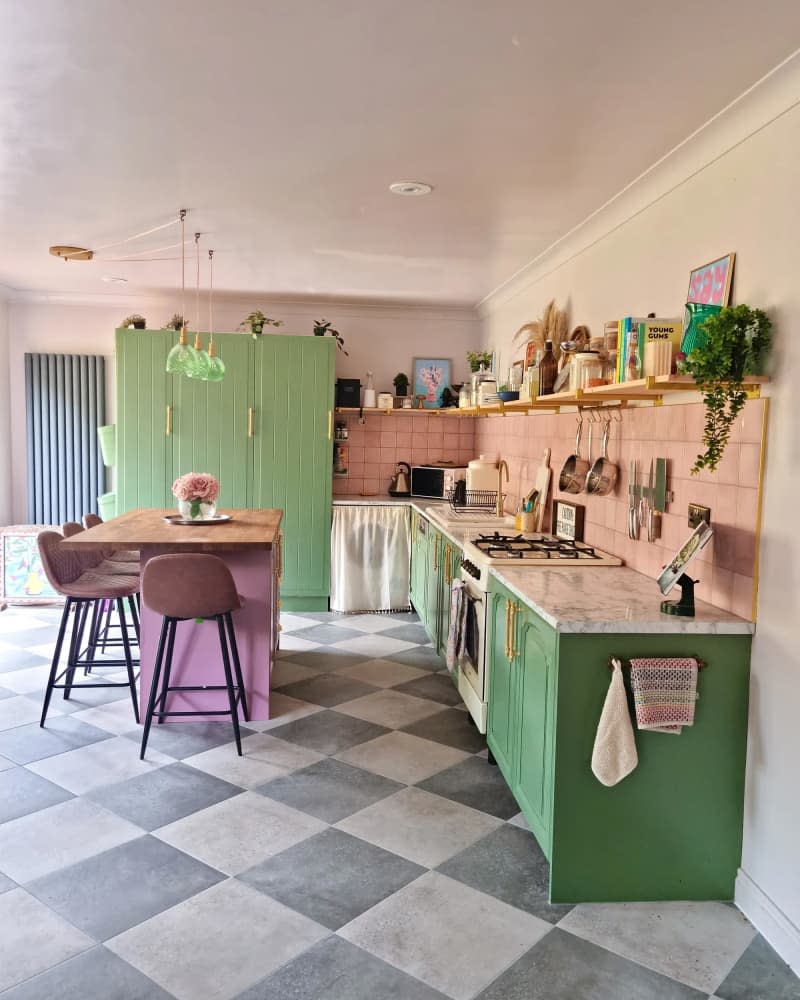

During the renovation, Salma made a somewhat controversial decision: she decided not to have upper cabinets in the kitchen.
“I've never really liked upper cabinets,” she says. “They block light, they're bulky, and at 5'2″, there's a lot of overhead storage that's out of reach for me, so they were out of date for me. … I love open shelving. I think it's so much easier to stay organized if you display things correctly and have a system that others can follow.”
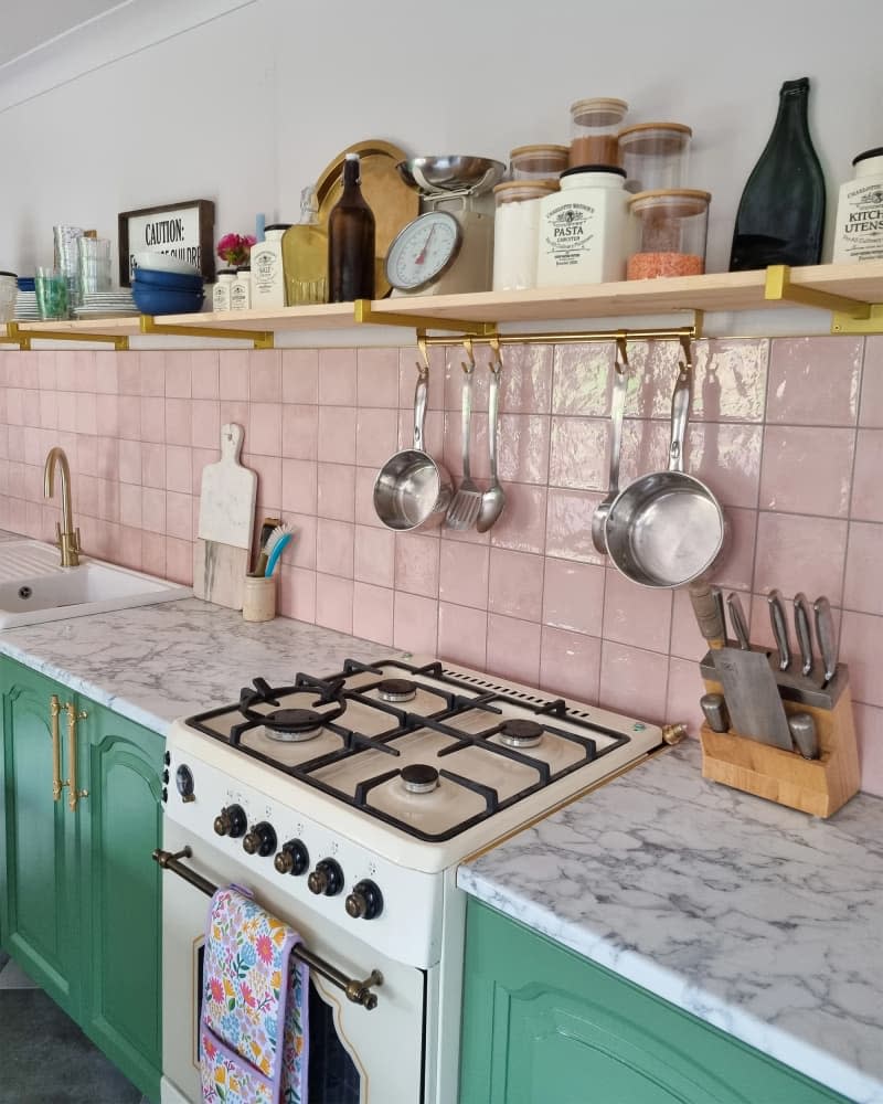

Salma has become a master of open-shelf organization, placing her most-used and least-used sections (think plants, decorations, cookbooks, trays, artwork) next to each other, and using dividers to keep each space neat and tidy. “Everything I need is there and it looks nice,” she says.
But it wasn't just the disjointed layout and cabinets that needed to be revised: She also wanted the kitchen to look more modern. “I love green and pink kitchens, and I think that color combination is beautiful,” she explains. “So I started there, but now that the playroom is one big space, I also needed to choose colors that would match that.”
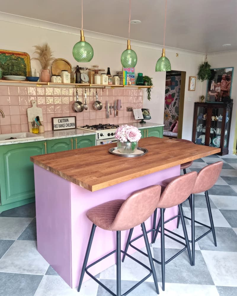

The existing cabinets have also been painted in Rust-Oleum's All Green, while the walls have been painted Dulux's Mellow Mocha.
To add a pop of colour to the centre of the room, Salma chose Lick's Pink 10 for the kitchen island, but that's not the only colour accent: a pink backsplash complements the room's soft palette, and the two-tone flooring (with Amstel Anthracite and Amstel Grey tiles) adds a retro feel.
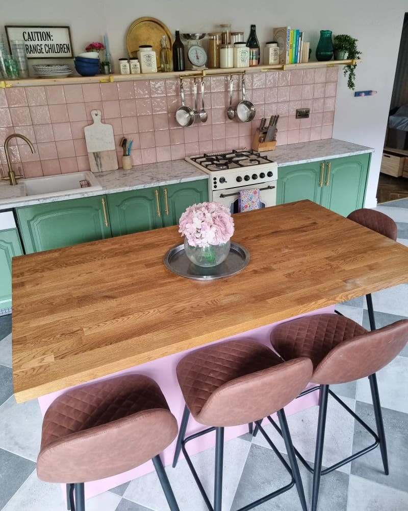

Finally, the family changed the lighting, and Salma's father-in-law hung new pendant lights above the kitchen island. To complete the kitchen, upcycled furniture was added to the room, which she calls “undeniably modern, yet eclectic.”
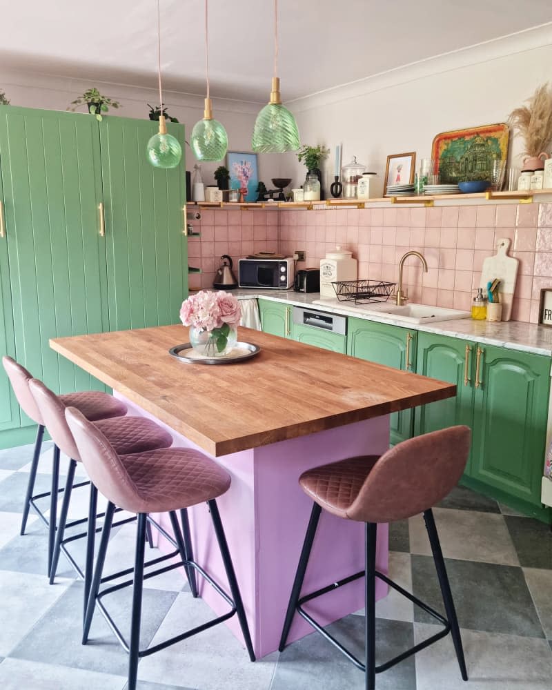

The kitchen renovation took about four months and $10,000, or roughly £8,000 (including labour and new appliances), but it has quickly become one of the most loved rooms in the house. “The kitchen is the heart of the home and connects to the playroom and garden, and we love that it's colourful,” says Salma. To see more of this vibrant space, check out Apartment Therapy's living room renovation and tour of the whole home.
This post originally appeared on The Kitchn. Check it out here: Before and After: Striking green cabinets (and pink tile!) instantly add drama to a dated, “stuffy” kitchen.


