Because the kitchen is often the hub where everything happens in the home, including cooking, eating, and gathering, layout and flow are crucial. If the space isn't laid out optimally, it can feel cramped and inefficient, and that was certainly the case in this San Diego kitchen in a Craftsman-style home built in 1922.
“Before the renovation, the narrow hallway into the kitchen made it feel closed off from the rest of the home,” says Jennifer Werth, founder and CEO of Blythe Interiors. “In addition to a disjointed flow, the kitchen layout wasn't the most functional. Counter space was limited and the makeshift coffee bar area needed a lot of maintenance.”
Natalia Robert
In addition to layout and flow issues, the kitchen, while somewhat modern, felt dark and unstylish. Jennifer says it lacked “wow” factor and the space needed character and charm.
Jennifer's clients wanted a sleek, modern design with color and character, and they also wanted to incorporate mid-century modern design details while retaining the home's original Craftsman-style charm.
Natalia Robert
“The kids love to cook, so we needed to overhaul the kitchen and use the space more cleverly, with more counter space and plenty of storage space for our coffee and tea collection,” adds Jennifer.
Firstly, the Blythe Interiors team widened the narrow hallway into the kitchen, improving the flow throughout the home and allowing in plenty of natural light.
Natalia Robert
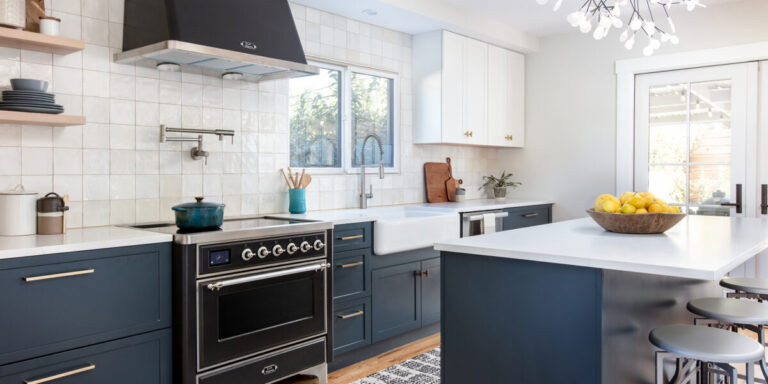
“We also re-examined the kitchen footprint, creating a smarter layout while maximizing storage space,” says Jennifer. “We removed the double-height oven that was on the left wall and replaced it with a gorgeous range and modern range hood. By removing the double-height oven and moving the refrigerator to the other side of the kitchen, we created counter space that wasn't there before. This also freed up a lot of wall space, allowing us to display beautiful square artisan tiles from the counter to the ceiling, making the space feel larger and brighter.”
Natalia Robert
The design team added character and style by painting the lower cabinets a deep blue color and balancing their richness with the white upper cabinets and floating shelves for added storage and visual interest, and they also replaced the center island to hang a modern, luxurious chandelier.
Natalia Robert
“In the coffee bar niche, we added a lower cabinet that provides plenty of storage and organization,” says Jennifer. “Following the opposite wall, we used a floating shelf, which adds vertical space and allows for displaying knick-knacks and accessories, adding practicality and style.”
Now the kitchen is brighter, more colorful, and packed with efficient, functional features that make it perfect for the home cook. It looks modern, but would also fit in well in a Craftsman-style home. “The homeowners are thrilled with the final design and feel it has had a positive impact on their quality of life,” adds Jennifer.


