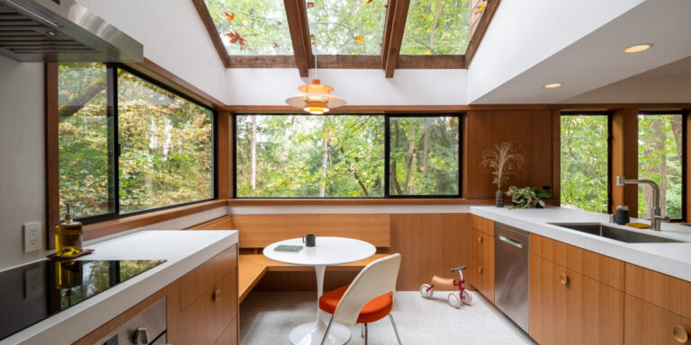
The kitchen in this 1970s William Rutledge-designed home on Mercer Island, Washington, had the enviable assets of strong bones and plenty of light. “The house incorporates many period elements, including vertical glass wraparound skylights, dual-level construction, vertical spaces, and soaring ceilings,” said Thomas Scheer, principal at SHED Architecture & Design. explains. “Situated on a wooded lot, these features maximize the amount of light that enters the home.”
Dane Sussman
Although the kitchen did not lack natural light, there were some drawbacks. Mainly, it looked like it hadn't been updated in a long time. “Despite having some original features beloved by the homeowners, the existing kitchen was isolated from the rest of the house. Additionally, it was outdated and in need of updating.” added Jin Park, also of SHED.
Thomas and Jin's customers, a young family with a grandmother living with a newborn baby, wanted to open up the kitchen to the rest of the house. “The original kitchen had a triangular workspace facing a corner window overlooking the wooded hillside, but the chef was isolated,” says Thomas. “This family, like most families these days, sees the kitchen as an active social space, so the new layout opens into the dining and family room.”
Other goals for the kitchen were to create a breakfast nook, add functional storage, and stay within budget. All of this may seem like a tall order, but the SHED team rose to the challenge.
Dane Sussman
The team didn't look far for inspiration for the renovation. According to Jin, the existing home and its soothing material palette were the main sources. “As always, our focus is on leveraging existing space to best support the family life our customers envision,” explains Jin. “Rather than using reference images or projects to guide the process, we aim to integrate the new work in such a way that it's hard to tell where the original work begins and ends. Within the updated space. , sometimes reintroducing trims and materials found elsewhere in the house, or creating a modern interpretation of what's already there. These moves not only create a dialogue between old and new; We are trying to clarify an idea that may have been executed only in part and not in whole.”
Dane Sussman
By working within the home's premises and utilizing some of its existing features, we were able to keep the project within budget. “Adding or replacing windows is often budget-intensive and a slippery slope that can result in replacing other windows or adjacent siding for consistency,” Thomas says. “We aimed to integrate the renovated space with the existing windows and skylights. The existing black aluminum windows were wrapped with jamb liners and casings and connected with gap panels to create a reconfigured woven into the space. As a result, all work was done within the building's exterior walls, keeping scope and cost under control.
Dane Sussman
One of the main parts of the renovation was to remove the wall between the kitchen and dining room, bringing in the peninsula and allowing it to be used as a central space for gatherings and activities. This allows more natural light to flow from the kitchen to the dining room.
“The vertically stacked configuration of the living room (top floor) and dining room (first floor) in this home did not provide the open living-dining-kitchen configuration common in modern homes, but By removing the wall, we were able to free up the three spaces, “atmospherically connected through an opening at the end of the dining room, entrance, and central staircase,'' Thomas explains.
Dane Sussman
For the breakfast nook, the team placed it in a corner of the kitchen, under an existing skylight and next to two large windows. “Simple details like running steel bars between the skylight beams and dangling pendant lights above the breakfast nook table add subtle beauty to the room,” says Jin. That spot is now the center of the kitchen.
Dane Sussman
The team also made the cabinets and drawers more functional. That's because older kitchens often have drawers that partially open and cabinet doors that have fixed shelves that require you to bend down to find pots and pans. “Using modern drawer hardware, large drawers can be fully expanded and the contents under the counter can be easily accessed,” says Thomas. “Making the most of under-counter drawer storage can make your kitchen more functional and more comfortable to work in.”
Dane Sussman
Other additional touches to the kitchen include terrazzo floor tiles for added color. The quartz countertop was also made extra thick because the client prefers to work on a very high countertop. Height is now 38 inches instead of 36 inches. “Note that quartz, installed flush with the painted drywall, wraps behind the cooktop, around the appliance zone and under the wooden shelving to keep durability understated. Please,” Jin added.
The kitchen has been modernized and made more functional as the family grows. This space takes full advantage of the abundance of windows and skylights, letting in plenty of natural light and showing off the woods outside.


