The steep hills surrounding Cole Valley near San Francisco's core are filled with colorful Victorian and Edwardian homes that have stood for generations. When a couple from the Midwest moved to this compact neighborhood a little over a decade ago, they fell in love with the beautiful scenery, but it wasn't until 2021 that they purchased a home on the area's coveted hilltop perch.
Aside from a lick of paint and the installation of a new stove, oven, and refrigerator, it was clear the previous owners hadn't done much to renovate the kitchen back when the Summer of Love was still fresh in the city's memory (yes, we're talking circa 1967). For designer Rachel Seldin, principal of Seldin Design Studio, the obvious issues were the room's lack of curb appeal, countertop space, and storage. “And the predominantly white-and-gray cabinetry was matched by bulky, nondescript appliances,” she points out.
The couple wanted a space where the architectural details of the home's exterior (and, frankly, the entire neighborhood) were reflected inside, from the push-button light switches to the antique brass hardware. Read on to find out how Seldin reimagined period features for a modern address.
Create better layouts with small moves


The owners didn't have a problem with the kitchen's existing layout—in fact, the sink was conveniently located next to the dishwasher, and the refrigerator and oven were positioned at an angle to one another, allowing them to navigate the space efficiently—but the appliances were all just inches away from their ideal positions, cutting into valuable countertop real estate.
Seldin replaced the 30-inch-wide stove with a 36-inch version and centered it along the wall, allowing about 18 inches of prep space. both We also increased the size of the refrigerator to 42 inches and moved it 12 inches to the left to meet the edge of the counter on the opposite wall, giving us much more space to chop veggies and roll out dough.
Another benefit of keeping appliances (mostly) in their familiar places is that the budget didn't have to include changes to water and gas lines, allowing Seldin to instead put those funds toward more enjoyable features, like brass cup pulls in the dining nook and custom Roman shades.
Lower the ceiling if you need a proper hood

When Seldin and her clients first discussed the changes they wanted to make to the kitchen, they all agreed that the spotlight should be on the range hood. Before the renovation, the range hood was built into a half-wall cabinet near the door frame, but the three agreed that pulling it out and making it a corner focal point would be more rewarding. The only problem was that the ceilings were nearly 11 feet high, necessitating the addition of soffits for added support, resulting in a boxy look.
“We decided to shift our approach and lower the entire ceiling by a few inches,” says Seldin. The lower profile allowed for the freestanding hood to serve as a clean focal point while simultaneously making the area more inviting. The ceilings still feel very high, and the family will barely notice the difference.
Classic palette with historical details


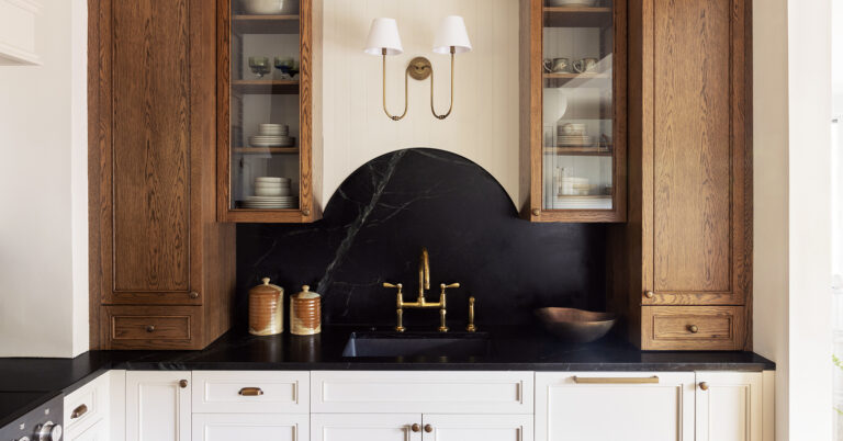
Seldin and the owners were on the same page when it came to the color palette, deciding that plain white cabinets wouldn't work in the kitchen's long space, as they would make the room feel cold and unwelcoming. Plus, the goal was to bring a Victorian aesthetic to the room, so Seldin and her husband went for Stormy Black soapstone countertops, cream lower cabinets (painted Farrow & Ball Strong White), and dark wood upper storage that matched the floors. They incorporated some glass fronts to create a pharmacy-like feel.
The curved shape of the backsplash behind the sink also adds a layer of texture and a nod to history. “The graceful curves of the backsplash not only add an element of elegance and uniqueness, but also fit with the overall aesthetic,” says Seldin.
Copy the curves to incorporate a breakfast nook


The breakfast nook was already part of the kitchen when Seldin was approached to refresh the room, but it felt disjointed. “Even though there was a table and four chairs, the area felt empty,” she says. To make the nook feel part of the kitchen, Seldin created a custom bookshelf using the same wood stain, stone countertop, and brass details as the rest of the kitchen.

Unfortunately, the designers couldn't add hidden storage to the bench (it houses a baseboard heater), but instead gave it a half-moon silhouette that resembles the backsplash behind the sink. “This improves the visual flow, and even if you removed the table and chair, this nook would stand on its own as a beautiful reading nook,” she says. But let's be realistic: when you're sitting at that window, you're looking at the hills, not reading a book.


