Small kitchens can be challenging but they can also be really rather special. For one thing, it’s easy to make them feel cozy, and there’s a place for everything and it’s always close to hand. Plus, you’ll need to buy fewer cabinets to fit out a small kitchen, so your budget will go further.
When designing a small kitchen, selecting the best cabinet style is a great place to start. Whether you go for a traditional framed cabinet, a minimalist flat door or a transitional option like Shaker, that suits modern and classic homes, the style of your kitchen millwork can steer the entire scheme.
Working out the best cabinet styles for small kitchen ideas may prove a little more challenging than when there are no spatial restrictions in force. ‘In a large open-plan kitchen anything goes, but in a small kitchen, you should try to avoid kitchen cabinet styles that will make the room look cluttered or chaotic,’ says interior designer, Dean Armstrong. ‘Your choice of hardware, colors and finishes can also impact the overall feeling of spaciousness.’
10 best cabinet styles for small kitchens
Luckily, being saddled with small kitchen layouts doesn’t rule out too many popular cabinet styles. There are still plenty of beautiful options that can make your space-deprived kitchen ideas sing.
1. All-white

(Image credit: Anastasia Casey/Madeline Harper)
The space-boosting powers of white are no secret, and white kitchen ideas that go for a full white-out from floor to ceiling remain one of the most popular moves for a small kitchen. ‘Bright white kitchen cabinets are always a good idea in a small space, simply for their light-reflecting qualities,’ agrees Anastasia Casey, founder of IDCO Studio.
‘White kitchen cabinets will instantly make a space feel bigger and always make a space feel brighter. My all-time go-to white paint color is Benjamin Moore’s Chantilly Lace. I love the slight richness of the bright white, but for a no-warmth-at-all version, Alabaster by Benjamin Moore is a true white.’

Anastasia Casey main business, IDCO Studio, is a creative agency specializing in beautiful and unique marketing solutions for interior designers. She is also celebrated for her interior design skills, and her monochromatic aesthetic, layered in texture and pattern, is highly sought after and admired. Anastasia launched The Interior Collective podcast last year, and is also founder of Design Camp, a business retreat for interior designers in Austin, Texas.
2. Half glazed

(Image credit: Creative Tonic Design/Julie Soeffer)
Switching solid doors for glass can have a transformative effect on the feeling of spaciousness, helping to break up large expanses of cabinetry, without losing out on any badly needed storage. Consider mirror-backed glazed unit for extra space-enhancing benefits.
‘Glazed cabinets allow you to see right to the back wall, which visually expands the room’s dimensions. It also offers up fabulous opportunities for displaying your favorite kitchenware and decorative pieces,’ adds Courtnay Tartt Elias, principal, Creative Tonic Design.

Courtnay founded Creative Tonic Design in Houston, Texas in 2006 with a passion for weaving brilliance into her surroundings and composing vibrant environments that invite celebration. With a fearless use of color and decidedly inventive flair, Courtnay’s award-winning work has been praised by renowned editorial teams worldwide and can be found within the pages of several showcase coffee table books. She believes that more is splendidly more and delights in sharing her vibrant approach to celebrating everyday moments.
3. Pared-back palette

(Image credit: Kligerman Architecture & Design/ Eric Piasecki)
Taking a reductive approach to material selections is a sophisticated technique to detract attention in a kitchen with less-than-ideal dimensions. ‘Wrapping the room in floor-to-ceiling oak plays down the distinction between wall and floor and cabinet in this small galley kitchen,’ explains Thomas A. Kligerman, founding partner of Kligerman Architecture & Design. ‘The seamless use of one material allows the eye to move across the services without stopping from one to the next.’
Majoring on one material needn’t be uninspiring. ‘Using different cuts of oak, such as the character grade and rift-sawn here, brings richness to this space. We recently finished a kitchen where even the countertops were oak but decided that might be too much of a good thing here,’ adds Thomas.
4. Rich timber

(Image credit: Kara Childress/Julie Soeffer)
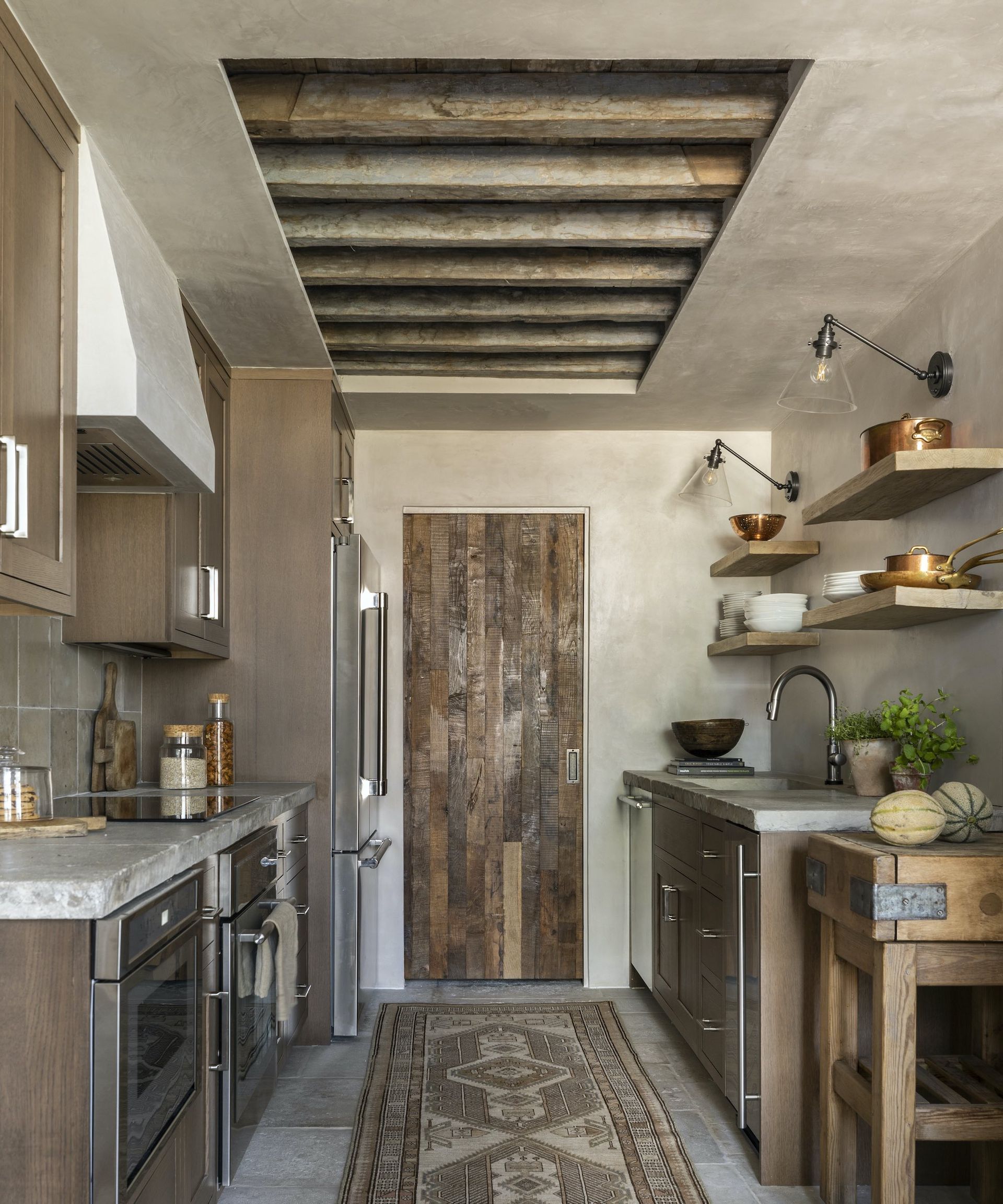
With no room to waste in this apartment kitchen transformation, designer Kara Childress made every decision with space-maximising in mind, without neglecting character and personality. Restricting tall cabinets to one side of the room has a widening effect, while Kara’s choice of rich dark timber cabinets and reclaimed beam ceilings ensures plenty of visual interest.
‘The idea of a cozy galley kitchen was largely influenced by the chef-in-residence, who required a truly effective and efficient cooking space, which is closely connected to a walk-in pantry beyond the reclaimed oak pocket door,’ Kara recalls. ‘The time-worn stone countertops, Venetian plaster and antique stone floor also add personality and are exceptionally durable.’

Texas-based interior designer Kara Childress marries timeless style with Old World European charm for liveable homes that exude comfort and personality.
5. High gloss

(Image credit: Emily June Designs/Claudia Casbarian for Julie Soefer Photography)
White gloss cabinets are a top cabinet choice in small kitchens and with very good reason. By reflecting light, whether natural or otherwise, high gloss finishes in light or bright colors provide an illusion of increased space and can help maximize a feeling of roominess, even in a compact space,’ explains Emily June Spanos, founder of Emily June Designs.
Introduce warmer materials via your flooring and hardware – think burnished brass and wood – for a look that’s luxurious rather than clinical. High gloss kitchens are particularly prone to dust and fingerprints, especially when the sun falls on them, so it’s worth genning up on how to clean kitchen cabinets before you buy. A microfibre cloth, try e-cloth, is your friend.

Emily June Spanos established her Houston-based studio in 2016. Renowned for her fearless approach to color, pattern and texture, Emily’s interiors are always adventurous and filled with joy.
6. Ditch the handles

(Image credit: Roundhouse/Mary Wadsworth)
Handleless kitchen cabinets are perfect for small kitchens. The elimination of protruding hardware and a streamlined look reduces visual clutter, and you can shave an inch or two off the usable floorspace, too.
‘There are several options when choosing handleless cabinets for a small kitchen. The most popular for access ease is the recessed handle, which provides plenty of grip, while retaining that sleek, flush look. We like to use a different material within the shadowline to add another layer of design interest,’ says Sam Hart, senior designer, Roundhouse.
‘Another option is a push-touch opening system, even manually or electric, which allows drawers and cupboards to open with the lightest touch. However, you do run the risk of sticky finger-marks on the doors of cupboards and drawers that are used most frequently,’ adds Sam.

A senior designer at bespoke furnituremakers Roundhouse, Sam Hart has been curating beautiful kitchens and living spaces for more than 14 years. Her creative vision, spatial design skills and product knowledge result in exceptional interiors that push design boundaries and exceed expectations.
7. Traditional in-frame

(Image credit: Tamara Magel/Rikki Snyder)
A bespoke in-set kitchen with classical framed doors is one of the most popular kitchen cabinet styles out there, and can look just as impressive in a small space, as it does in large open-plan kitchen ideas. The key is to consider the proportions of the door profiles. A slender frame detail, as seen on the door fronts of this kitchen designed by Tamara Magel, feels more in balance with the small space than a chunkier design might. ‘I also like the fresher look of plain fronts on drawers in a small kitchen – it helps prevent the classical cabinetry from appearing too busy,’ adds Tamara.
8. Colourful paintwork

(Image credit: MMB Studio/Nick Sargent)
‘Painting cabinetry in bold colour is one way to grow a space that may physically have a small footprint,’ says Matthew Boland, principal, MMB Studio. ‘The colour is Sherwin-William’s aptly named Energetic Orange and it seriously grabs your attention, allowing your eye to travel the entire length and height of the space.’
Take the color right up to the cornice to maximize impact, and don’t be afraid to paint out the architectural millwork while you’re going for it! ‘The smallest spaces can be the most memorable if you keep the focus strong,’ adds Matthew.
9. Hidden storage

(Image credit: Studio Minosa/Nicole England)
When space is restricted, concealing the working heart of a kitchen behind closed doors can be a game-changer. The hidden kitchen is a kitchen trend that’s gaining ground thanks to clever pocket-door systems that close everything away when not in use, including ovens, small appliances, and even the kitchen sink.
Fading seamlessly into the surrounding walls, this hidden kitchen by Australia-based Studio Minosa shows how hiding clutter away can really boost the sense of space. It features push-touch doors and faux paneling to create a kitchen that feels far more expansive than the reality.
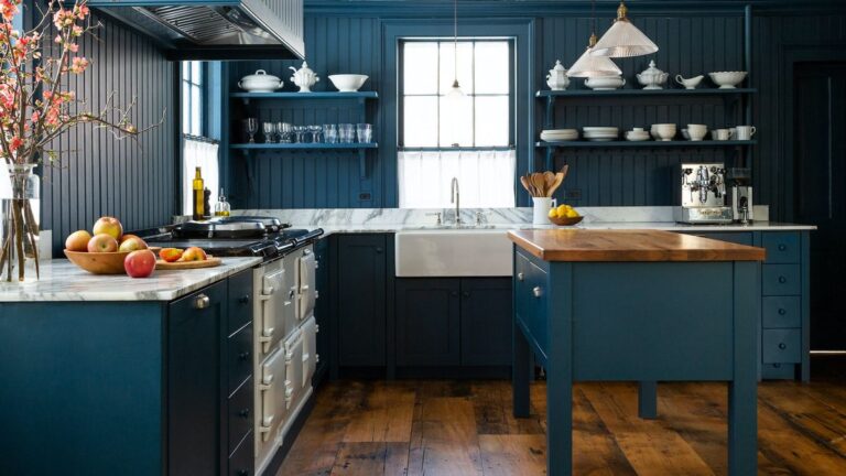
10. Classic Shaker

(Image credit: deVOL)
No small kitchen cabinet ideas line-up is complete without highlighting the brilliance of the classic five-piece Shaker door. This timeless cabinet style can be dressed up or down, made to look more modern or totally country, and never fails to make you feel at home. Best of all, Shaker kitchen ideas work just as well in small spaces, as they do in any other.
‘The lack of ornamentation and simple, clean lines of Shaker cabinetry make it the smart choice in small spaces,’ agrees Helen Parker, of deVOL. ‘In a pale paint colour with a few glazed cabinets, Shaker cabinetry will feel light and uplifting, no matter the size of your kitchen.’

Helen is the Creative Director at deVOL, a leading kitchen design company that mixes classic and contemporary. Helen has been creative director at the company since 2011, and is passionate about the signature understated approach deVOL takes to designing kitchens.
FAQs
Which shape kitchen is best for small space?
Galley kitchen ideas are considered the most space-efficient layout, and will allow you to achieve maximum storage and prep space per square footage. Named after the ship’s kitchen, where every inch counts, this popular linear layout is designed to help deliver dinner with ergonomic ease. Unlike many of the other popular kitchen layout shapes, like L-shape or U-shape, the galley layout doesn’t have any corner cupboards, which are notoriously wasteful and hard to access.
‘I love a classic galley kitchen in a small space,’ adds interior designer Heidi Caillier. ‘They just feel so intimate and special, and there is something very appealing about them practically. They force you to be thoughtful in how you lay out every inch, and I also like the mentality of using ALL of your kitchen versus just that one corner between the range and the sink.’
What cabinet colors make a small kitchen look bigger?
Pale colors are widely tipped as the go-to for small kitchens, especially off-whites with warm undertones and creamy stone shades. However, the room’s natural light levels and direction in relation to the sun, are more important considerations than its dimensions.
For example, a North-facing room can make some whites, especially whites with blue undertones look cold, unenticing and no bigger in any way, shape or form. In this scenario, a darker color that carries over the architectural woodwork – and even onto the ceiling – can be far more effective at making a small kitchen look bigger.
‘For those looking to add a splash of color, opt for a bolder color on lower cabinets and contrast with paler shades on upper cabinets to create a cohesive feel that is not overwhelming of color,’ says Helen Shaw, of Benjamin Moore.


